Creating widgets
When creating a widget it depends on which framework you want to create it in.
We already offer some templates depending on the framework you are using.
- Angular template: https://github.com/better-care/angular-widget-template
- Svelte template: https://github.com/better-care/svelte-widget-template
- React template: https://github.com/better-care/react-widget-template
All inputs confirm to the same schema description.
The end "widget" is a web component that can then be installed in the content manager and from there used in Form Builder.
To get the credentials for content repository and to upload the widget please contact us on tools@better.care
Every widget has potentially 2 inputs, 2 outputs and schema specification. Inputs, outputs and description are provided in this page as they are the same for any framework.
Schematically this would look like this:
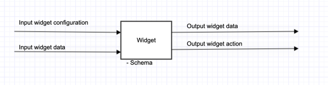
This means we have 4 different options on how the widget interacts with environment and one schema property:
- Input widget configuration
- Input widget data
- Output widget data
- Output widget action (still in beta - coming in 3.3)
- Schema (denotes how inputs and outputs should behave)
These are the specifics how to create widget and how to make it interact with environment. Explanations and examples of these interactions will be made in Angular way, but they are not dependent on the framework and can be done in other frameworks:
Input widget configuration
Widgets behaviour can be configured through input widget configuration.
Configuration that you provide to the specific widget on the canvas is not dynamic and cannot be changed during runtime of the widget.
For angular component this is how it looks like in a web component:
    @Input()
    config: any;
And this is an example of a configuration for a slider shown in Studio.
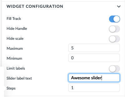
The configuration is not mandatory if the widget doesn't need it.
Input widget data
The dynamic data that the widget shows is passed through the inputData property:
    @Input()
    inputData: any;
You can connect widget to different resources through this property.
Output widget data
If the widget is not a read only widget (slider is a good example) and also is abe to change the data then the widget also needs to have an output emitter:
    @Output()
    outputData: EventEmitter<any> = new EventEmitter<any>();
The data for the widget is stored in the composition the same way as for other generic inputs.
outputData must have the same schema as inputData. If we create input text widget for example, then this input text widget can emit the text and also receive it from somewhere else. The schema, a text primitive is the same for inputData and outputData
Schema Specification
All the inputs and outputs conform to the same specification. What kind of objects are accepted in the inputs and what kind of data the widget emits (what kind of schema they have) is described in description.
Sample of descriptor for a pie chart:
descriptor = {
    valueModel: {
        type: 'list', // 'object', 'array', 'string', 'number', 'boolean',
        listModel: {
            type: 'object',
            objectModel: {
                value: { type: 'string' },
                label: { type: 'string' }
            }
        }
    },
    configuration: {
        chartType: {
            type: 'enum',
            values: ['pie', 'doughnut'],
            defaultValue: 'pie',
            metadata: {
               title: 'Chart type',
               descriptor: 'defines if you want to see chart eaither as a doughnut or pie'
            }
        },
        hideLegend: { type: 'boolean' },
    }
};
This is how this descriptor would then look like in Studio:
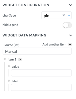
descriptor can have two root properties:
- valueModel that defines the schema for
@Input() inputData - configuration that defines the schema for
@Input() config
There is no configuration for output schema because it must have the same schema as valueModel - the valueModel that defines the widget
Then each property defines the property that can be then used either in configuration or inputData binding.
Let's look at chart type configuration:
  chartType: {
      type: 'enum',
      values: ['pie', 'doughnut'],
      defaultValue: 'pie',
      metadata: {
         title: 'Chart type',
         descriptor: 'Defines if you want to see chart eaither as a doughnut or pie'
      }
  }
This corresponds to Widget configuration Chart Type:

There are 4 properties in chartType object:
type
This describes what type of property is accepted. There are six possible types: boolean, string, number, enum, object, or list
boolean, string, number, enum are primitives, while object, or list define another level in the configuration.
values
if the type is enum then you can also define what are the possible options to pick from. In configuration this looks like dropdown from where you can select values:

defaultValue
primitives can also have a default value. When the widget is added initially on the canvas this value will already be preselected (and can be then be changed by the user)
required
defines if the property is mandatory or not. If this property is not defined then, by default, the property is not required.
metadata
This is an object where you define the title of the property and also description. You see the description when you hover over it with a mouse. If the title is missing then the name will be equal to property name in json (chartType for this example)
Default data
When you drag and drop the widget on the canvas during form building the data is not immediately present and the widget must be shown with some default dataset. This configuration needs to be embedded in a widget. Form renderer, during the actual rendering of the form for concrete example sets this property to false. All other values should make widget use default data that is part of the widget:
    @Input()
    useDefaultData: boolean | undefined;
Concretely, when you add the widget on the canvas the default data will be presented (useDefaultValue will not be false). When you click the preview or when you are using this form in the end application this property will be set to false.