Input Fields
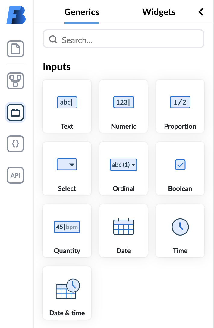
Input fields are components intended for entering or selecting values. All template leaf nodes (fields that can't have any children) are input fields. Besides templates, you can also pick generic input fields from Generics component panel and add them to a form.
Some configuration is common to all fields, while some is specific to the type of an input field.
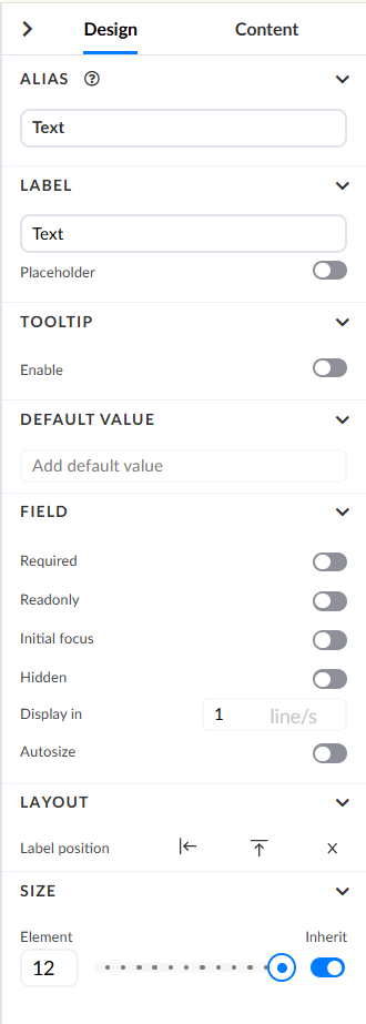
Configuration options common to all input fields are:
- Alias of an input field allows it to be referenced by a custom name,
- Label, which lets you change the name of a field shown to a person using the form,
- Default Value, which lets you define the default value of an input field,
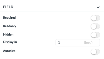
- Setting input fields status to required, hidden, or readonly,
- Changing how a field behaves in the presentation mode,
- Setting the layout of a field - where the label resides, and
- Changing the size of an entire input field.
Field Layout and Size
In the Layout section of the Design panel, you can change the label layout of a field. A field can have a label on top, on the left side, or hidden.

If none of these options is selected, the label layout is inherited from its parent container, with global settings being the topmost ancestor. To revert the layout options to its default state inherited from its parent, click on a field on the canvas and then simply deselect the currently active layout option in the Layout section of the Design panel.
The layout you specify for your input fields will be reflected in their presentation on the canvas.

In the above example, the first field's label layout is set to top, the second one to left, and the third one has its label removed.
You can change the size of a field by moving the slider in the size configuration option:
Fields with labels on the left size have one additional configuration that lets you change the amount of blank space a label needs relative to the input space.
Specific Field Configurations
Some fields can be configured in ways specific to a certain type or types of fields.
Almost all fields have a placeholder option that lets you define a placeholder value that is displayed before data is inputted.

Input Text
This is the most basic input type and as the name denotes, it serves as an input to which users can write text.
On the text field you can set additional validation in the form of a RegEx. There are four predefined ones you can choose from:
- email,
- only letters,
- only numbers,
- url,
If none of predefined ones suits you, you have the option to write your custom one and create an error message to display if the text does not meet criteria.
You can increase these input fields' height by changing the display in 1 line/s configuration. Additionally, you can configure text fields to automatically resize depending on the text's length.
NOTE: Most common input text field types are DV_TEXT and GENERIC_INPUT_TEXT, but many other openEHR-related text inputs are available.
Numeric, Count & Proportion Fields
Numeric, Count, and Proportion fields only accept numerical input. Count only allows whole numbers while Numeric and Proportion allow numbers with as many decimal places as configured.
The only specific configuration for these fields is Field Validation located in the Content tab of the Property panel. Field Validation allows you to validate inputs based on:
- how many decimal places are allowed.
- a boundary value, which the input values either mustn't surpass or be lower than.
example of a validation for generic numeric

NOTE: DV_COUNT and DV_PROPORTION are openEHR fields frequently named as Count and Proportion. GENERIC_NUMERIC_FIELD and GENERIC_PROPORTION_FIELD are generic components that reside in the Generics panel. In the Generics panel they are named Numeric and Proportion.
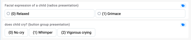
Dropdown, Radio Button, and Button Group Fields
The configuration of dropdown fields is the most complex of all field categories. They can be set to any of the four available presentation options, they have three different ways of defining their selection values, and a specific number of allowed values settings.
There are five different input fields that reside in this category:
| Field type | Field name | Generic field | Description |
|---|---|---|---|
| DV_TEXT | input text️ | ⬜ | Texts can have selections values defined. These values can just be suggestions, and the end user can input something else. |
| DV_CODED_TEXT | coded text | ⬜ | Selections are stored in EHR Server as code (abstract code of the selection) and label (user-facing label of the value). ️ |
| DV_ORDINAL | ordinal | ⬜ | DV_ORDINAL is equal to DV_CODED_TEXT, except that it also holds ordinal number which is an integer. |
| DV_SCALE | scale | ⬜ | DV_SCALE is equal to DV_ORDINAL, except that instead of the ordinal number value, it holds scale number value which is a real number. |
| GENERIC_CODED_TEXT | generic coded text | ✅ | ️Acts as coded text, except that it is generic. |
| GENERIC_ORDINAL | generic ordinal | ✅ | ️ Acts as ordinal, except that it is generic. |
In the right panel's Design tab, in the Field section, you can choose among four different Presentation options of these fields:
- combobox
- checkbox
- button group, and
- interactive image.
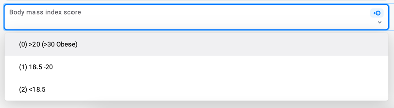
The combobox presentation option allows picking values from a dropdown menu when filling in forms. This is the best presentation option for fields that have lots of possible values.
The logic behind checkbox and button groups presentation options is very similar with the main difference being that button groups don't have to necessarily be distributed among columns. They can also be distributed depending on the field configuration. If we allow more than one selection value, radios simply become checkboxes.
The last presentation option on the list is interactive image. This option is used for fields residing within an image map. Image maps allow you to create clickable pressure points on an image. To learn more, please read the image map documentation.
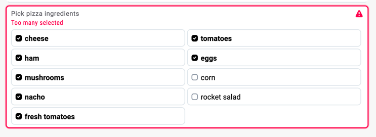
Multiplicity of a Dropdown Field
By setting the min multiplicity of a field you are setting how many selection values are mandatory. By setting the max multiplicity of a field you are setting how many values can be selected. The most common two examples are:
- min multiplicity = 0, max multiplicity = 1. This means that the user can select one value from a list, but it is not required
- min multiplicity = 1, max multiplicity = 1. User must select one value from a list of values.
If the min multiplicity = 4 and max multiplicity = 6, then the user must select at least four values, but not more than 6. More concretely, user must select between 4 - 6 pizza ingredients:
Selection values of a dropdown elements
Selection values are all the possible values for the user to choose from. If these selection values are already defined on the openEHR template, then the user can only hide them by clicking the eye icon on the left or change the label of them.
If the selection values are not defined, either because a field is generic or because template does not have them defined, then you can can add selection values in three ways:
- by adding internally defined selection values manually
- by getting them from external API through datasource
- by getting them from AQL variable
You can learn more about external API in External API section. To learn more about AQL variables open variables section
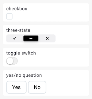
Boolean
Although it is a very simple field with only three possible values (null, true, false) it still offers rich configuration options.
You can present boolean field in four different ways:
- checkbox
- three-state
- toggle switch
- yes/no question
 Three state boolean and yes/no question are the only presentation where user has total control regarding the null value of the field. For other presentations the second "switch" or "check" simply changes the value to false instead of null. If the configuration of boolean field in archetype designer does not allow false values then the second switch switches to null instead of false.
It is the only input field where you can also position the label on the right side of the value:
Quantity
Quantity is a composite field that has 2 input values:
- magnitude part where you write the number
- unit part where you select the unit
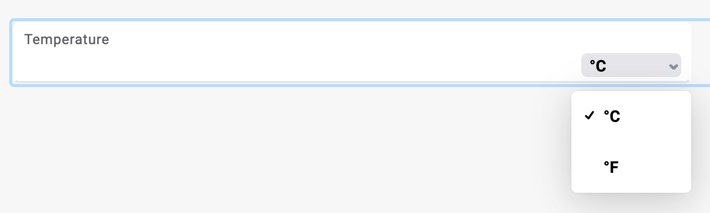
Units will be presented in dropdown if more than one value is available otherwise it will be shown as a simple readonly label. You can make unit read only (where units can only change through dependencies), or you can also hide units on the Content Tab, so they aren't presented to the end user.

When quantity value is empty, unit will be shown at the end of the field since it is not yet associated to a value. Once value is entered a unit will stick to the value for easier reading.

Magnitude part allows you to add validation as on numeric fields.