How to Design Forms
Here, you will find tips on how to design a better user experience for those filling in your forms. A proper form should always strike a balance between user experience and design. Making the correct choices when it comes to layout, types of fields, and structure, make filling in a form faster and simpler. To design better forms, you need to reduce the workload and tailor the experience for the person filling it in.
The information given here is based on the book by Jessica Enders, called Designing UX: Forms: Create Forms That Don't Drive Your Users Crazy.
Before you start designing, be sure to always:
- review your content. Think of ways to optimise and reduce cognitive load for the person filling in the form.
- adjust content and word framing to the end user: will the form be filled in by an advanced user or an elderly person?
- Will the form be used daily by the same person or will it have unique users each time?
- Consider on which devices the form will be mostly used.
Layout and Alignment
A clearly defined layout can help users navigate the form quicker and with greater success.
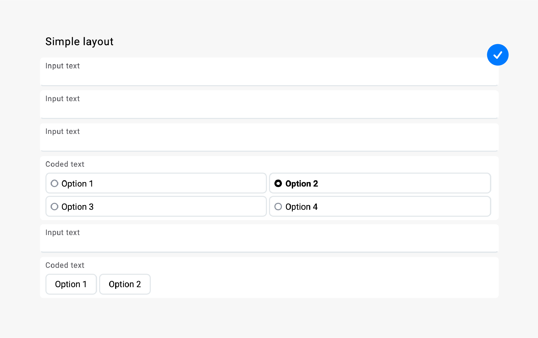
Simple Layout
We can provide a better experience of filling in a form by guiding the end user through a straight, unobstructed vertical route.
Using this approach might make the form longer, but this way the experience for the person filling out the form is the most straightforward and least confusing.
Or, to put it differently, a vertical path doesn't make form filling objectively faster, but it does make it feel like it happens faster.
Example A: A clear, vertical path with a predictable positioning of labels (the user can always expect them on the left at the start of each field).
Example B: A multiple-column layout can interrupt the smooth flow through the form. The sequence of fields is not clear.
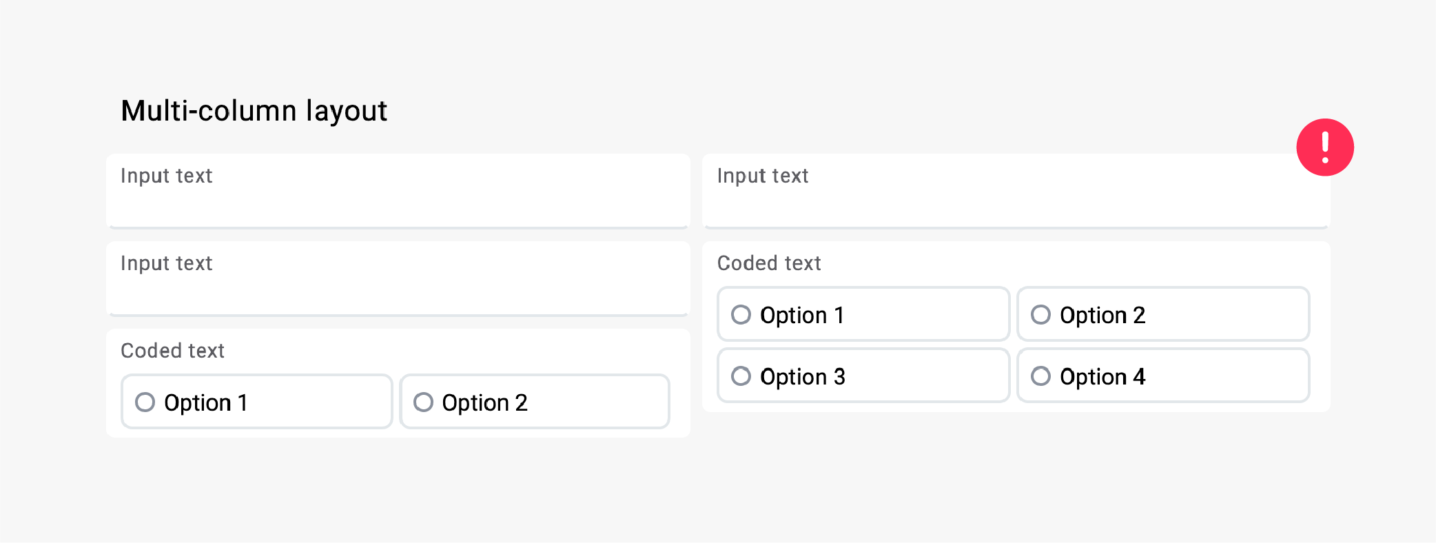
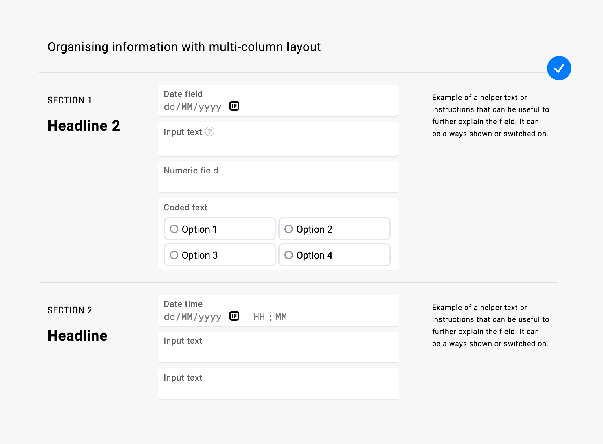
Multiple-Column Layouts
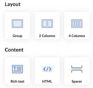
When working with multiple-column layouts, chose Group, 2 Columns and 4 Columns tools in the section called Layout and the Rich text, HTML and Spacer tools in the section called Content.
These generics are necessary to design a more complex multiple-column layout or to adjust the default design. When working layout groups note that they do not have a header so use Rich text for headings instead.
On big screens, the use of horizontal space can be helpful to keep the form compact.
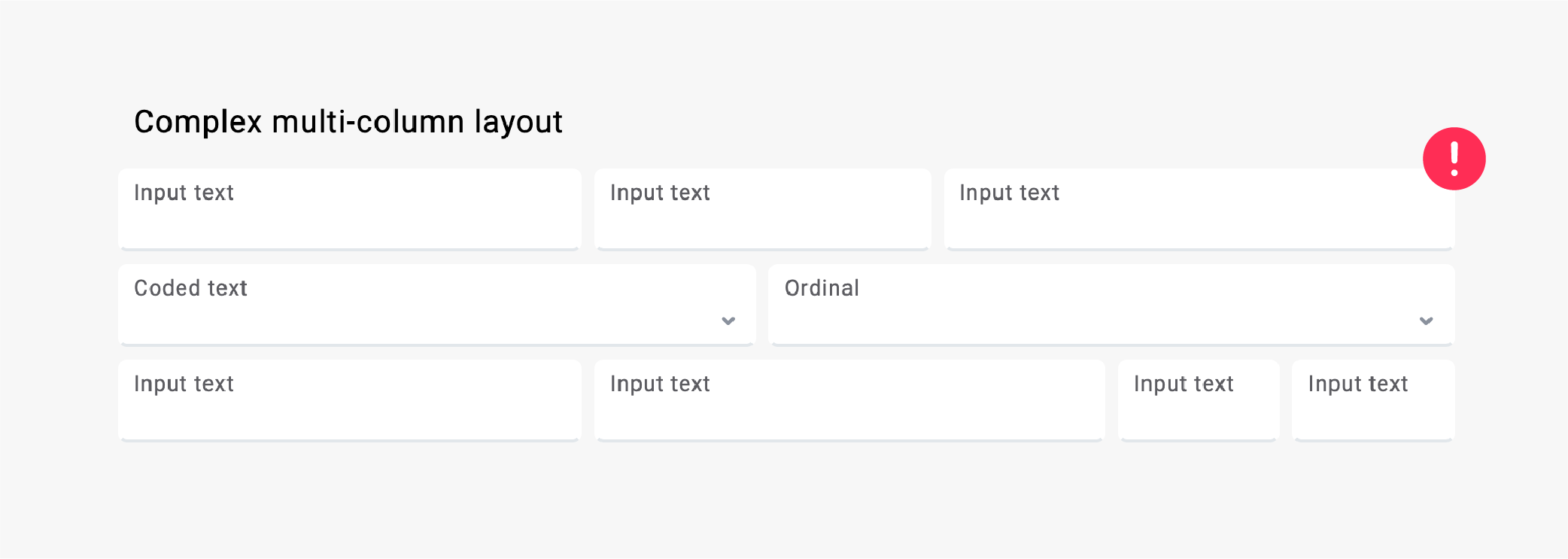
If you decide to use horizontal space, be careful of:
- users missing the questions on the right side. This can be even more crucial when working on a bigger screen.
- keeping the fields grouped by content that goes hand in hand (e.g., height and weight).
- how the form looks and behaves on all devices. Use preview to check.
- the sequence of the fields on mobile screens.
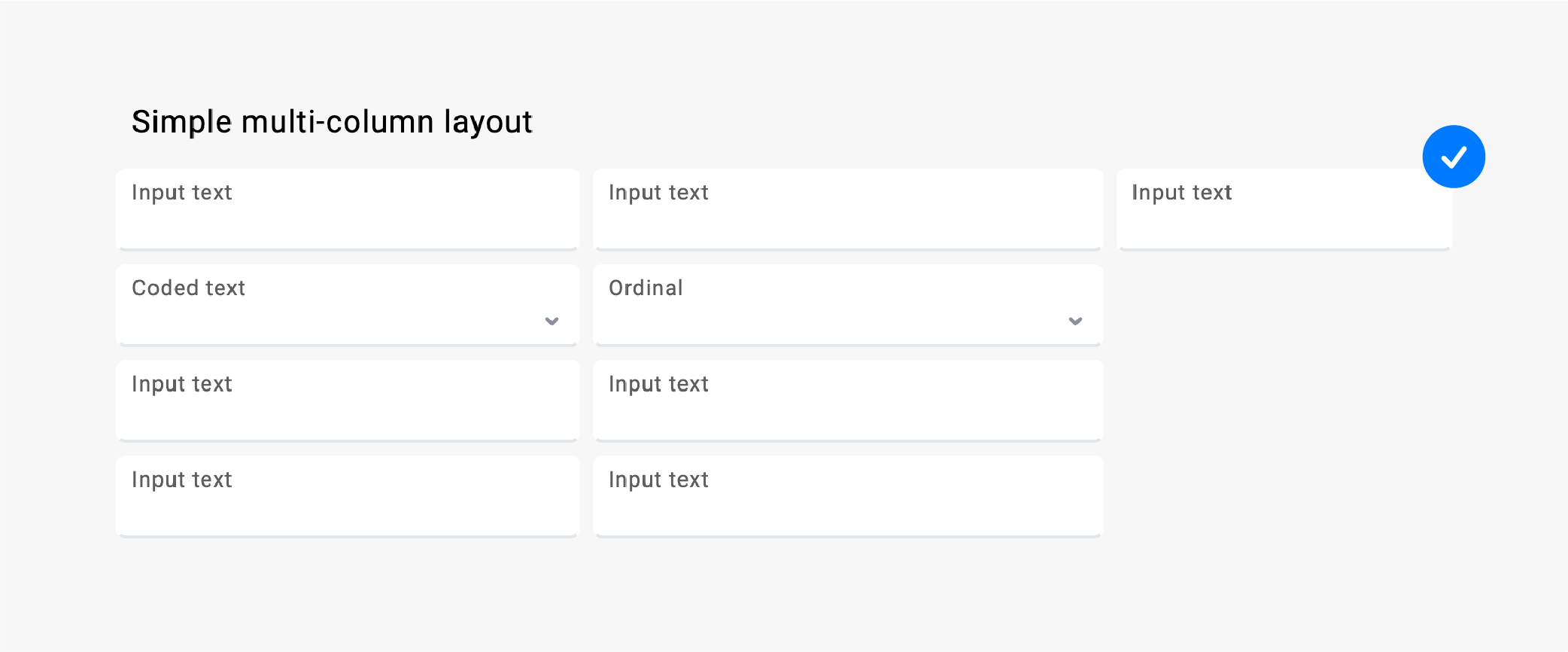
Example A: A multiple-column layout can be helpful for organising content and keeping the form compact.
Example B: Be careful to align all fields. While mixed sizes of fields can save some space, they can also be confusing and harder to scan through.
Example C: It is better to follow a predefined grid, even though some fields may seem too big.
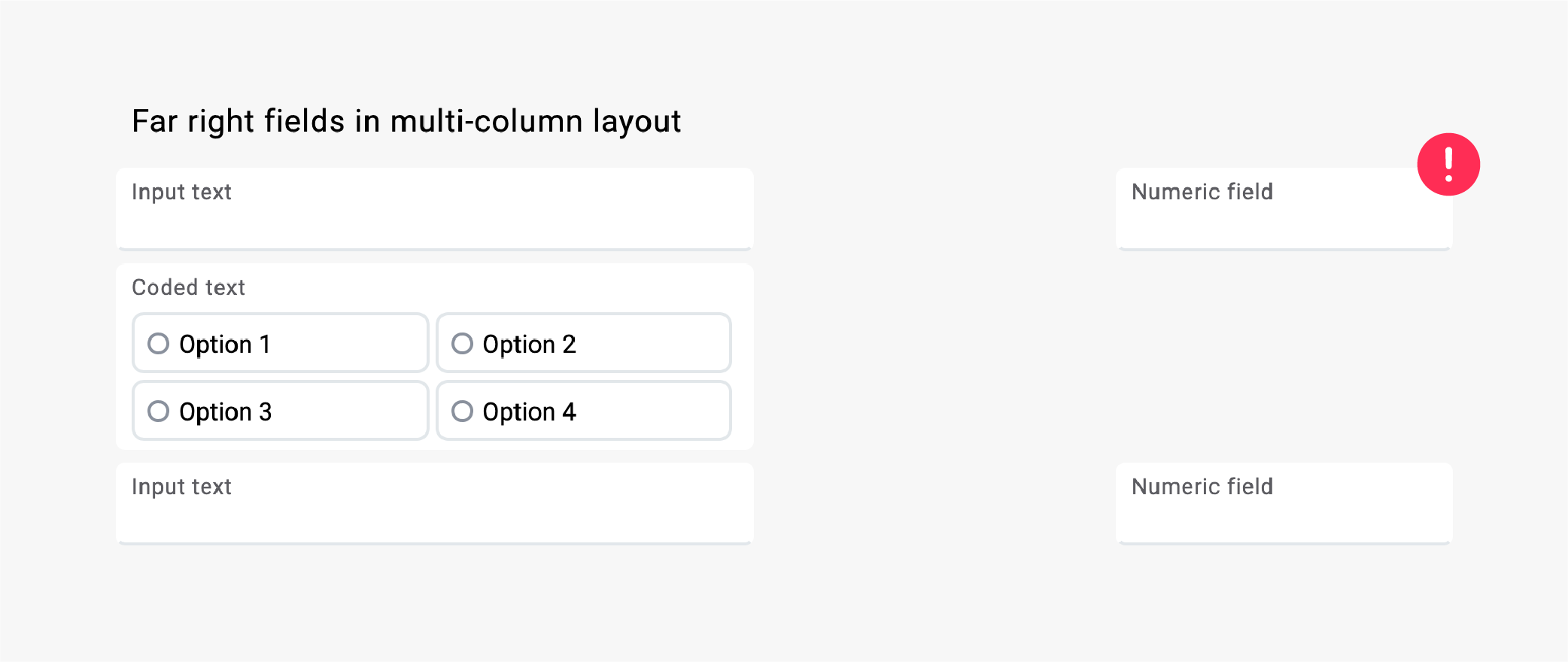
Example D: Be careful how close together the fields are. On bigger screens, the user can miss the right-aligned fields.
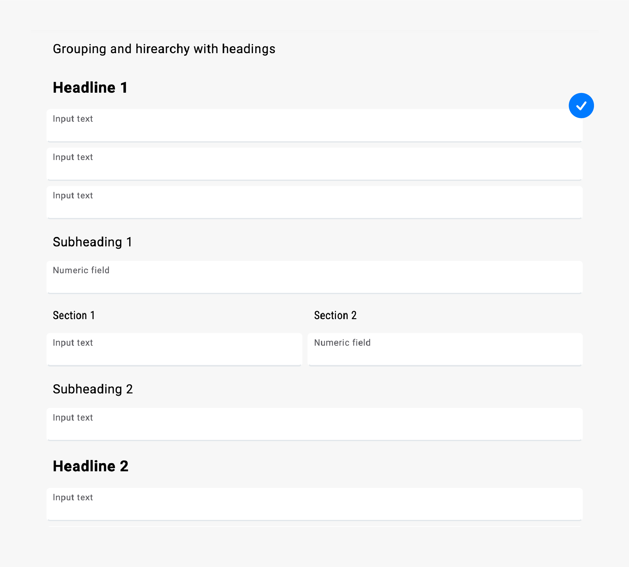
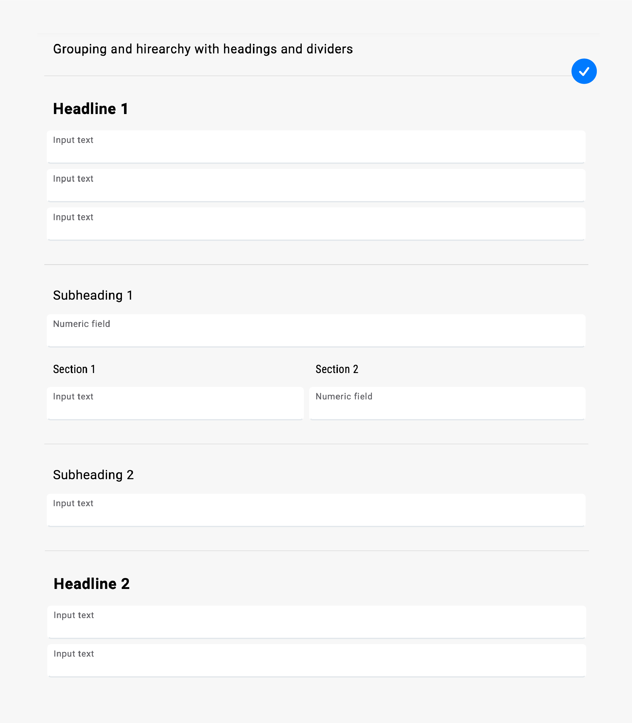
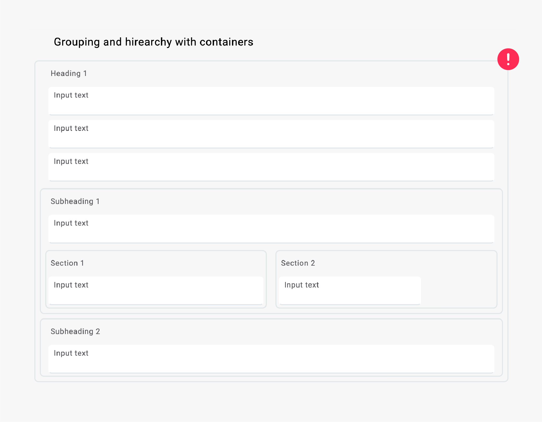
Grouping Sections
There are several ways to connect certain content in a group. Introduce hierarchy by using headlines, spacings, and dividers.
Example A: Headings help establish hierarchy and group content.
Example B: Using dividers is another good way to group content.
Example C: Don't use containers for grouping. It will only create more clutter.
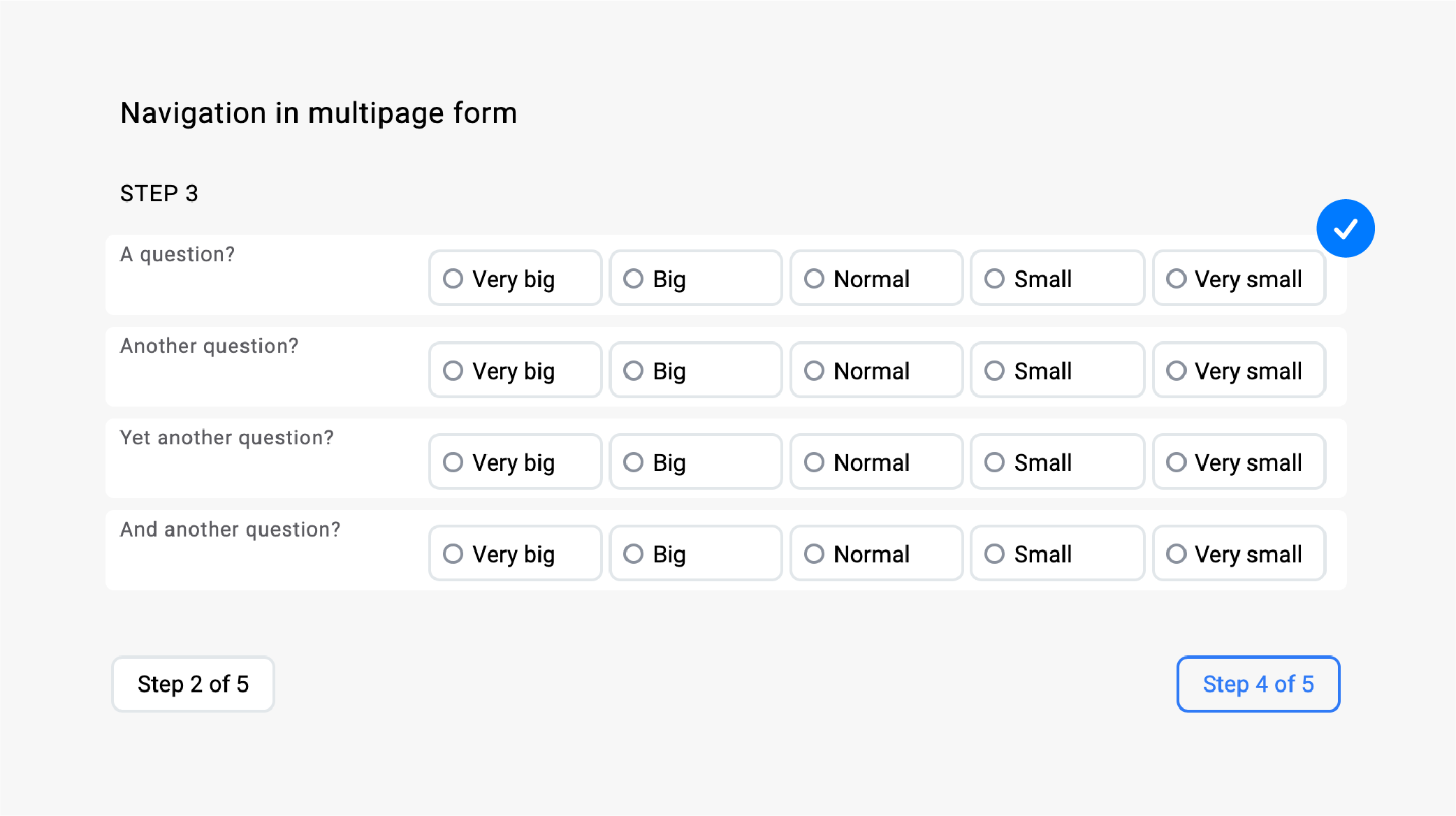
Paging
When splitting a form into multiple pages or screens, try to keep the number of pages below 10, as a higher number of pages can discourage the person filling in the form.
If the form will be used by different, unique people, consider designing a gateway screen before the form starts and adding a confirmation screen when the user finishes filling in the form.
Help users by clearly indicating the number of pages in advance:
- the number of already completed steps,
- the number of the current step, and
- the number of steps ahead.
For multi-page forms, it's considered good practice to have one question per page. This can be helpful for both, the people new to filling in forms, and the ones with low digital literacy. However, it can be frustrating for repeating users who know what to expect. One question per page can also be successfully used on smaller screens or mobile devices.
Example A: A simple step counter using the Button function:
Labels
The position of the labels can be set in the Layout section.

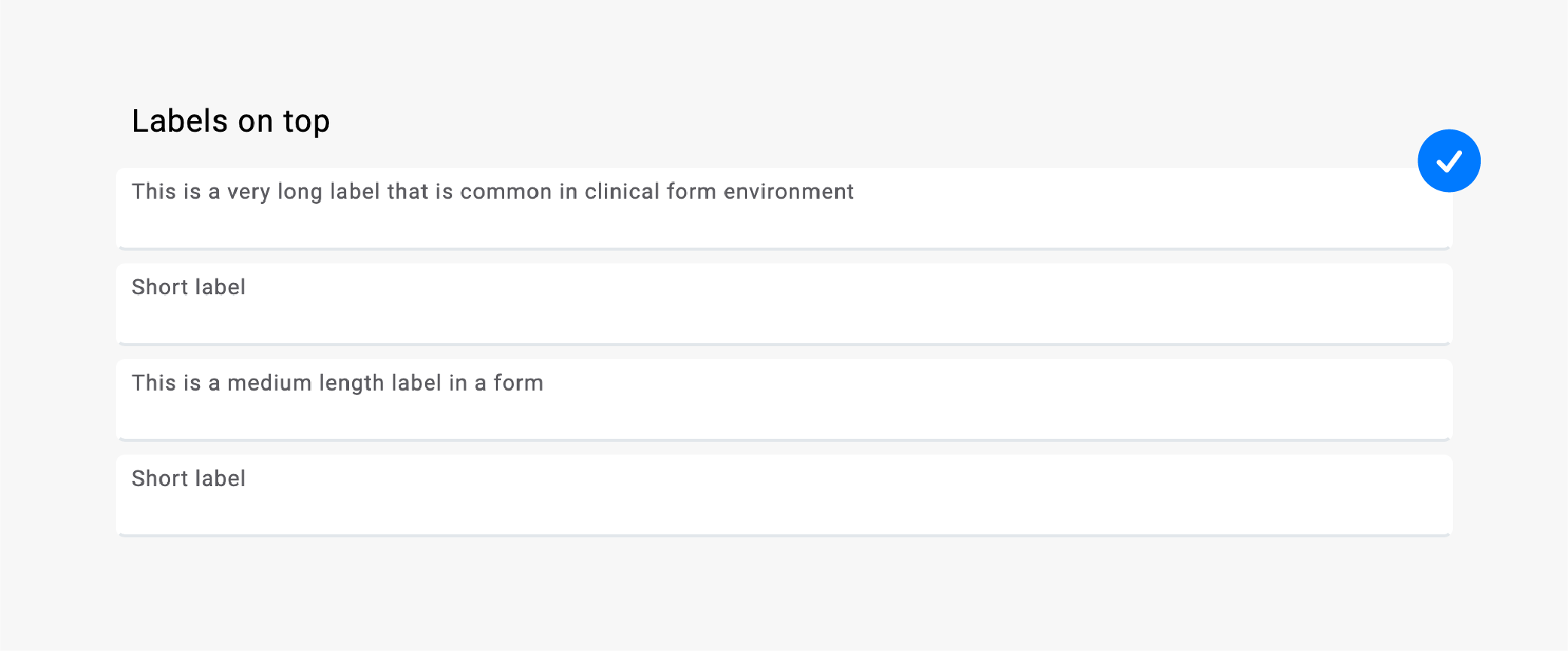
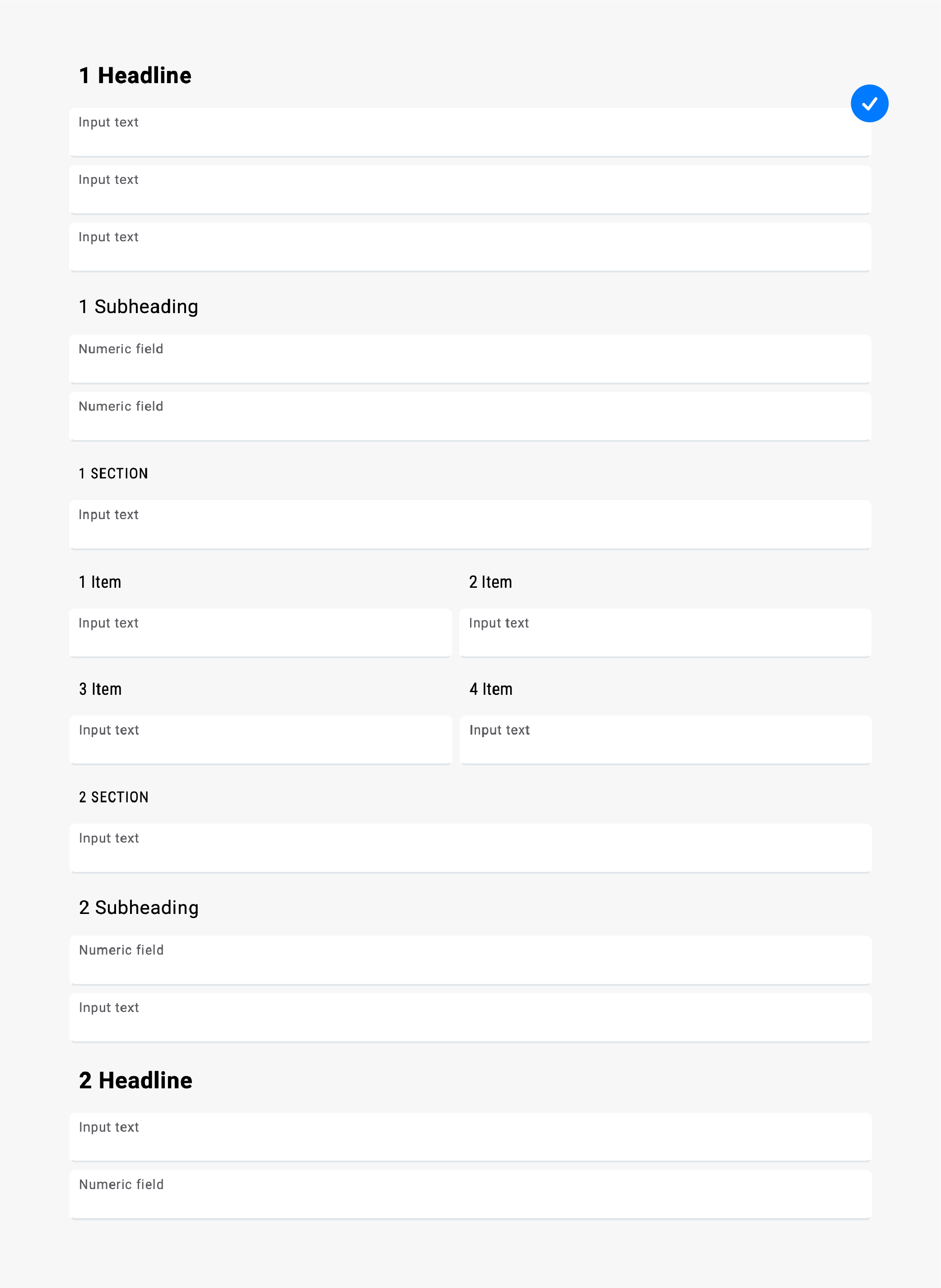
Top Labels
It's best to use the default, labels on top option. Top labels are the most robust of them all and provide an optimal experience on desktop and touch devices.
The reason behind is the better control of the layout when working with longer labels and minimal eye-tracking, as described in the layout section above.
Also, always use the top labels if your form is a combination of short and long labels instead of mixing other possible positions of a label.
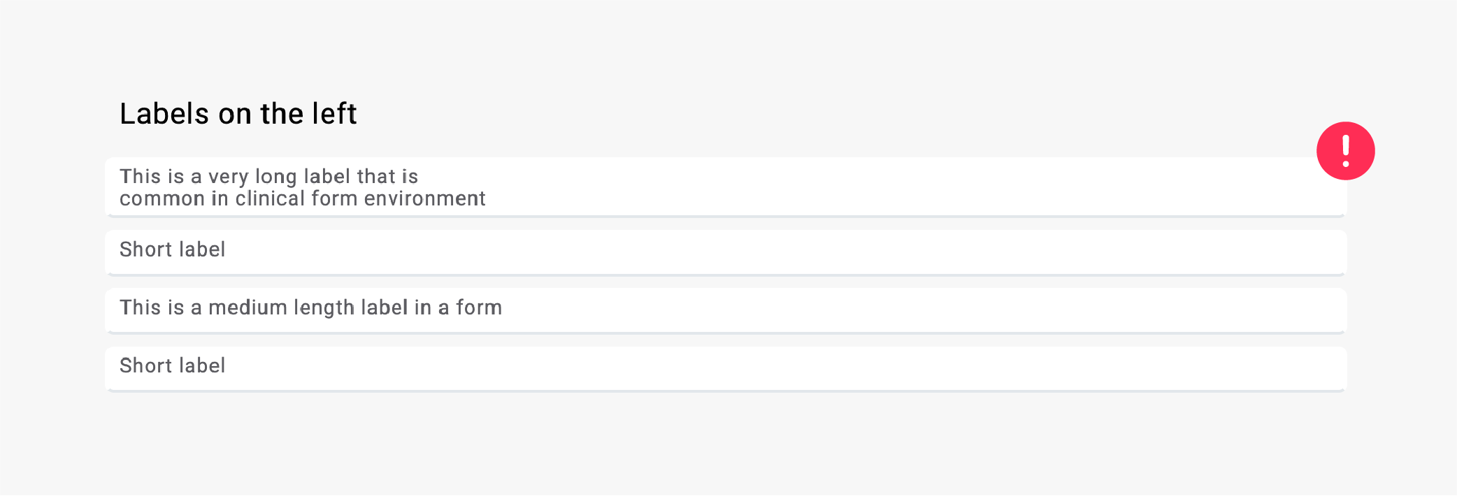
Left Labels
Labels on the left side are a popular choice as they provide a more compact layout and successfully separate the information that's on the labels from the input. However, this is true only when using shorter labels.
When working with long labels or combinations of short and long labels, left-sided label can cause a messy layout, which is actually harder to scan through.
One thing to keep in mind is the proportions of the label and that of the input space. If the labels often break into several lines, consider using labels on top instead.
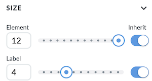
You can adjust the size and proportion of a label in Size menu
Example A: Top labels might increase the length of the form, however, the order and rhythm they bring make the form easier to scan through.
Example B: Left labels provide a more compact solution, but when used with longer labels they also make the form harder to scan through and increase cognitive load for the user.
Example C: Label on the left is more suitable for when the focus should be on the label, like in questionnaires that have the same answers.
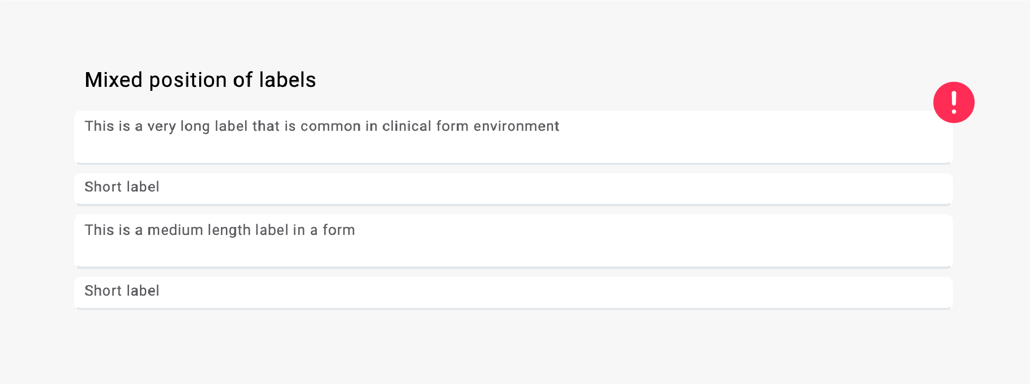
Mixed Labels
Example A: Don't use mixed labels. They create a difference in height of the fields, which can be confusing for the user.
Additional Information
Many forms require additional texts to help the user understand the content of the form.
There are several preset styles in Rich text editor, which is the main tool for adding additional information to form fields.

Headings
Headings should convey their position in the hierarchy.
Although you can choose from five preset styles of headings, it is advisable to establish no more than three levels of hierarchy.
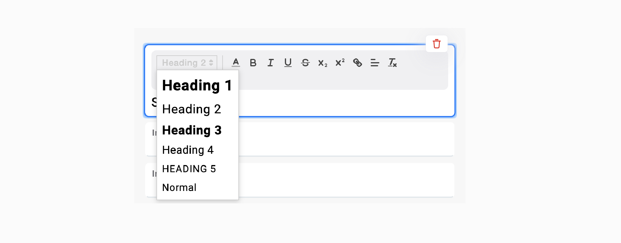
Example A: Four levels of hierarchy, expressed with a gradation of headings.
Helper Texts
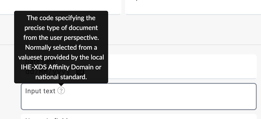
Helper texts give additional information that cannot be expressed with headings, labels, or tooltips and is important while filling in a form.
Always show the question-level help next to the field it refers to. If it is particularly long, convey the main points and link to more details. You can also hide more details under a Show more toggle switch.
Remember, if an information is crucial for correctly filling in data, don't hide it in a tooltip, because:
- the person filling in a form has to make an extra effort to see it.
- users have learned that the help icon isn't particularly helpful, so they won't click on it.
- hidden help may not work on mobile.
- it may be already too late for the user to go search for help.
Tooltips
Tooltips provide very brief additional, contextual information for a label.
Think of them as a tinny helper text that increases end user's confidence and certainty about an interaction.
Tooltips should be used for:
- helpful, non-critical information,
- brief descriptions of a label, and
- showing the full version of a truncated text (a text that has been shortened with three periods).
Tooltips shouldn't be used:
- for communicating critical information,
- when you need to include links or actions, or
- when you want to include a long explanation. Instead, use a logically placed helper text, which you can switch on and off via a toggle.
Some General Tips Regarding Text Styles
- Avoid using italics for full paragraphs as they are much harder to read on screens.
- Avoid UPPERCASE for emphasising words. Use bold and italic styles instead.
- If the person filling in a form is a patient, consider using larger fonts and customizing your labels.
- Sentence case (capitalizing the first word only) is most suitable for forms.
Which Type of Fields to Use
Most questions can use one of the three main types of an answer field:
- checkboxes,
- radio buttons, or
- text boxes.
These main types work because:
- the users are familiar with them (e.g., from paper forms),
- they work on all screen sizes and devices,
- they are simple to use, and
- all other fields are just enhancements of them.
Checkboxes and Radio Buttons
There are several options for the layout of radio buttons and checkboxes. This depends on the number and length of the option text you are working with.
Avoid using single checkboxes as they require some mental calculations to link the checked/unchecked state to the wording of the question. Things get even more complicated if the question is stated in the negative.
All single checkboxes should therefore be replaced with radio buttons that have a 'yes' and 'no' option.
Dropdowns
Selection menus are popular to use because they are compact and capable of holding a lot of information. However, there are some issues to consider:
- Some end users might have difficulties using them as they might not have experience using a drop-down menu from the paper forms they are used to.
- Many users don't know how to navigate them with just a keyboard, so they switch between keyboard and mouse.
- The options are hidden or cannot be seen at one time.
- Compared to checkboxes and radio buttons, selection menus require at least twice as much interaction.
- Selection menus are not easy to use on touch devices.
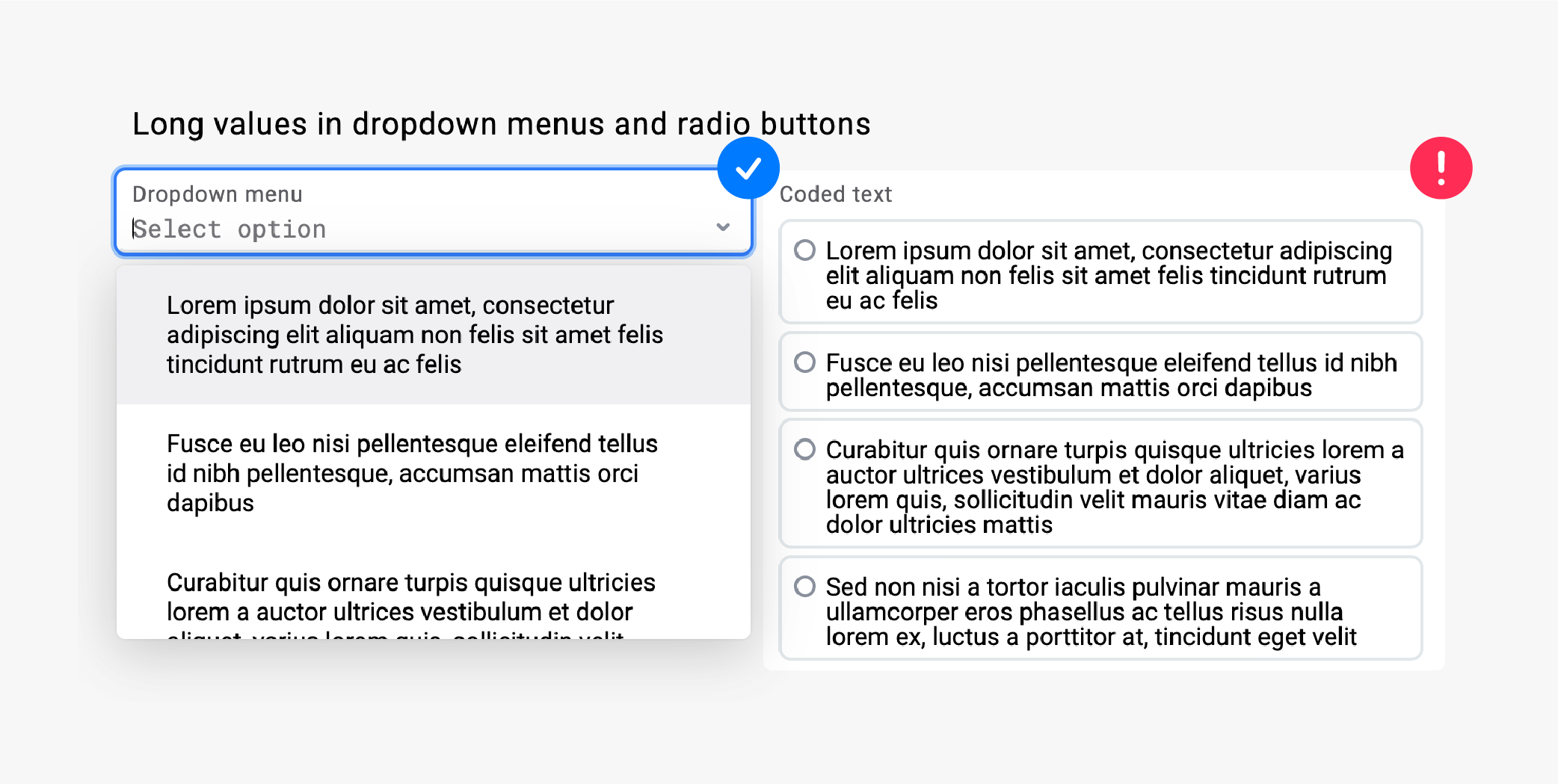
Follow this simple rule: when a list of options is manageable, always use radio buttons or check buttons. When you operate with a longer list of options (for example a list of countries), use a dropdown menu.
Example A: While a dropdown menu is more compact, it requires at least twice as much interaction compared to checkboxes and radio buttons.
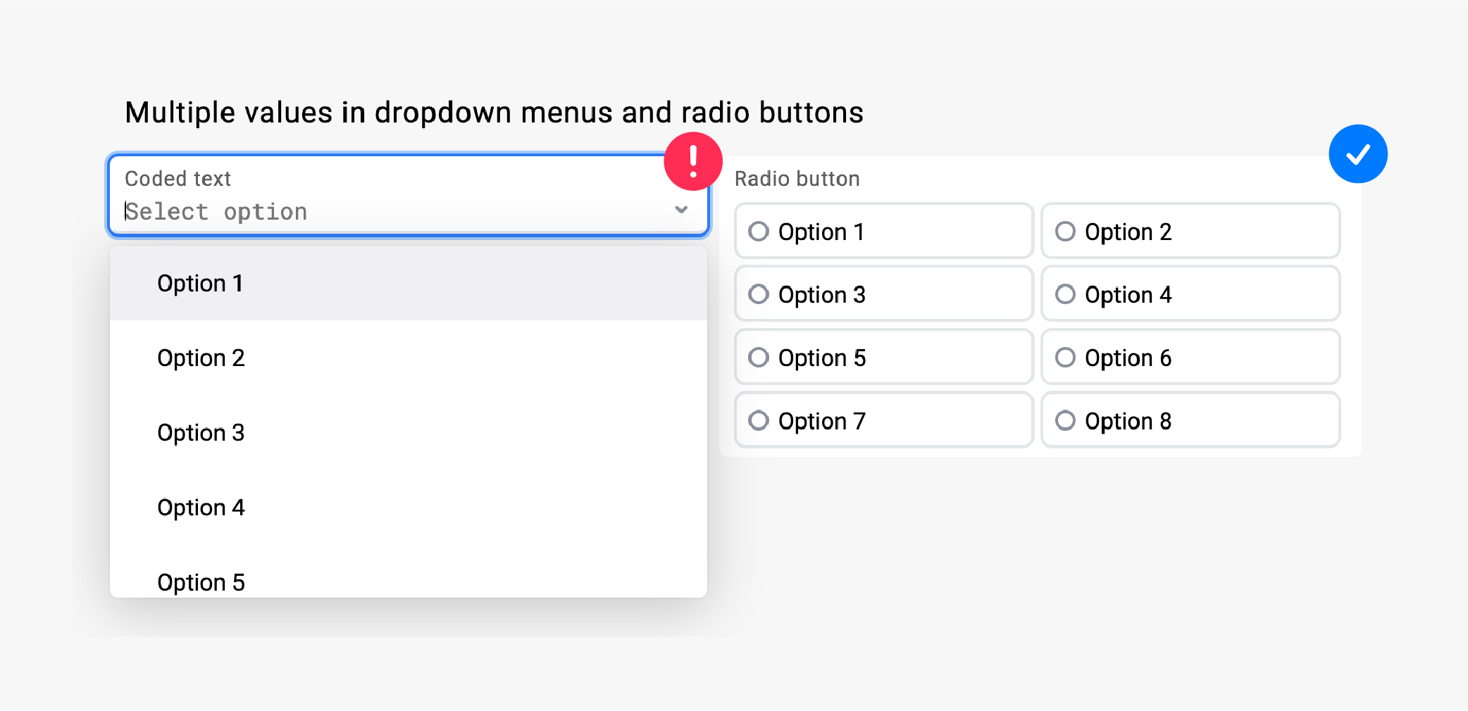
Example B: When working with longer values, a dropdown menu can help with keeping the form compact.