Field Settings
Field settings allow you to customize fields behaviour. To access these settings, simply click on the field you want to modify and select the Design view. Design view tab is explained in previous section, and you can access it here. The settings are present in the Field section of the property panel.
Field Attributes
Field attributes define the behavior and appearance of a field or element when the form is rendered. Different fields or elements may have different attributes available, but below is a list of most common attributes and their functions:
- Readonly – Field appears as read-only and is not editable.
- Initial Focus – Automatically places the cursor in this field when the form loads. (specific to input fields and button)
- Hidden – Hides the field from the form while keeping it in layout.
- Show in Columns – Organizes the field’s content into a column-based layout for improved readability.
- Display In – Specifies how many lines the field should be displayed in.
- Presentation – Changes the visual presentation of a field.
For more details about field-specific attributes and other attributes not mentioned here, explore the Form Components section.
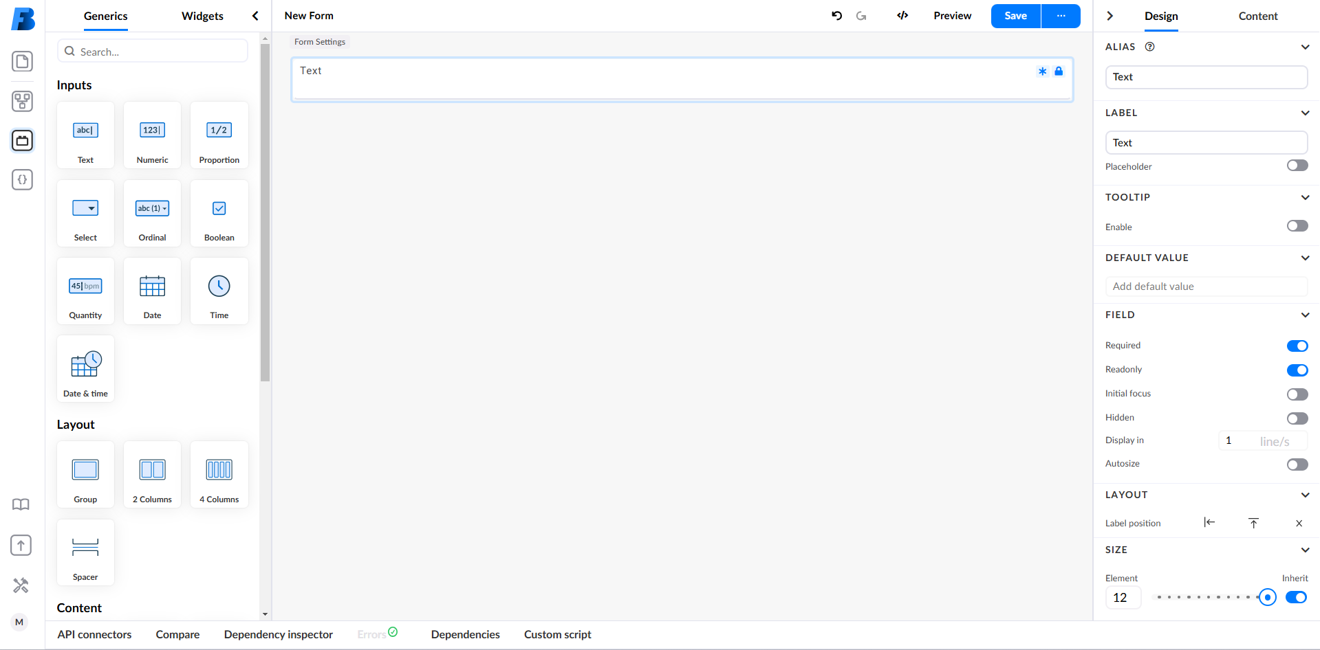
Field Indicators
When certain field properties are enabled, visual indicators appear on the field to provide additional context. These indicators help users identify key field attributes at a glance. For example a lock icon may appear if the field is set to Readonly or a hidden field marker may indicate that a field is set to Hidden but is still part of the form structure.
Example
Here’s a simple example. You can see that the field has both the Required (indicated by the asterisk) and Readonly (lock icon) properties enabled, which are also reflected visually on the field itself.