Right Panel
The right panel of the Editor screen lets you change a form's design and add data sources and interactions to a component or a form.
The right panel has two main views:
- Design view lets you design each component of the form or add a global form setting like label position or elements size.
- Content view lets you populate components with data.
TIP: Since different components have different properties and capabilities, the content of the right panel changes depending on which component you have selected on the canvas.
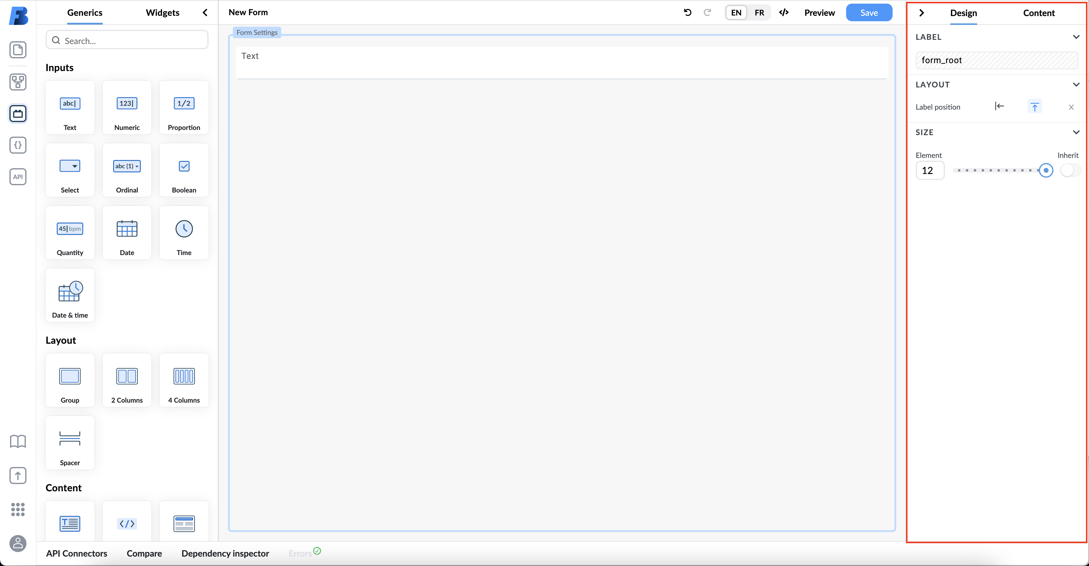
Design View
In Design view, you can set or change the component properties. For example, you are be able to:
- set an alias,
- set a label,
- set a tooltip,
- set the default value,
- change the visibility,
- presentation,
- read-only property,
- position, and
- size.
To change the design properties of a specific component, simply click on it and change its properties in the right panel.
NOTE Since different components have different properties and capabilities, the content of the right panel changes depending on which component you have selected.
Each component has different settings bound to it. These settings are described in the Form Components section.
Tooltip
A plain text tooltip can be set for all input fields except for the canvas field. The tooltip will be displayed if the user hovers over the label of the field. If the user enables the Show icon field, an icon will be displayed next to the label and the tooltip will be displayed when the hovers over the icon.
When using the tooltip function in combination with the field description (can be found under the content view) the following rules apply:
- if only the description is set it should be shown
- if only the tooltip is enabled it should show tooltip
- if both are enabled only the tooltip is shown
Default Value
The default value of fields can be set in the design view. If you wish you can use plain simple values, or you can use expressions and make use of our expression assistant to help you with even more complex functions and calculations.
Content View
Content view enables you to populate components with data. In this view, you can:
- see component details,
- add selection values,
- bind data source from an external API or AQL variable,
- add additional properties,
- add field validation,
- edit widget configuration and add data to widgets,
- components, and
- replace a field.
NOTE The content of the Content view changes depending on the type of component you select on the Form Builder canvas.
Each component has different settings bound to it. These settings are described in the Form Components section.
Details
The Details section in right's panel Content view allows you to see a template's path and, if applicable, field type. Here, you can also add a field description to a component and have it displayed as a tooltip. If you have a tooltip set up for this component the description will be overridden by the tooltip.
Selection Values
The Selection Values section enables you to add predefined options, values to chose from when the form is being filled in.
Each predefined option has value and view properties.

View property is marked with the eye icon and lets you show or hide a specific predefined value from a form's interface. Value property is the data that you will save in a form composition.
You can add new selection values by filling in the Add new option field and clicking the + icon. You can change the option's value next.