Specific form component types
This content is intended for all Studio users.
Here are some additional information for the most frequently used form components.
Input fields
Input fields are components intended for entering or selecting values. All template leaf nodes (fields that can't have any children) are input fields. Besides templates, you can also pick generic input fields from Generics component panel and add them to a form.
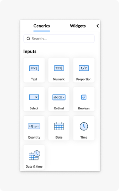
Some configurations are common to all fields, while some are specific to the type of input field you are working with.
The configuration options that are common for all input fields are:
- The alias of an input field allows it to be referenced by a custom name.
- The label, which allows you change the name of a field shown to you while using the form.
- The default value, which allows you to define the default value of an input field.
- You can set the input fields status to required, hidden, or readonly.
- You can change how a field behaves in the presentation mode.
- The settings the layout of a field (where the label resides).
- Size changes of an entire input field.
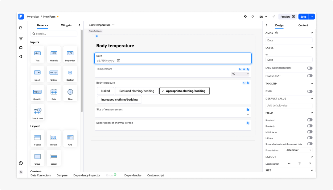
Field layout and size
In the Layout section of the Design panel, you can change the label position of a field. A field can have a label on top, on the left side, or hidden.
If none of these options is selected, the label layout is inherited from its parent container, with global settings being the top-most ancestor.
To revert the layout options to its default state inherited from its parent:
- Click on a input field component on the canvas.
- Deselect the currently active layout option in the Layout section of the Design panel.
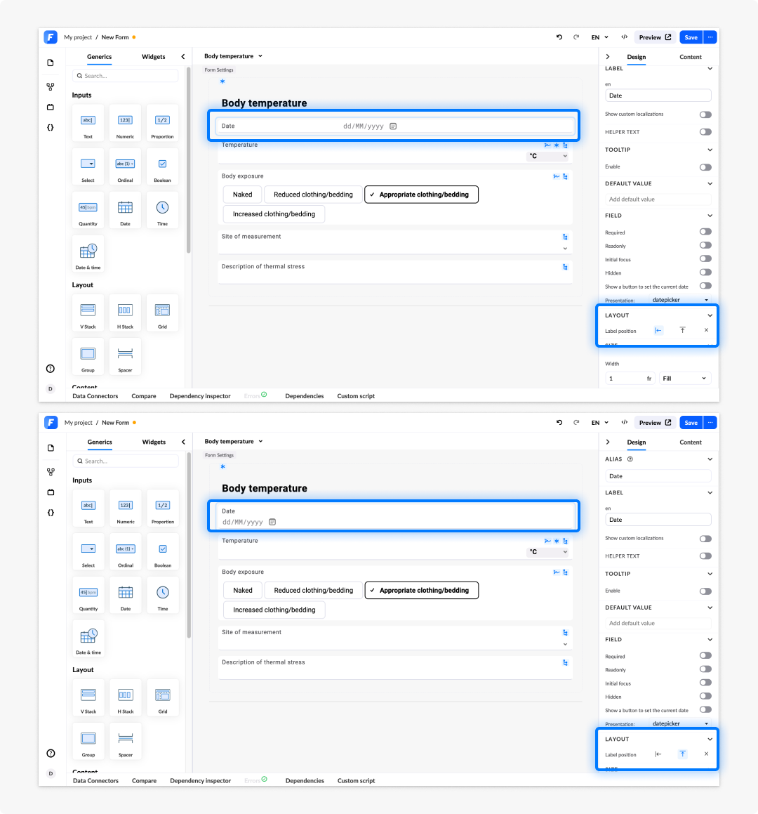
The layout you specify for your input field components will be reflected in their presentation on the canvas.
You can change the size of a field by moving the slider in the size configuration option. Fields with labels on the left size have one additional configuration that allows you to change the amount of blank space a label needs relative to the input space.
Persistent property
Input field components can be marked as persistent.
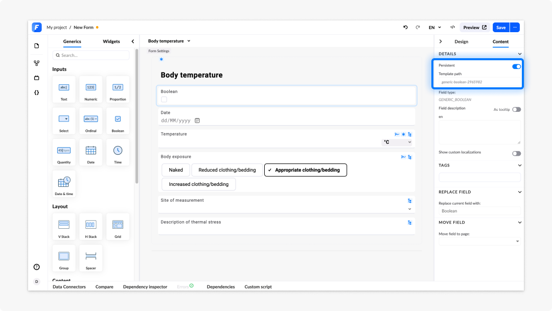
Although this is not a template field, when a generic component is marked as persistent, its value will be stored within the composition. This allows it to be reloaded into the form whenever the composition is applied. This way, you can manage additional values that are needed on the form, even if they are not part of the template model.
Specific input field configurations
Some input field components can be configured in ways specific to a certain type or types of fields.
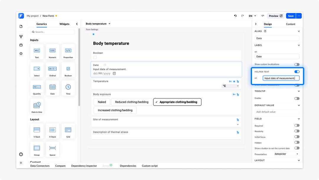
Almost all fields have a placeholder option that lets you define a placeholder value that is displayed before data is inputted.
Input text
This is the most basic input type and as the name denotes, it serves as an input to which users can write text.
On the text field you can set additional validation in the form of a RegEx. There are four predefined ones you can choose from:
- only letters
- only numbers
- URL
If none of predefined ones suits you, you have the option to write your custom one and create an error message to display if the text does not meet criteria.
You can increase these input fields' height by changing the display in 1 line/s configuration. Additionally, you can configure text fields to automatically resize depending on the text's length.
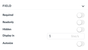
Most common input text field types are DV_TEXT and GENERIC_INPUT_TEXT, but many other openEHR-related text inputs are available.
Numeric, count, and proportion fields
Numeric, count, and proportion fields only accept numerical input. Count only allows whole numbers, while numeric and proportion allow numbers with as many decimal places as configured.
The only specific configuration for these fields is the field validation located in the Content tab of the Property panel.
Field validation allows you to validate inputs based on:
- How many decimal places are allowed.
- A boundary value, which the input values either mustn't surpass or be lower than.
Here is an example of a validation for generic numeric:

DV_COUNT and DV_PROPORTION are openEHR fields frequently named as Count and Proportion. GENERIC_NUMERIC_FIELD and GENERIC_PROPORTION_FIELD are generic components that reside in the Generics panel. In the Generics panel they are named Numeric and Proportion.
Dropdown, radio button, and button group field components
The configuration of dropdown fields is the most complex of all field categories. They can be set to any of the four available presentation options, they have three different ways of defining their selection values, and a specific number of allowed values settings.
There are five different input field components in this category:
| Field component type | Field component name | Generic field | Description |
|---|---|---|---|
| DV_TEXT | Input text | No | Texts can have selections values defined. These values can just be suggestions, and the end user can input something else. |
| DV_CODED_text | Coded text | No | Selections are stored in EHR Server as code (abstract code of the selection) and label (user-facing label of the value). ️ |
| DV_ORDINAL | Ordinal | No | DV_ORDINAL is equal to DV_CODED_TEXT, except that it also holds ordinal number which is an integer. |
| DV_SCALE | Scale | No | DV_SCALE is equal to DV_ORDINAL, except that instead of the ordinal number value, it holds scale number value which is a real number. |
| GENERIC_CODED_TEXT | Generic coded text | Yes | Acts as coded text, except that it is generic. |
| GENERIC_ORDINAL | Generic ordinal | Yes | Acts as ordinal, except that it is generic. |
In the Design tab of the Property panel, under the Field section, you can choose among four different Presentation options of these fields:
- combobox
- checkbox
- button group
- interactive image
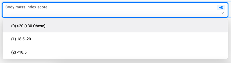
The combobox presentation option allows picking values from a dropdown menu when filling in forms. This is the best presentation option for fields that have lots of possible values.
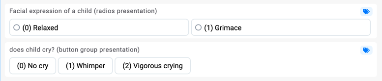
The logic behind checkbox and button groups presentation options is very similar. The main difference is that button groups do not have to necessarily be distributed among columns. They can also be distributed depending on the field configuration. If we allow more than one selection value, radios simply become checkboxes.
The last presentation option on the list is interactive image. This option is used for fields residing within an image map. Image maps allow you to create clickable pressure points on an image. See below under Image map for more
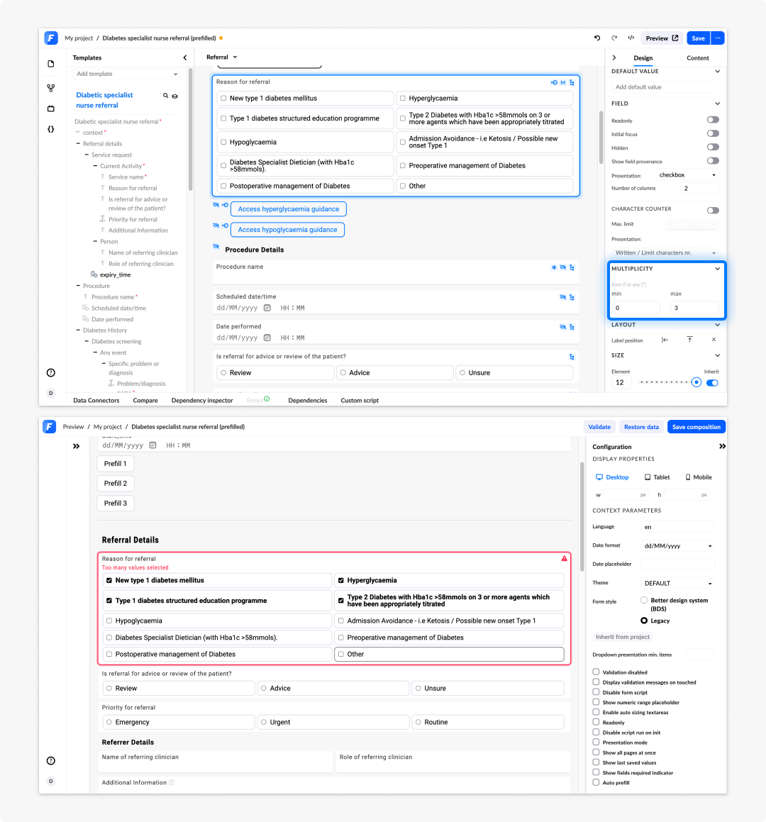
Multiplicity of a dropdown field
By setting the minimum multiplicity of a field, you are setting how many selection values are mandatory. By setting the maximum multiplicity of a field, you are setting how many values can be selected.
The two most common examples are:
- min multiplicity = 0, max multiplicity = 1. This means that the user can select one value from a list, but it is not required
- min multiplicity = 1, max multiplicity = 1. User must select one value from a list of values.
If the min multiplicity = 4 and max multiplicity = 6, then the user must select at least four values, but not more than 6. More concretely, user must select between 4 - 6 options.
Selection values of a dropdown elements
Selection values are all the possible values for the user to choose from. If these selection values are already defined on the openEHR template, then the user can only hide them by clicking the eye icon on the left or change the label of them.
If the selection values are not defined, either because a field is generic or because template does not have them defined, then you can add selection values in one of the following ways:
- by adding internally defined selection values manually
- by getting them from external API through datasource
- by getting them from AQL variable
Boolean
Although it is a very simple field component with only three possible values (null, true, false), it still offers rich configuration options.
You can present a boolean field component in four different ways:
- checkbox
- three-state
- toggle switch
- yes/no question
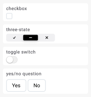
Three state boolean and yes/no question are the only presentation where user has total control regarding the null value of the field. For other presentations the second "switch" or "check" simply changes the value to false instead of null. If the configuration of boolean field in archetype designer does not allow false values then the second switch switches to null instead of false.

Quantity
Quantity is a composite field that has two input values:
- magnitude part where you write the number
- unit part where you select the unit
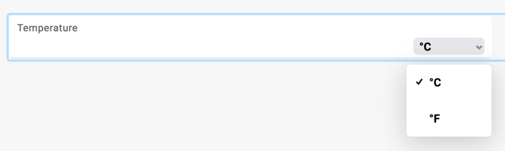
Units will be presented in dropdown if more than one value is available otherwise it will be shown as a simple readonly label. You can make unit read only (where units can only change through dependencies), or you can also hide units on the Content tab, so they aren't presented to the end user.
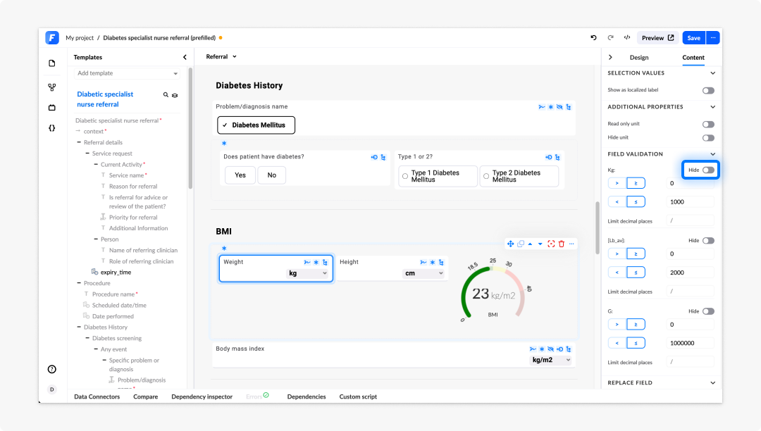
When quantity value is empty, unit will be shown at the end of the field since it is not yet associated to a value. Once value is entered a unit will stick to the value for easier reading. The magnitude part allows you to add validation as on numeric fields.
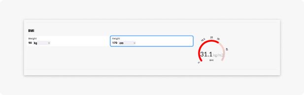
Layout group fields and containers
Layout group fields are used for two purposes:
- To change the layout of the fields by adding rows and columns.
- To group fields together.
For your convenience, layout groups are provided in a single-column layout by default, with the option to add or remove columns and rows.
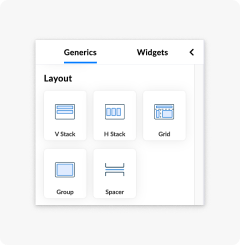
Layout options
We differentiate between the following layout options:
- V Stack: Arranges its child fields in a single column, one below the other.
- H Stack: Arranges its child fields side by side in a single row.
- Grid: Lays out child fields in a defined number of rows and columns, giving you precise control over the placement of each field.
- Group: A named container that visually and semantically ties a set of fields together without changing their individual layout.
- Spacer: Inserts a fixed or flexible gap between fields, letting you control whitespace without adding a visible element.
V Stack
Use V Stack when you want fields to flow downward. This is the most common default arrangement for a form section. Children are stacked top to bottom, with consistent gaps between them. You can control whether child fields distribute from top to bottom or spread out to fill the available vertical space. If V Stack is placed inside another layout component, you can set its width to Fixed (a specific pixel value) or Fill (takes up a proportional share of the remaining space). Enable Wrap to allow children to continue into a new column when they exceed the available height.
H Stack
Use H Stack to arrange fields in a row. An example would be to have a first-name and last-name field sitting next to each other. Children are distributed left to right by default, or you can change this setting to spread them evenly across the full width of the row. Each child field can be set to Fixed or Fill width, which controls how much horizontal space it claims relative to its siblings. Enable Wrap to let children overflow onto a new row when the total width of children exceeds the container width.
Grid
Use Grid when you need a structured, table-like arrangement that cannot be achieved by nesting stacks alone. An example would be a form section with three columns of varying widths. Each column can be set to a Fixed pixel width or a Fill fraction (fr), which distributes remaining space proportionally, following the same behaviour as column widths in a column list. Grid is not responsive by default; On narrow screens you should test how the layout behaves with your chosen column widths.
Group
Use Group when you want to label or visually enclose a set of related fields, without restructuring how the fields themselves are arranged. An example would be a "Contact details" section. A group adds a visible header (the group label) above its children. You can show or hide a border around the group. Unlike other layout options, a group does not control the flow direction or sizing of its children. Those properties are determined by the stacks or grid components placed inside it. You can add a dependency to the whole group to show, hide, or disable all its contents at once.
Spacer
Use Spacer to push fields apart or to create breathing room between sections of a form. When placed inside an H Stack, a spacer with Fill width pushes subsequent fields to the right edge of the row. When placed inside a V Stack, it adds vertical space between fields. A spacer has no visible output in the rendered form, it is a layout-only element.
Adding Rows and Columns
If you want to have fields distributed among rows and columns, you must have a layout group on the canvas and click on the cogwheel on the right side of the cell and then add rows or columns.
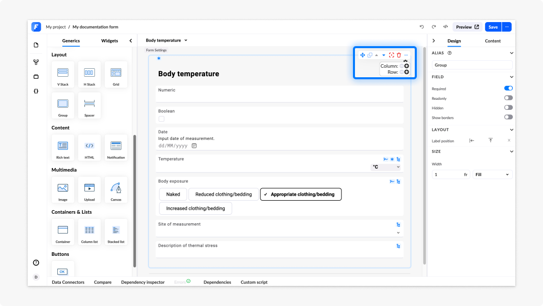
These columns are responsive to the environment they are in, and they stack on mobile device.
If Show borders is deselected, the end users won't see that this is a layout group. They will only see fields distributed among columns and rows.
Before layout group fields were introduced containers were used to create a layout for the form. Since version 3.2.0 all previous containers, that had their header hidden, were automatically converted into layout groups. Containers have no longer the ability to add rows and columns, they are used only for grouping fields together.
Grouping fields together
By adding fields in one layout group or container you are able to visualize them as one group of items.
You can achieve this by adding fields to a layout group:
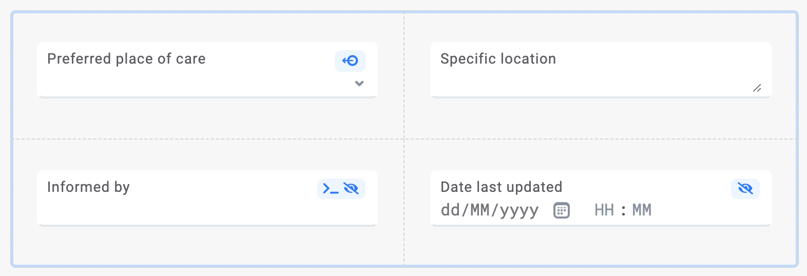
You can add fields into a container (but note that here you can no longer add rows or columns):
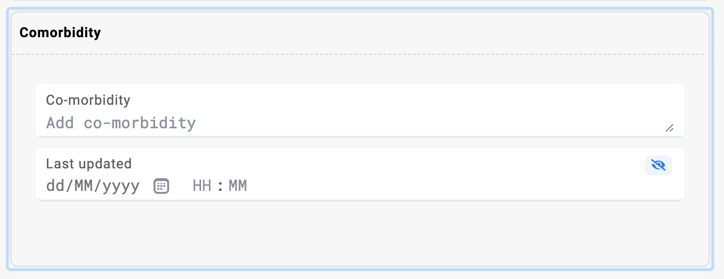
You may also insert a layout group with rows and columns inside a container:
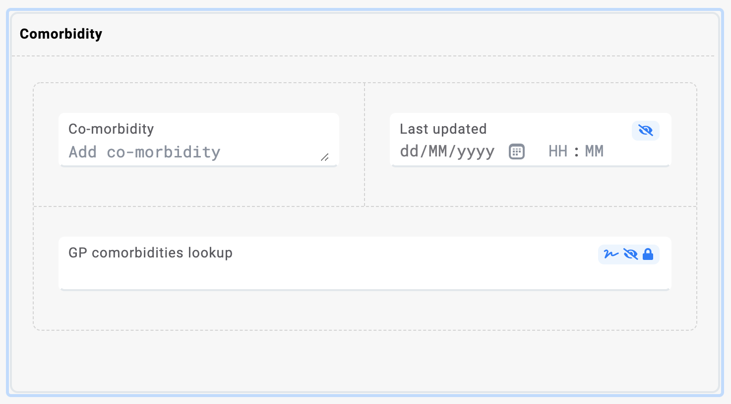
Consequentially, you can add a simple dependency on the whole container or layout group instead of adding it to individual fields separately:
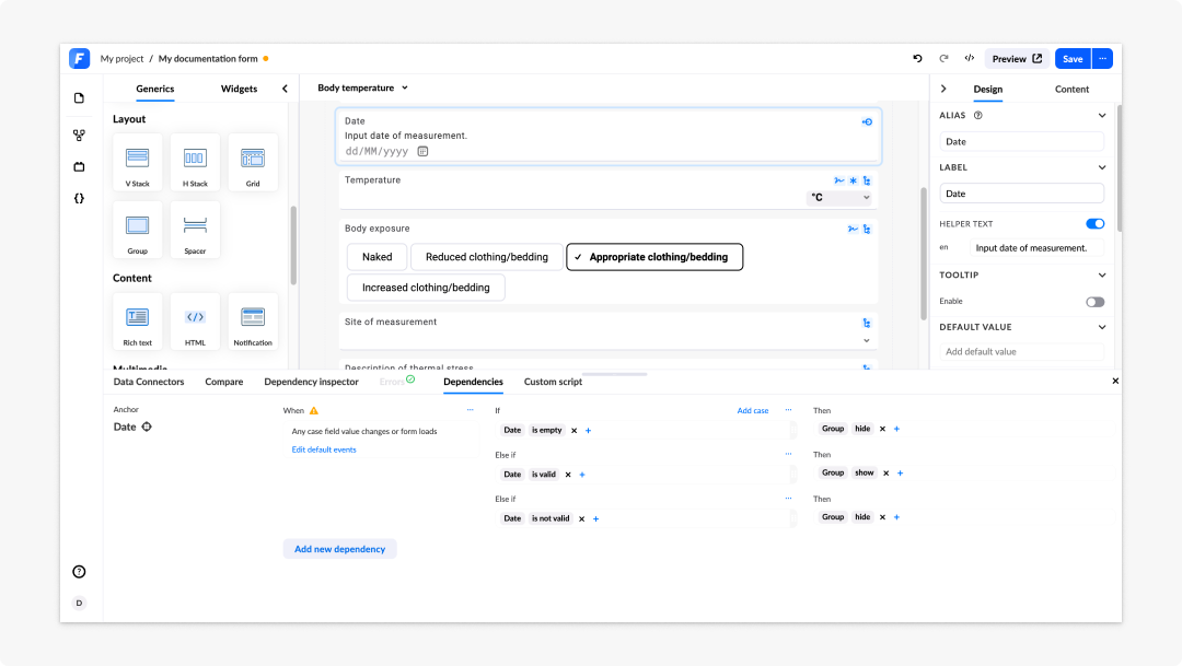
Using containers on the canvas reduces the speed of your application, as rendering them is a performance-intensive operation. The alternative is to use tags to group elements together.
Multiplication of data
This is only possible with non-generic containers that have max multiplicity > 1. The minimum setting will set the required data.
An example would be setting the minimum to 1. The end user will need to fill at least one set of the container components.
The maximum setting will set the number of available duplicates of components within a container.
When setting design rules to your container field or component, click the ellipsis (...) to duplicate or copy the field or component:
By setting the Height measurement event to min one and max two, the height measurement is required (at least one measurement), and it is limited to two measurement events.
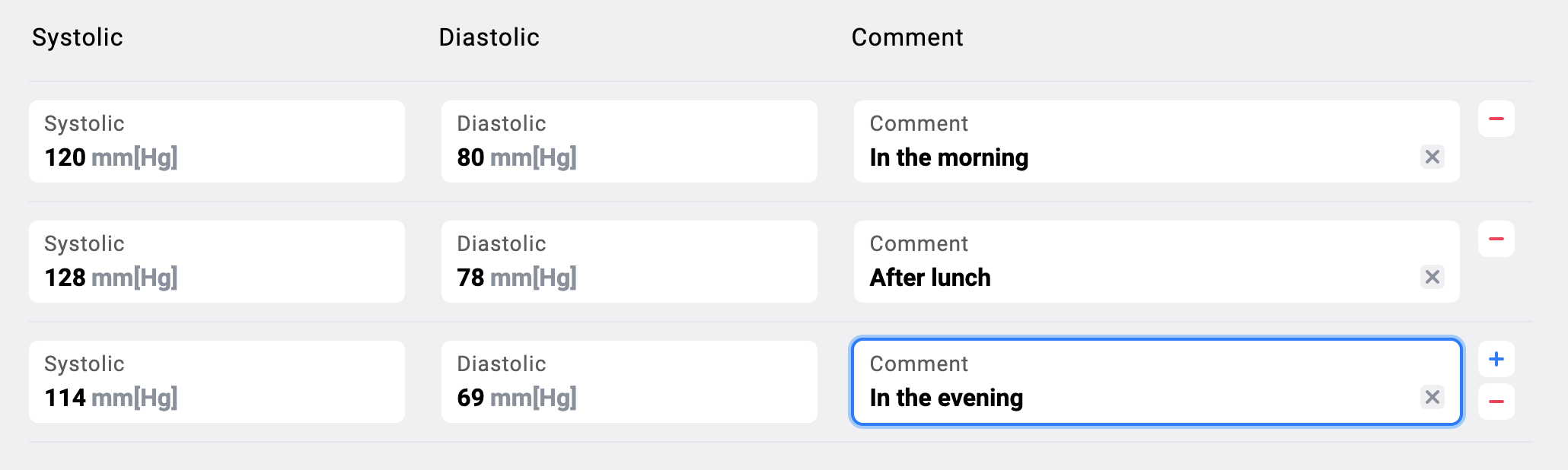
List presentation of multiplied containers
If you have a container that allows multiplication and does not contain containers within itself you can change the presentation of it to list.
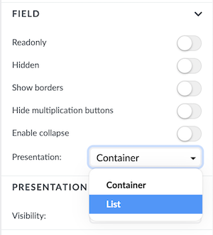
The list presentation will create a list of columns with the field names as headers. The functionality is the same as with multiplied containers above, the difference is the presentation, which might be more suitable for certain situations.
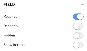
Layout group settings
Layout group settings include:
- Required: The user can set the layout group to behave as required or not.
- Readonly: All fields inside the layout group will be readonly.
- Hidden: The layout group and all its fields will be hidden.
- Show border: The user may choose to show the borders of the layout group field.
- Layout group settings
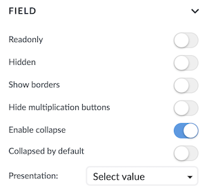
Apart from the widely used readonly and hidden, other containers settings are:
- Show borders: The user can show the border of a container.
- Enable collapse: Containers can be collapsed.
- Collapse by default: You can set a container to be collapsed by default if Enable collapse is set to true.
- Hide multiplication buttons: This will hide the + and - multiplication buttons (Note that this setting only appears if the container can be multiplied to begin with).
- Presentation: The user can choose the presentation of the container to be as container or list. Note that this setting only appears if the container can be multiplied to begin with and if it doesn't include any containers in itself.
- Container settings
When a container presentation is changed to list you get an additional setting group for Table. Here you can set:
- Hide header: Hides the header of the list.
- Show all borders: Shows all borders of the list.
- Set custom height: Opens up a input field where you can set a custom height expressed in pixels.
- Sticky header: Sets the header to sticky when scrolling through the list. Only available if you set a custom height.
- Sticky columns: You can set one or more columns to remain sticky when scrolling horizontally.
- Container list table settings
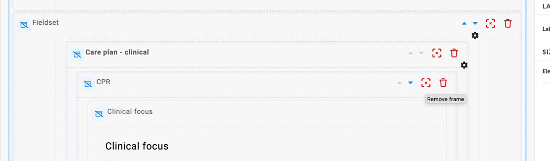
To remove a container from the canvas without removing the components that are in the container, you can click the red frame button on the right side of the container:
Buttons
Buttons are generic components that allow you to attach actions to them.
The button does not have any actions set and by itself does not do anything. You can hook actions to the button.
The most common examples are:
- Saving the composition or incomplete composition
- Toggling the visibility of some components.
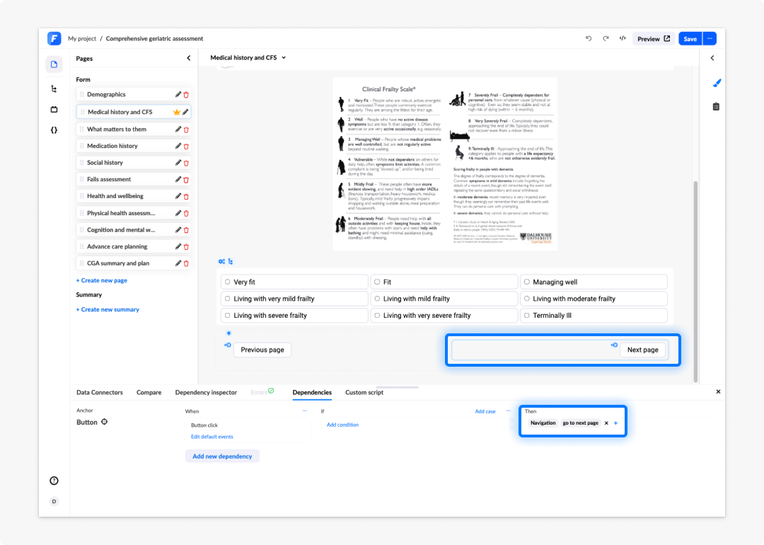
- Moving to another page.
When adding the When clause dependency, you cannot add an Otherwise clause. Buttons do not have this option available.
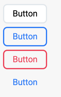
You can change the style of a button by setting the style in the property panel's Design tab. You can switch between four different styles:
Column and stacked lists
Lists are generic elements that allows you to display repeated sets of data in a tabular format. Data is obtained through APIs or AQL variables.
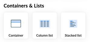
Imagine you're building a form for a patient's medical history. You can use a list to display information about the patient's visits, such as the date of the visit, the doctor's name, and the diagnosis. You can also use a list to display a list of medications, a list of allergies, etc. You can also control how data is displayed in the list. For example, you can sort the data, use widgets to convey complex information, or use generics to display simple data.
There are two kinds of lists to choose from:
- Column list: Displays data in a table format that consists of rows and columns.
- Stacked list: Display data in a single column format.
Column list
Column lists are used to display data in a table format. The data is displayed in rows and columns. Each column can contain any type of data, such as text, numbers, images, etc.
To add a column list to the form:
- The column list is available in the Containers & lists section of the Generics components.
- Drag the Column list option to the canvas.
You can also double-click any components onto the canvas. By dragging and dropping, you can place the component wherever in the Form builder canvas. Double-clicking will add the selected component to the bottom of your form.
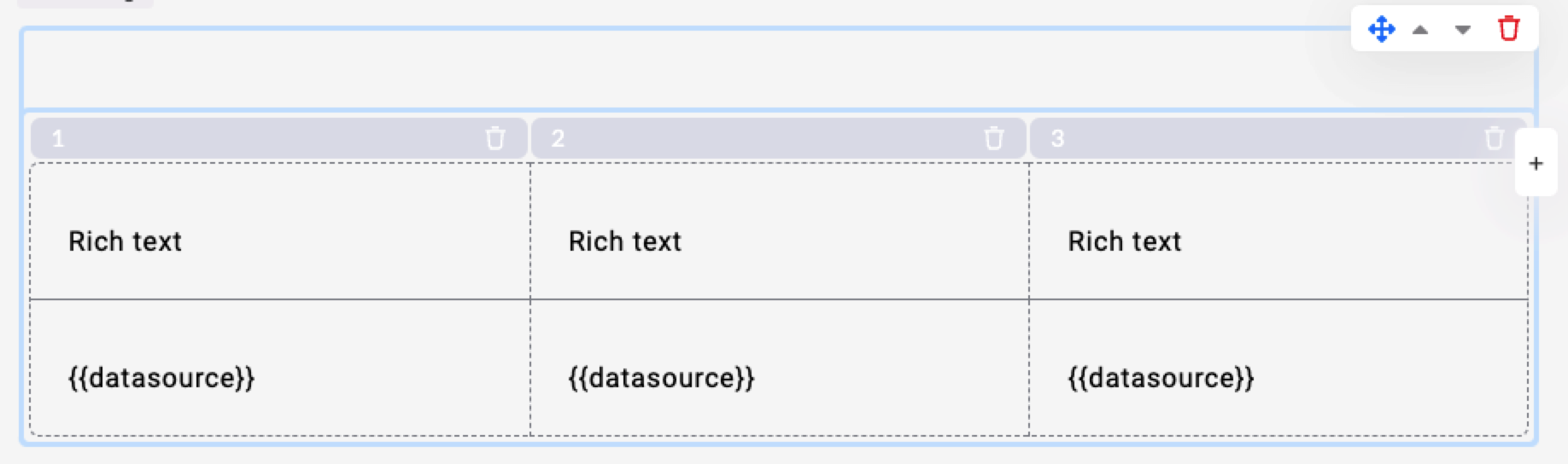
The column list has a header row and a data row. The header row usually contains column names that give an indication oo what kind of data is in that column, and can also contain sort indicators if sorting is enabled. If you have multiple rows in your source data set, the data row is repeated for each item in your source data set.
Setting data sources
A list can receive data from an API or an AQL variable.
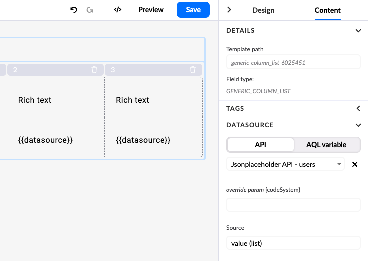
To set an API as the data source:
- Ensure you have an API connector that returns a list of objects.
- Select the Content tab in the right panel.
- Select the desired API as the data source.
- Set the source to
value (list).
Binding data to columns
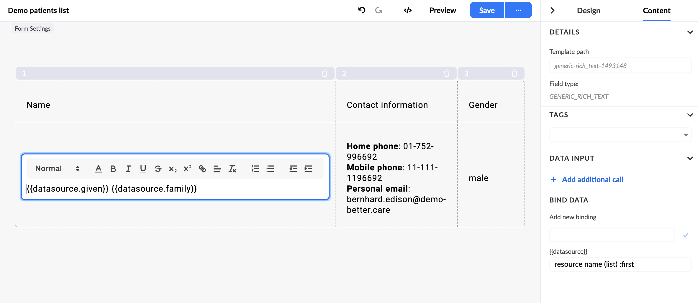
Each column has a rich text generic by default, which uses the Mustache templating engine. The default variable to bind data to is {{datasource}}.
You can bind data in the right panel under the Content tab by setting a label for {{datasource}}. Studio previews sample data when you bind.
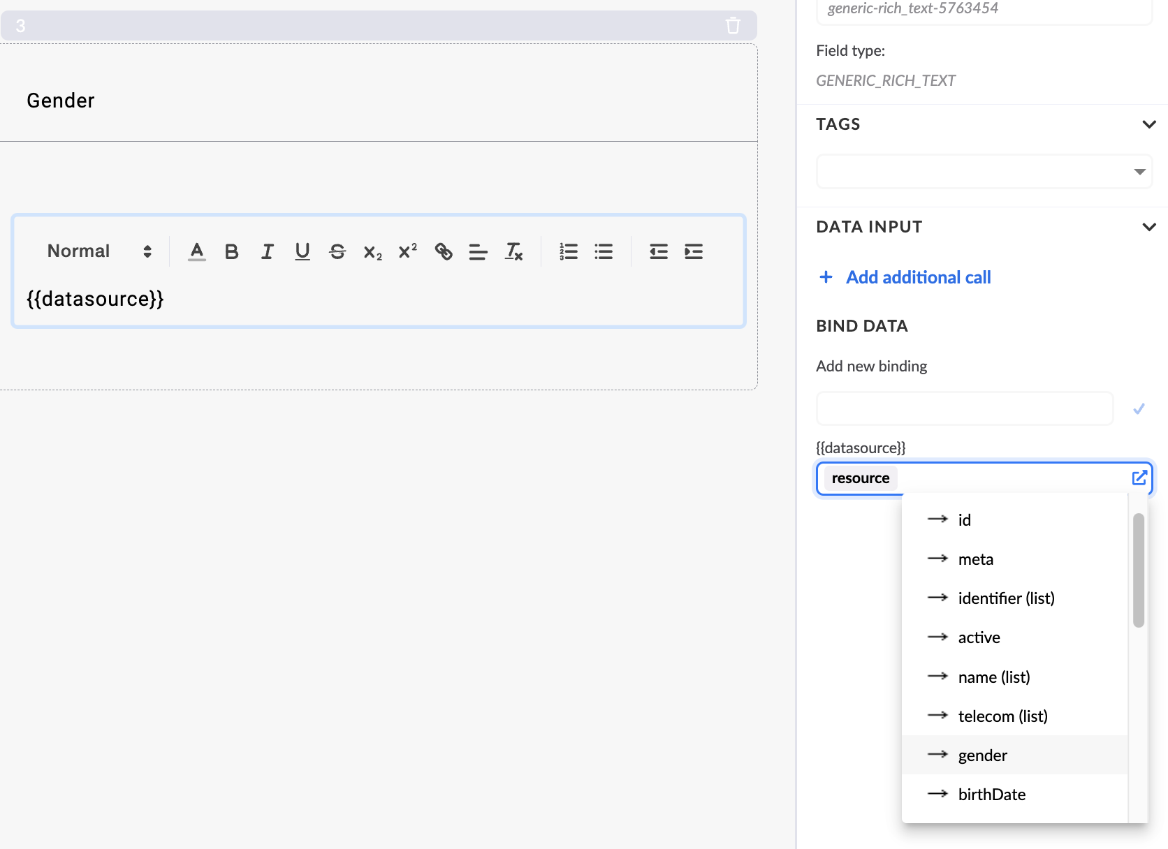
When an array of data is bound to one data source, you can access each item using dot notation, for example {{datasource.name}}.
Adding, removing, and reordering columns
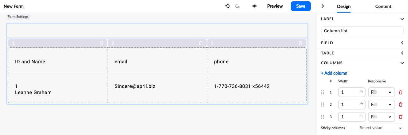
To add a column, click the Add column button in the Design tab or on the column list itself. Both methods add a column to the end of the list.
To remove a column, click the Remove column icon in the Property panel or on the column list. Either method removes the selected column.
To reorder columns, use the drag handle icon next to the column name in the Property panel.
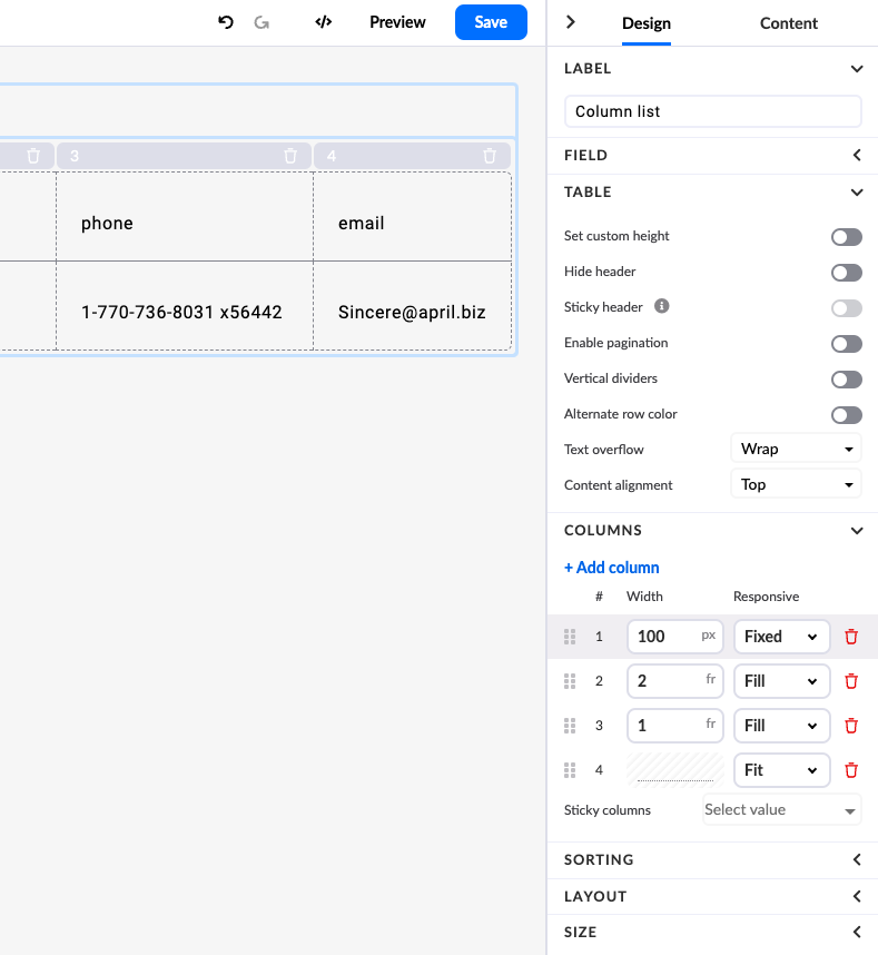
Column widths
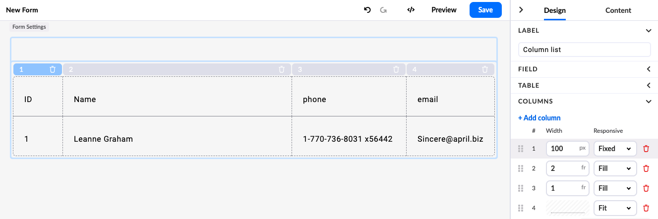
Three properties control column widths:
- Fixed: Sets a fixed width in pixels. The column width does not change regardless of content.
- Fill: Divides the remaining space between columns set to Fill, according to their fraction unit (fr). For example, in a two-column layout where both columns are set to Fill with 2fr and 1fr respectively, the first column is twice as wide as the second.
- Fit: Sets the column width to fit its text content.
- Add min: Adds a minimum pixel width.
- Add max: Adds a maximum pixel width.
Fit does not calculate the width of generic input fields. If a column contains input fields, it will shrink to the width of the generic input.
If a column contains a widget, set the column width to Fixed or Fit to prevent the widget from spilling into other columns.
Column widths and backwards compatibility
Studio 3.9 introduced column width, content alignment, and text overflow. These features are not backwards compatible with renderer version 3.8 or earlier.
If you are using Studio 3.9 with renderer 3.8 or earlier, column lists created in version 3.8 or earlier will still render, provided you do not edit any properties. Once you edit any property, the column list updates to the new version and cannot be used with renderer 3.8 or earlier. Updating converts all columns to Fill width.
List settings
The Property panel provides additional settings for the list:
- Set custom height: Sets the height of the entire list.
- Hide header: Hides the header row.
- Sticky header: Makes the header sticky (only available when a custom height is set).
- Enable pagination: Enables pagination and allows you to set the number of rows per page.
- Vertical dividers: Shows vertical dividers between columns.
- Alternate row colours: Applies a different background colour to every other row.
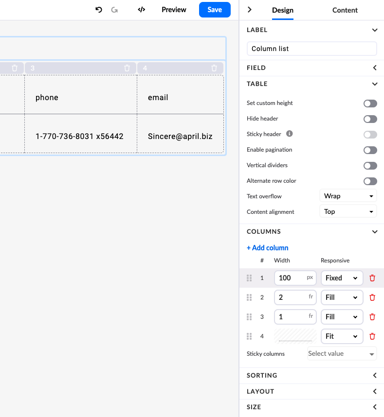
- Text overflow: Controls the behaviour of text that does not fit in a cell.
- Content alignment: Defines the alignment of content in cells.
- Sticky columns: Sets one or more columns to remain visible when scrolling horizontally.
Text overflow
Three options are available:
- One line: Text is displayed on one line and is not cut off.
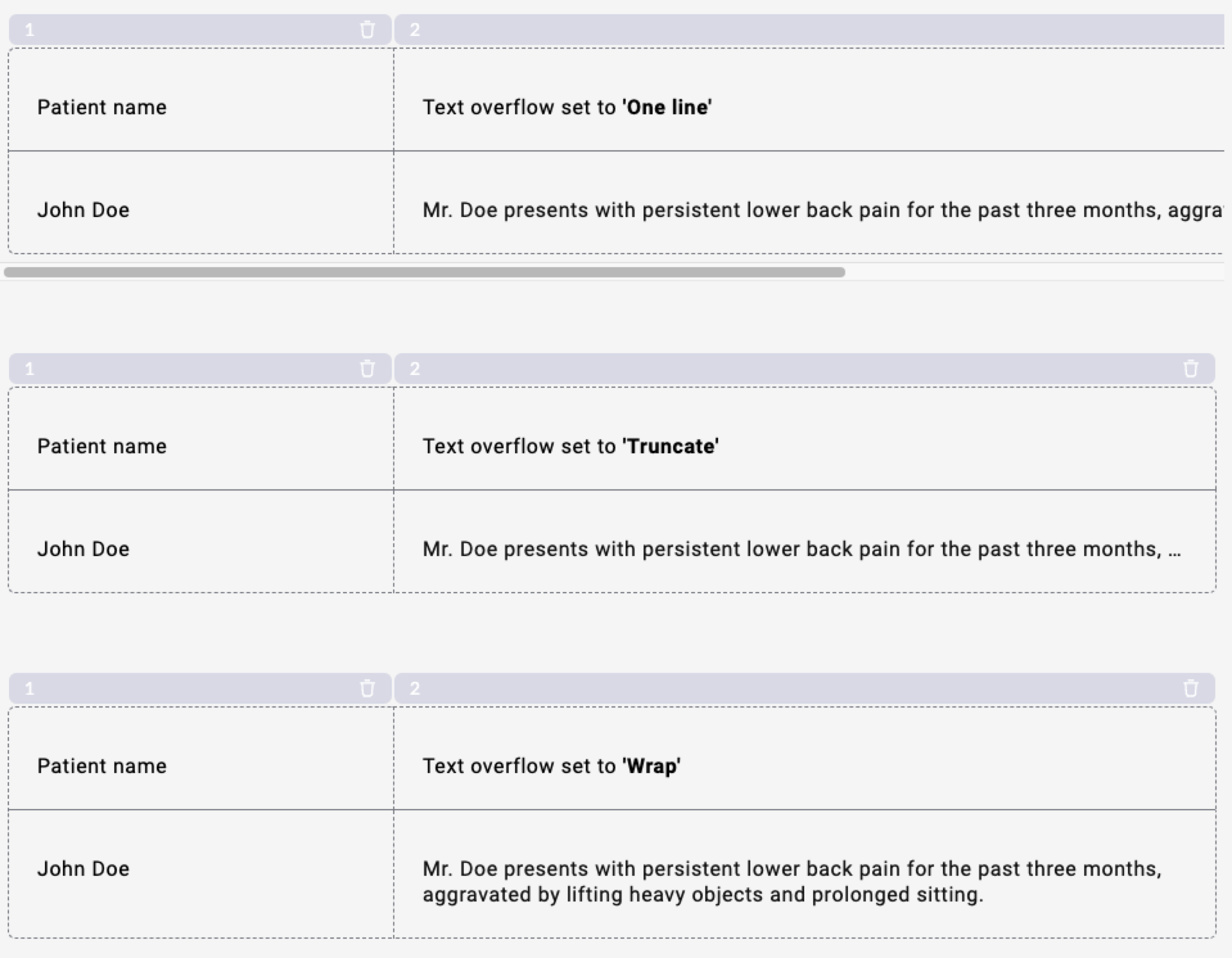
- Truncate: Text is displayed on one line and cut off with an ellipsis if it does not fit.
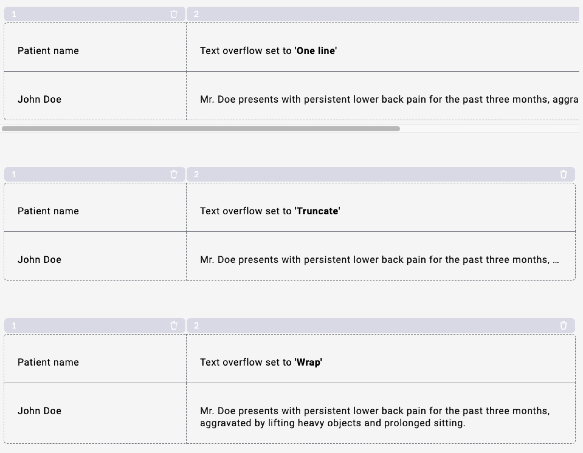
- Wrap: Text wraps to multiple lines if it does not fit.
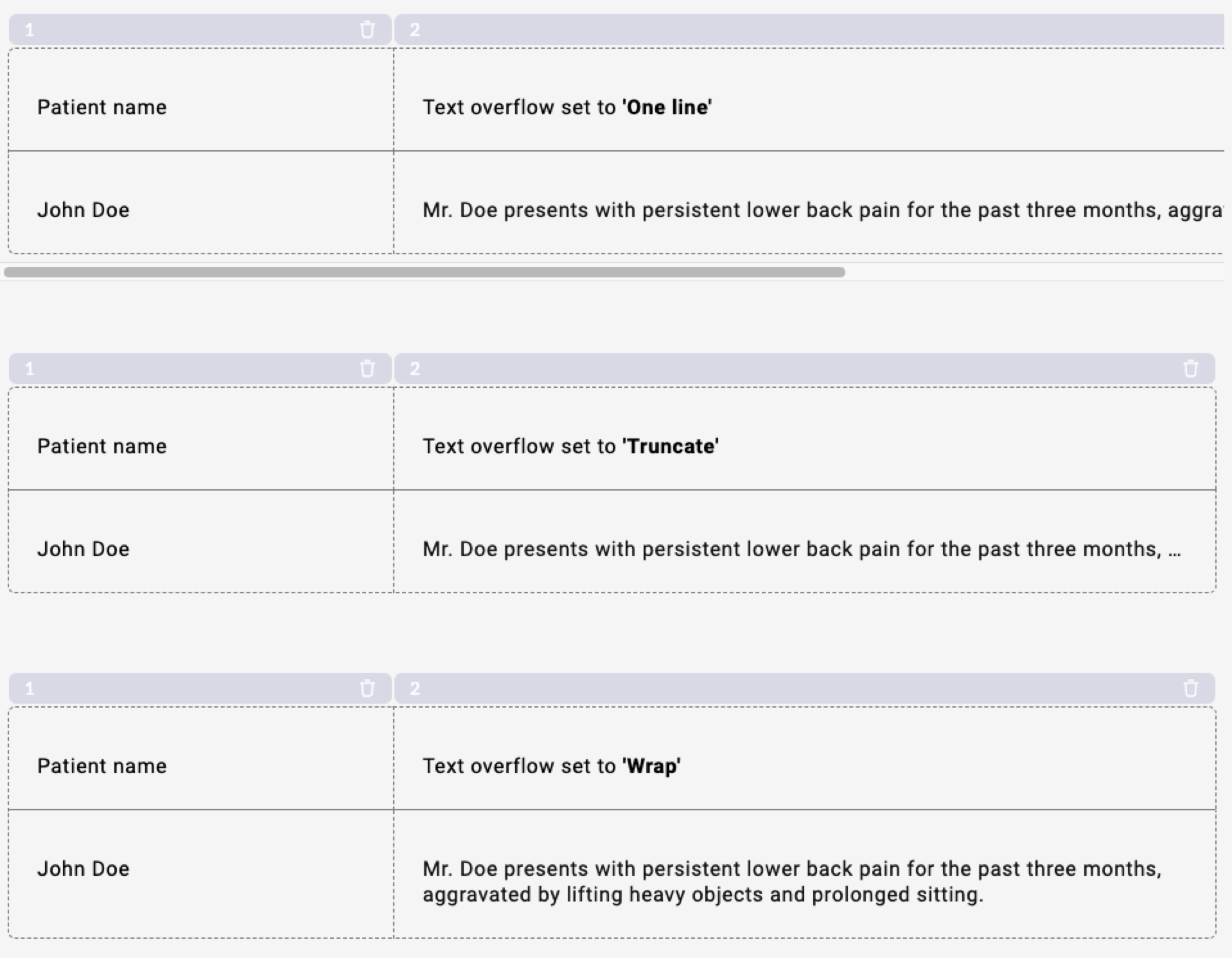
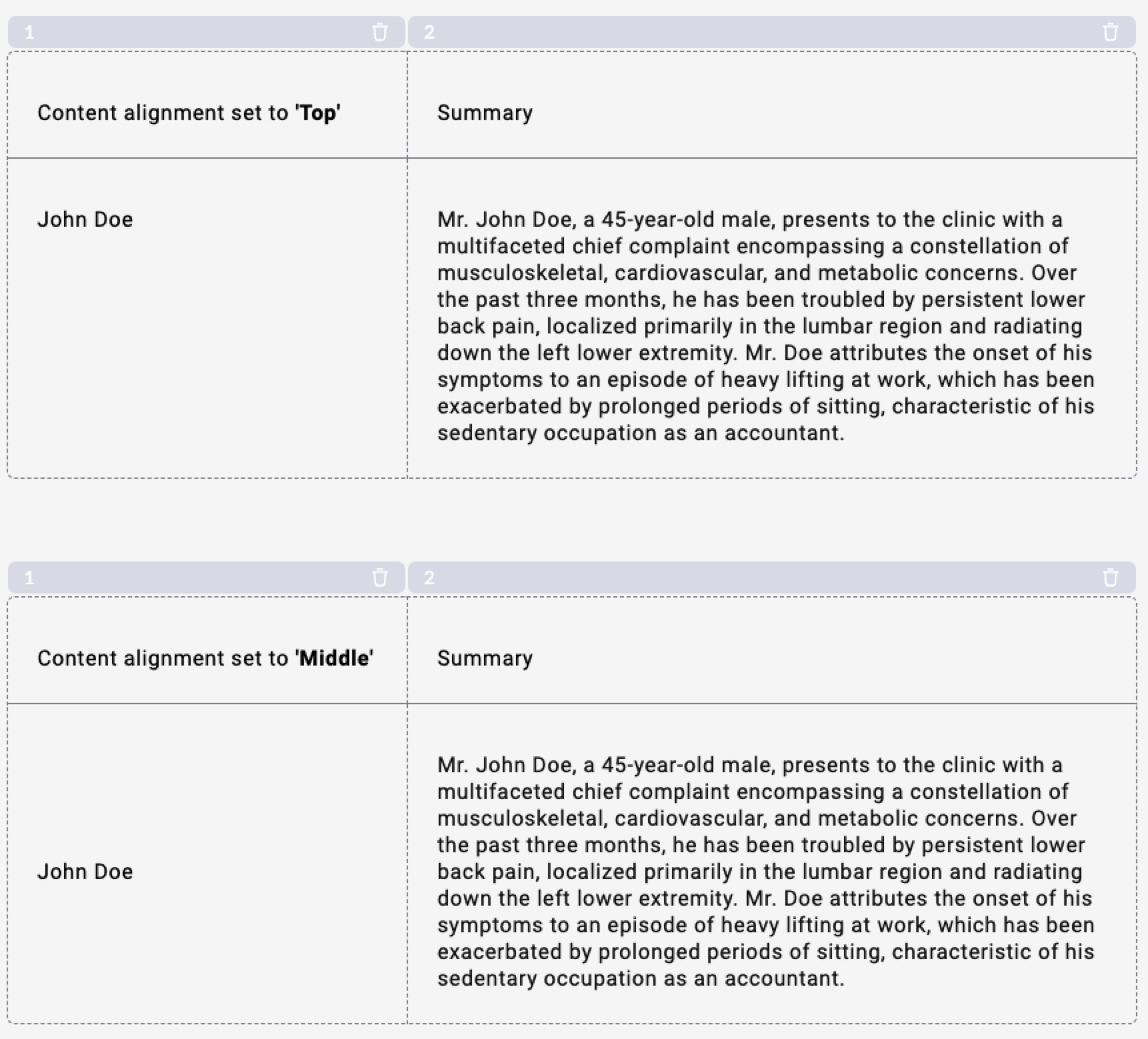
Content alignment
Two options are available:
- Top: Content is aligned to the top of the cell.
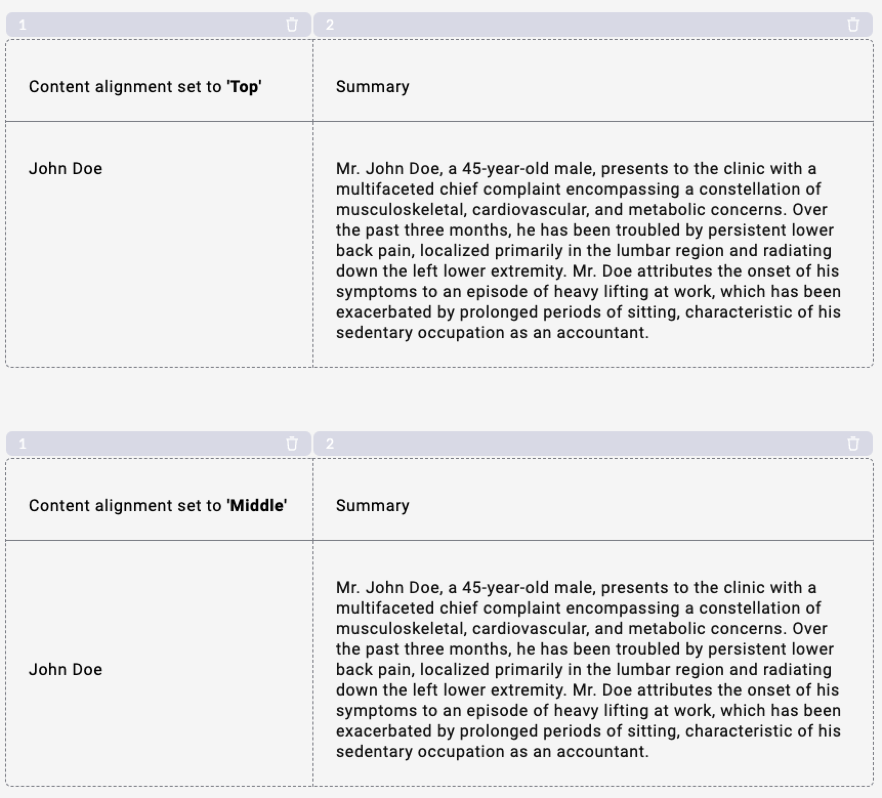
- Middle: Content is aligned to the middle of the cell.
Sorting
Sorting arranges column data in ascending (ASC) or descending (DESC) order. When a column is sortable, arrow icons appear to indicate that sorting is available and to toggle between orders.
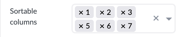
To enable sorting, select columns in the Sortable columns section. Remove a column from sortable columns by clicking the x next to the column number.
For each sort group, you can define key-value pairs for ASC and DESC directions. These pairs are appended to the data source URL. You can define successive key-value pairs — for example, sort first by date, then by name within the same date.
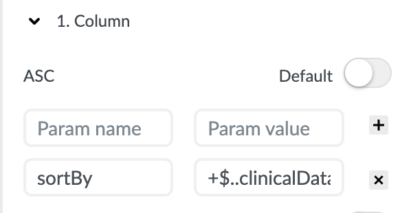
Each sortable column has a toggle to set it as the default sort order. This default is applied when the user first opens the form.
Sort persistence
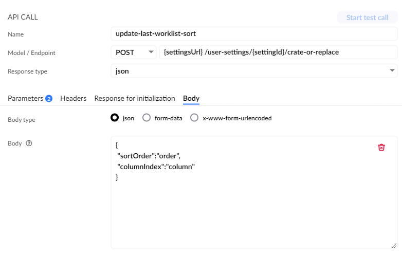
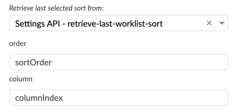
The last selected sort order can be saved to your server and applied each time the user opens the form. To enable sort persistence, scroll to the bottom of the Sort section in the Properties panel and configure the Persist last selected sort to and Retrieve last selected sort from dropdowns.
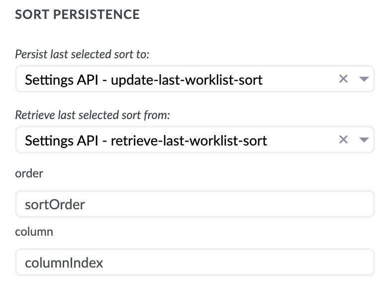
Saving: The form renderer binds sort values to the datasource body before sending to the API endpoint. Two predefined values are required in the API call body: order and column. These values are replaced by the renderer with the actual sort order and column number.
Retrieving: Any API call with a GET method can be used. After selecting a datasource, bind the return properties (ASC/DESC and column number) to the order and column properties.
Stacked lists
Stacked list is available in the Containers & lists section. Drag it to the canvas.
Stacked list is similar to column list, with two differences: It has no header row and it has only one column.
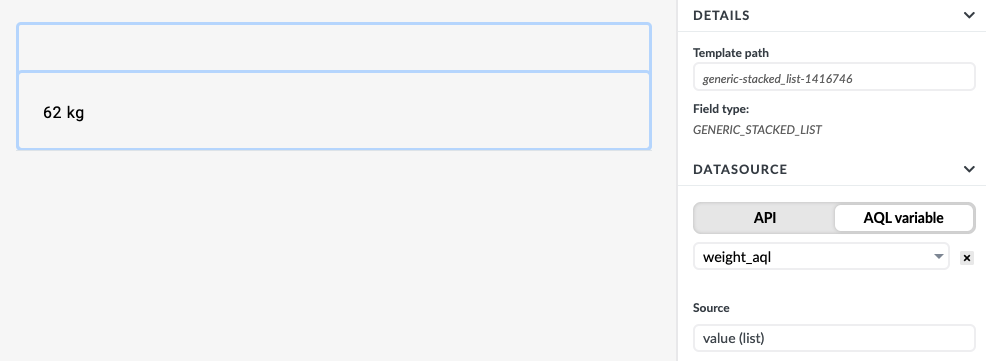
The example shows a stacked list connected to a weight_aql variable and displays the result in one column.

Manipulating data inside a list
Column list and stacked list support adding any type of field to columns. Every column also contains a rich text area with the Mustache template engine, enabling a range of display solutions.
To-do list with a status image
The following example shows a list of to-do tasks, each with name and completed properties. A red icon is displayed when a task is incomplete; a green icon when it is complete.
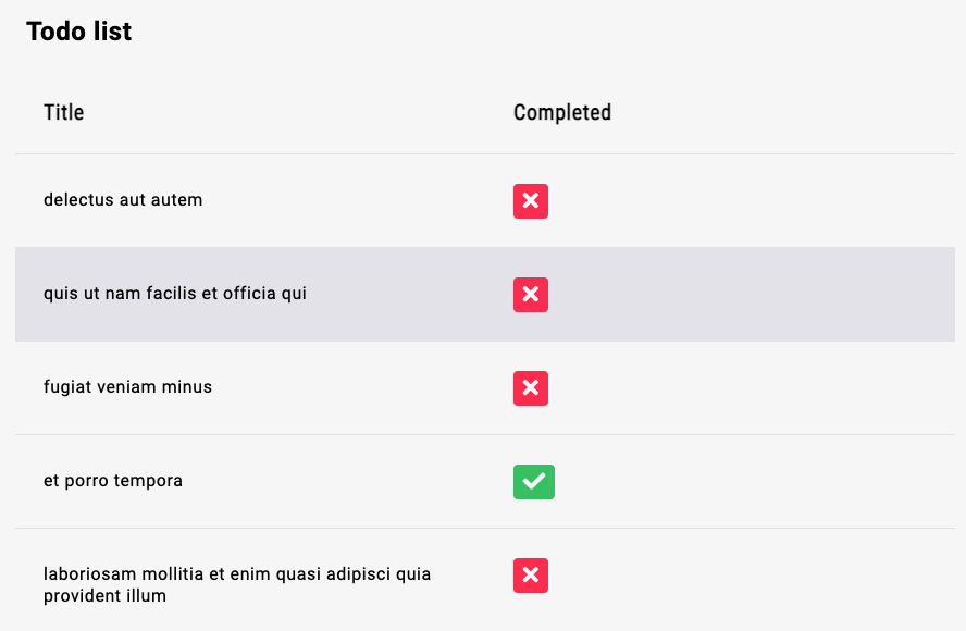
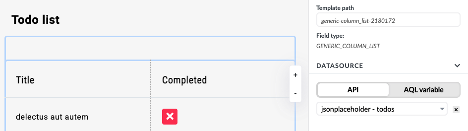
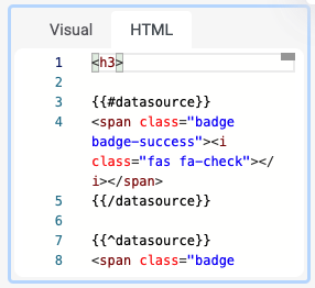
Connect the column list to an API returning the list of tasks. Drag an HTML component into the complete row. Using Mustache templating, check whether the data source variable is true or false and display the appropriate icon.
Measurements with a status image
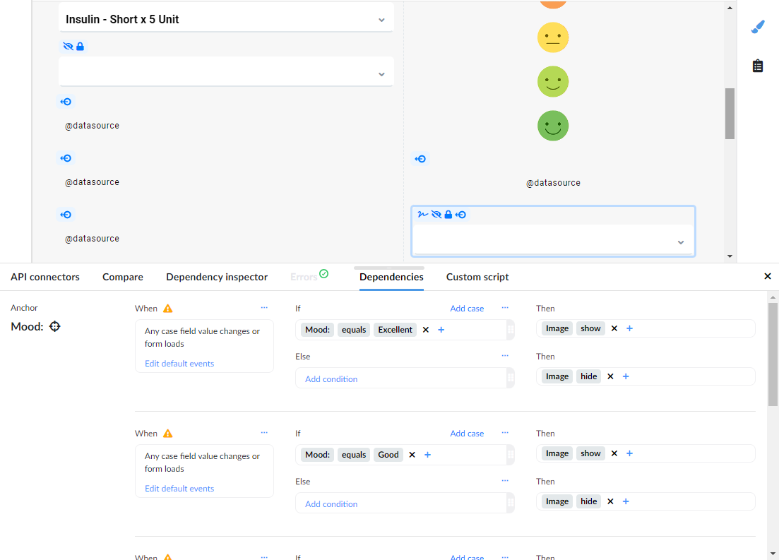
This example shows how to display different images based on patient mood measurements.
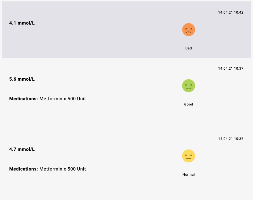
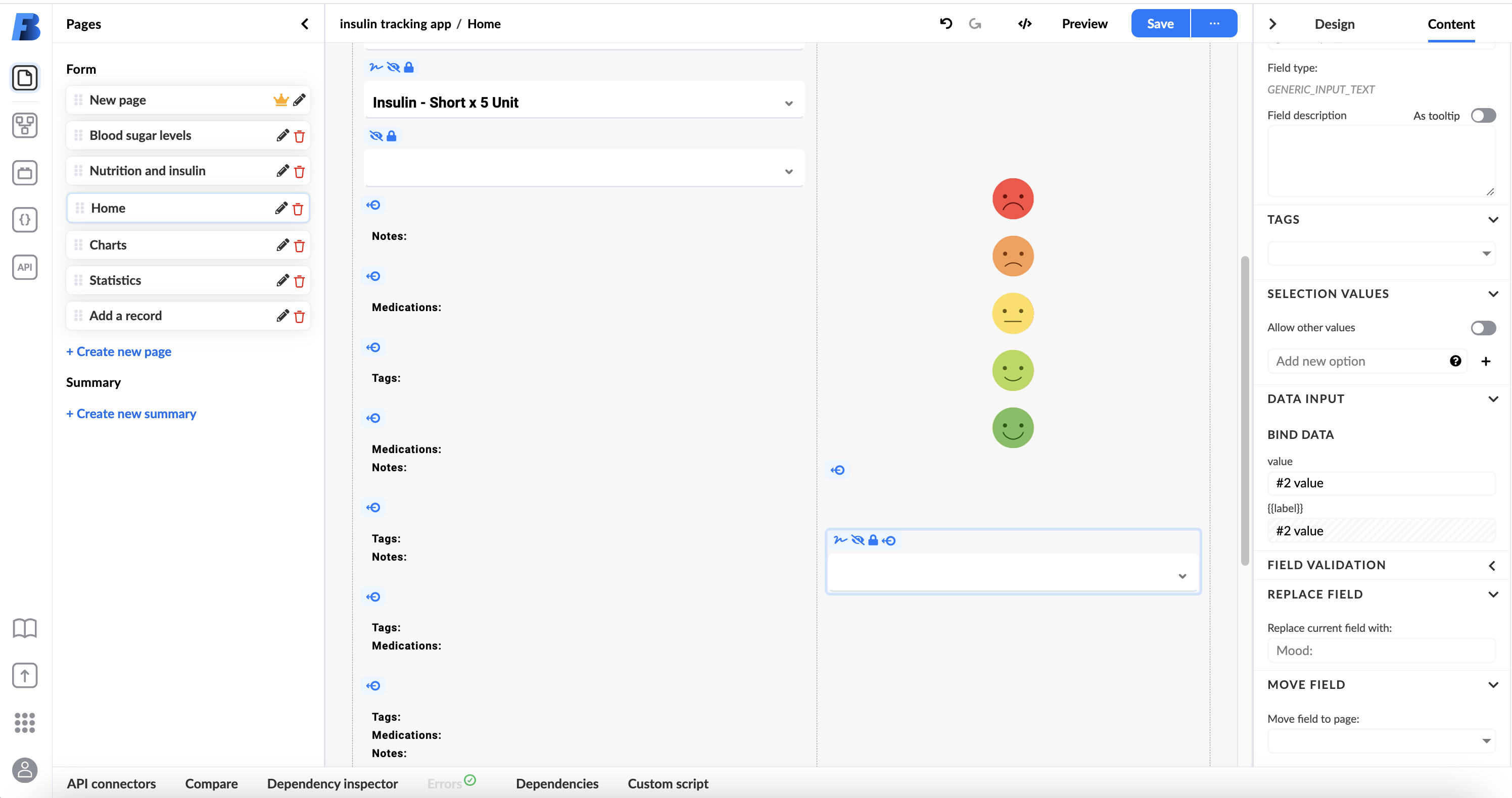
Since the Mustache engine can only check true/false values, use Studio's interaction dependencies. Add an input field, bind the mood data to it, and hide the input. Then set dependencies based on the input value to show or hide mood images.
Rich text
Rich text is a generic component that allows users to create and edit formatted content and to dynamically template content using variables. The component is split into two parts: an input area and a toolbar.

Formatting
The rich text component supports the following formatting options:
- Headings (H1–H5, paragraph)
- Unordered lists (bulleted)
- Ordered lists (numbered)
- Links
- Bold, italic, underlined, and strikethrough text
- Subscript and superscript text
- Indentation
- Text alignment (left, centre, right)
- Text colour (black, grey, blue, red, orange, green, purple)
- Clear format
To format content, select it in the input area and choose the desired option from the toolbar.
Pasting rich content from other sources may contain unsupported formatting, which Studio will strip from the content for visual and safety reasons.
Templating
Users can dynamically create content using the Mustache templating engine, with the same syntax and tags as the HTML component. Tags are indicated by opening delimiter {{ and closing delimiter }}.
Formatting rendered variable values requires that the whole tag is formatted, not just the content between the delimiters.
For a full reference of templating syntax and examples, see the HTML section below.
HTML
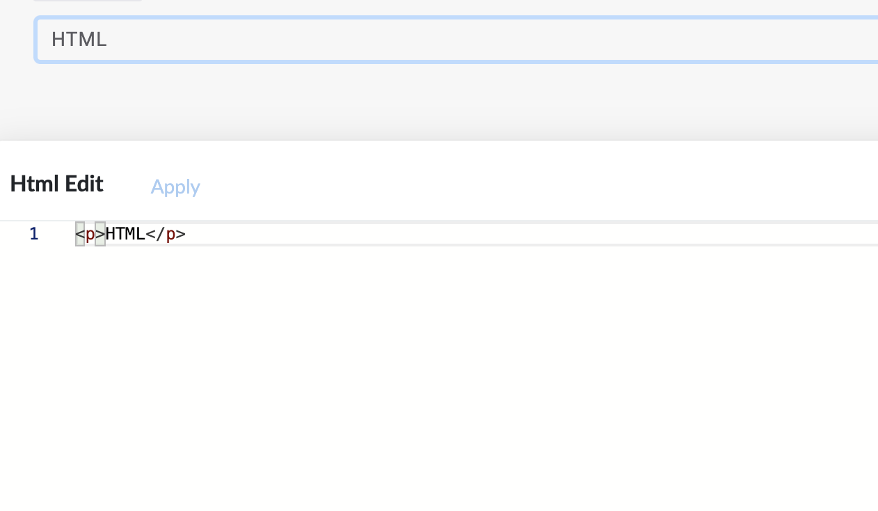
HTML is a generic component that allows users to write HTML code and dynamically template it using variable values. The component has two tabs: a Visual tab that previews the rendered HTML, and an HTML tab that provides an input area for writing code.
Templating
HTML templating uses the Mustache templating engine. Tags are indicated by {{ and }}.
Basic tags
A basic tag renders the value of the named variable. If the key is empty or the variable does not exist, nothing is rendered.
Variables:
{
  name: Michael
}
Template:
* {{name}}
* {{age}}
Output:
* Michael
*
Use dot notation to access object properties:
Variables:
{
  person: {
    name: Michael
  }
}
Template:
* {{person.name}}
Output:
* Michael
Use index and dot notation to access array items:
Variables:
{
  people: [
    { name: Michael },
    { name: John },
    { name: David }
  ]
}
Template:
* {{people.0.name}}
Output:
* Michael
Section tags
A section tag uses a # symbol before the variable name for the opening tag and a / symbol for the closing tag. The section block is rendered based on the variable's value.
False value — if the variable does not exist or has a false value (null, undefined, false, 0, NaN, empty string, or empty array), the block is not rendered:
Variables:
{ person: false }
Template:
* Shown
{{#person}}
* Hidden
{{/person}}
Output:
* Shown
True value — array: If the variable is an array, the block renders once for each item, with the context set to the current item.
Variables:
{
  people: [
    { name: Michael },
    { name: John },
    { name: David }
  ]
}
Template:
{{#people}}
* {{name}}
{{/people}}
Output:
* Michael
* John
* David
For an array of strings, use . to refer to the current item:
Variables:
{ names: [Michael, John, David] }
Template:
{{#names}}
* {{.}}
{{/names}}
Output:
* Michael
* John
* David
Inverted section tags
An inverted section uses a ^ symbol before the variable name. The block is rendered only if the variable has a false value:
Variables:
{ person: false }
Template:
* Shown
{{^person}}
* Also shown
{{/person}}
Output:
* Shown
* Also shown
Notification fields
The notification component is a generic form element for displaying important information.
It can have one of four styles:
- Basic
- Info
- Warning
- Draft
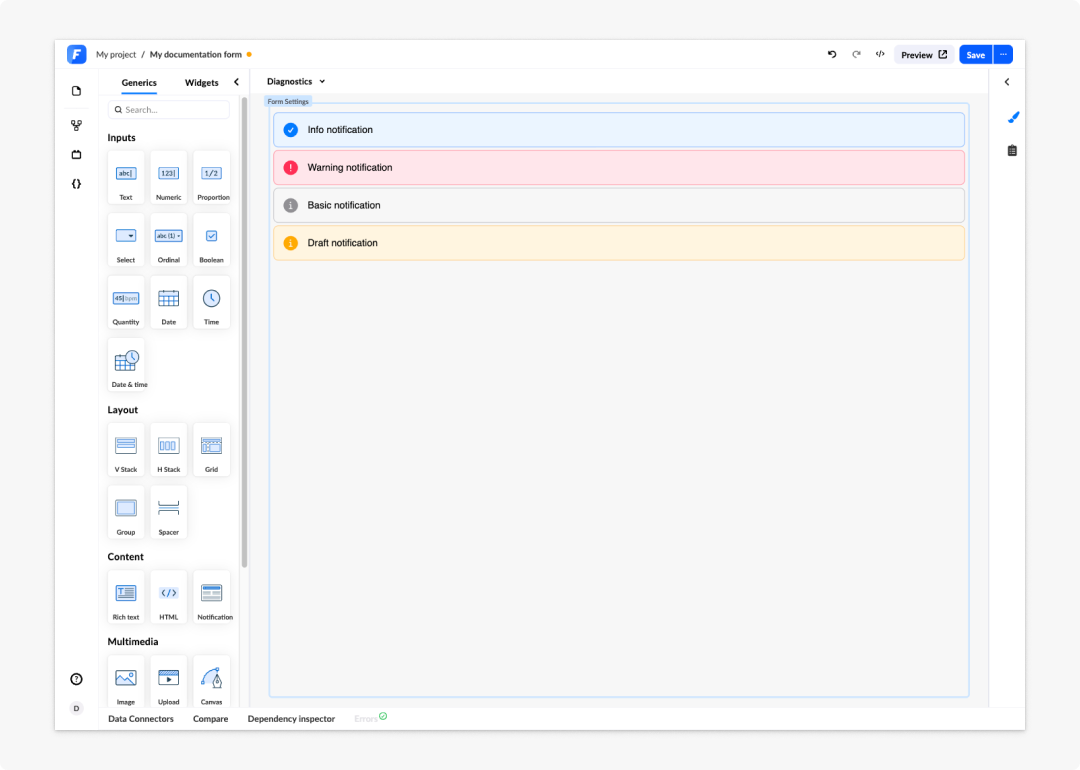
The styles let you quickly communicate the type of information — whether it is urgent or informational. You can format the text inside a notification field in the same ways as a rich text field.

Use dependencies to control when a notification appears on the form by toggling its visibility. If you use more than one notification on a form, it is good practice to change their labels in the Design panel to avoid confusion when multiple notifications are all labelled "Notification".
To dynamically change the content of a notification, use a variable within the notification and change it using dependencies, in the same way as with rich text elements. See the Rich text section for details.
Image canvas
Image canvas allows a user to draw on a selected image and then upload the image to an external server.
The image canvas component is available in the Multimedia section. Before using it, you must select and upload an initial image. Image canvas must be connected to a POST API endpoint to store the images.
Setting up an upload API endpoint
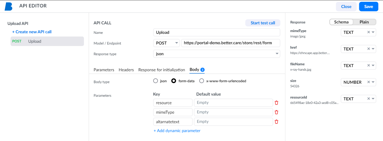
To save an image, set up an API endpoint using the POST method. The method receives form data and saves a file.
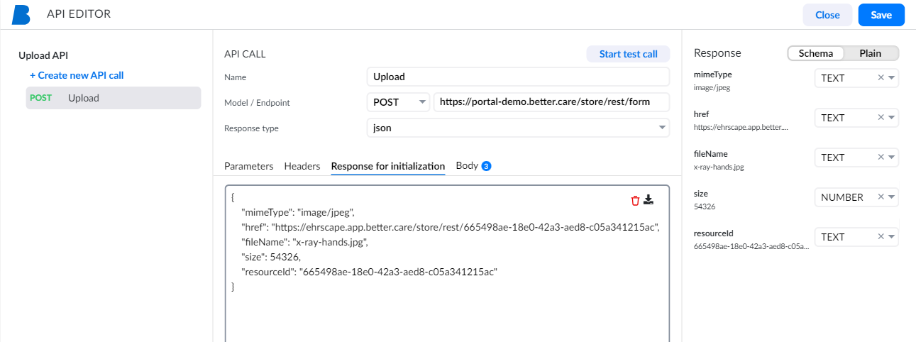
The example above expects three parameters: resource, mimeType, and alternateText.
Add a sample response of the API endpoint to the Response for initialization field, then click Start test call to initialise the API.
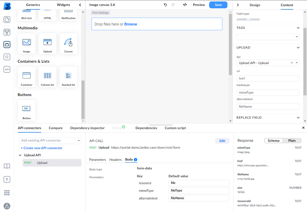
Adding the upload API to the image canvas
To connect the upload API to the image canvas, go to the Content panel in the right panel, select the API you created for the file upload, and configure the parameters.
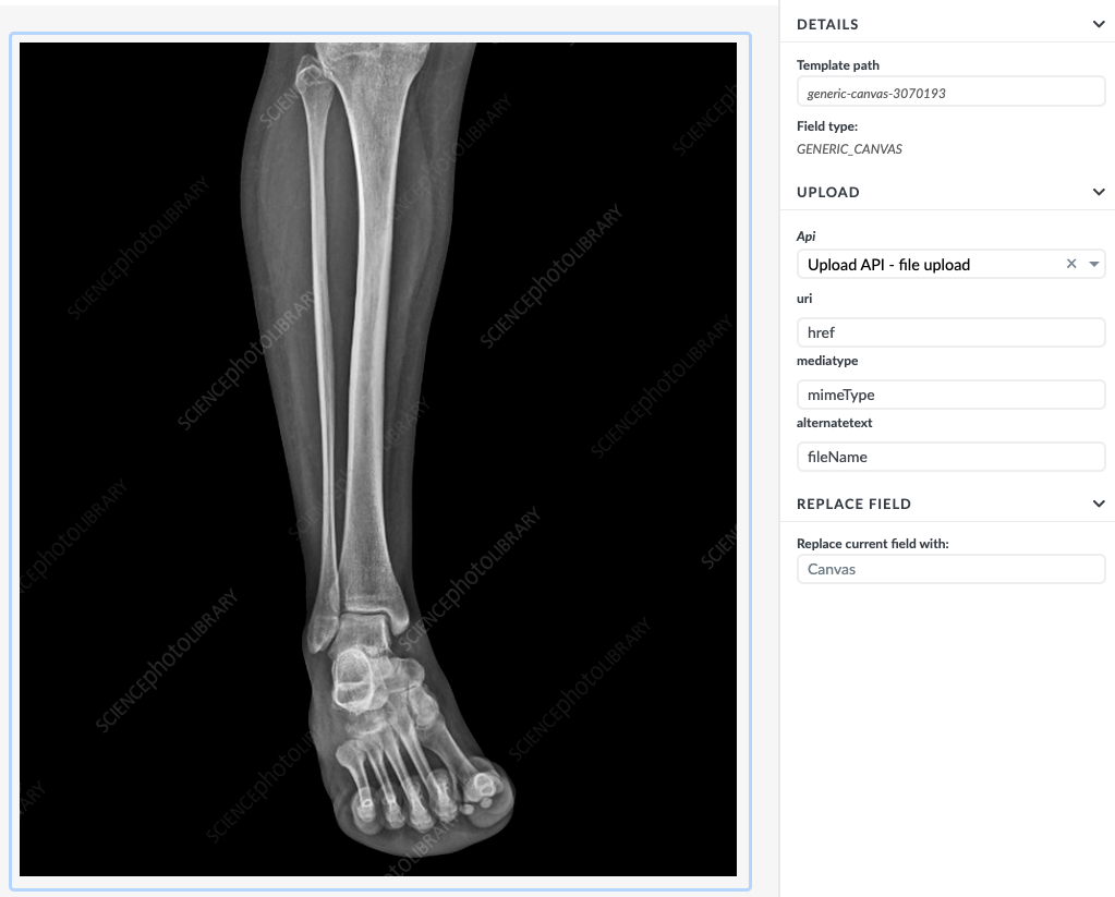
When you save a composition, the image with the drawings is sent to the API endpoint.
For further details on using APIs in forms, see API connectors. For authorisation handling, see Upload below.
Image map / Interactive image
Image map lets clinicians select a part of a patient's body — or another predefined location — from clickable hot-areas on an image, rather than searching a dropdown. Areas are bound to specific values of a field, so the resulting composition is the same as with a standard dropdown presentation of coded text.
Interactive image presentation is available only for coded text and its generic counterpart.
Showing a field as an interactive image
Place a coded text, ordinal, or scale field with predefined values on the canvas and go to the Design panel in the Property panel. Under Field, select Interactive image from the presentation dropdown.
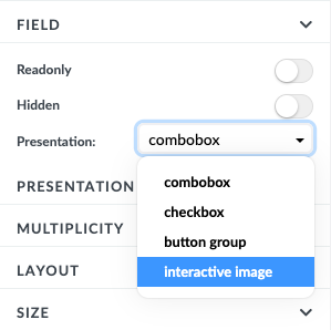
Once selected, an Interactive image properties section appears below the presentation dropdown and the field on the canvas changes to show "no image uploaded". Click Upload image to select an image from your file system. Once uploaded, the image appears on the canvas and the button changes to Change image.
The uploaded image is not responsive due to technical limitations. Keep this in mind when choosing an image.
Adding interactive areas
Under the hood, the interactive image uses the Image map concept. To create an image map, use the image map generator to define areas on your image, then copy the generated code.
To add the code to the interactive image:
- Click Add next to the Image map code label.
- Paste the copied code into the text box.
- Click Save.
Studio automatically transforms the code into areas on the image.
Binding interactive areas to the data model
After adding the image map code, the canvas displays the image with shaped areas, and a mapping table appears in the Interactive image properties section. Each row represents an area; hovering over a row highlights the corresponding area on the image.
Each row must have a corresponding value. Select a value for each row from the dropdown. Rows without a value will not function correctly.
Area names appear as tooltips when the user moves the cursor over the area. You can rename areas for easier orientation or toggle Auto-define area title from field labels to automatically bind area names to field labels.
Choosing colours for areas
- Area colour: Changes the background colour of the area when selected.
- Borderline: Changes the colour of the border. This colour does not change based on selection state.
Upload
Upload is a field that allows users to upload files such as documents or images. It can be part of a template or added from the Generics tab.
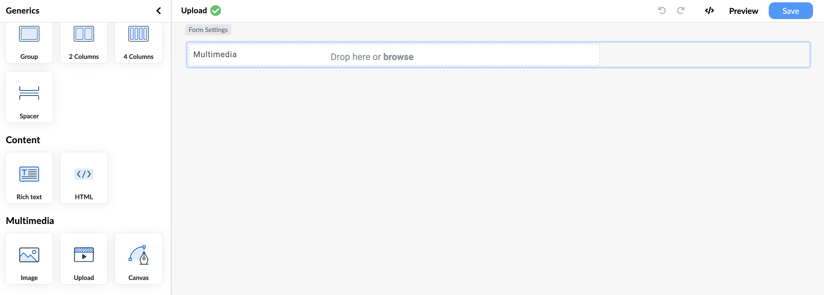
The Upload property panel exposes two independent tabs:
- Upload — the API call that receives the file when the user adds it. Returns a response from which the form bindings extract the URI, media type, and alternate text stored on the field.
- Download — the API call used when the user previews/downloads the attachment, and when an inline thumbnail is rendered for image attachments. Optional: if not configured, the renderer falls back to fetching the URI on the model directly, reusing the Upload API's authentication headers.
Upload and Download can point at different APIs — for example a write-only upload service plus a read-only CDN URL — but most setups use the same backend for both.
Setting up an upload API
- In the left panel, go to API and create a new API connector. For example, name it "Upload API".
- Create a call named "Upload" with the
POSTmethod and enter the upload URL. - Since
POSTis used, provide a Response for initialization so a test call can be made. For Better Store, you can use this example response:
{
  "mimeType": "application/pdf",
  "href": "https://store.better.care/rest/5d87731d-1782-4d6e-bcf4-820525503cbc",
  "fileName": "summary.pdf",
  "size": 39149,
  "resourceId": "5d89951d-1782-4h6e-bcf4-821525503cbc"
}
- Set the body type (in this example,
FORM_DATA) and add the required parameters:resource,mediaType, andalternateText. - Click Start test call, then save the API connector.
- In the API call parameters, bind the form data fields using the Multimedia dropdown: bind
resourcetofile,mediaTypetofileType, andalternateTexttofileName. - Select the Upload field on the canvas, go to Content in the Property panel, find Upload, and select your upload API call from the dropdown.
- Bind the fields:
uritohref,mediatypetomimeType, andalternatetexttofileName.
File substitution keywords
Whatever the body type, the renderer substitutes three reserved keywords into the API call's parameters when uploading:
| Keyword | Replaced with |
|---|---|
file | The file itself — as a Blob for FORM_DATA, base64 string for JSON and X_WWW_FORM_URLENCODED |
fileType | The file's MIME type (e.g. image/png) |
fileName | The original file name |
Use these as the value of a dynamic param (for FORM_DATA / X_WWW_FORM_URLENCODED) or as the value of a <placeholder> referenced from the JSON body template (for JSON).
JSON body uploads
If your upload endpoint expects a JSON document with the file content embedded as a base64 string, configure the API call as JSON body type and write a body template under Body using <placeholder> markers:
{
  "attachment": {
    "content": "<contentPlaceholder>",
    "mimeType": "<mimePlaceholder>",
    "filename": "<filenamePlaceholder>"
  }
}
Then add dynamic params whose name matches each placeholder and whose value is the file keyword:
| Dynamic param name | Value |
|---|---|
contentPlaceholder | file |
mimePlaceholder | fileType |
filenamePlaceholder | fileName |
At upload time, the renderer:
- Reads the JSON body template.
- Resolves each
<placeholder>against the matching dynamic param. - For the
filekeyword, base64-encodes the blob (nodata:prefix); forfileType/fileNameit substitutes the plain string; for any other value, the literal expression value. - Sends the resulting JSON as the request body.
Other dynamic params can still reference normal form expressions (e.g. %EHR_ID%) alongside the file keywords in the same payload.
Setting up a download API
Configure a Download API when:
- The platform stores attachments behind an authenticated endpoint that needs the same headers as the upload (most common).
- The download URL is derived from the stored URI but not identical to it (e.g. attachments stored on a separate service from where they were uploaded).
- You need offline-mode support for previewing attachments later (see Offline mode).
- In the API panel, create or reuse a
GETAPI call. - Set Response type to
blobso the response comes back as a binaryBlobrather than parsed JSON. - Use the reserved tokens in the URL template or path parameters when the request URL needs to encode the attachment URI. Example URL template:
/attachments/{attachmentUri}. - In the Upload field's property panel, switch to the Download tab and select the API call.
Reserved attachment tokens available in the Download API call URL and path parameters:
| Token | Replaced with |
|---|---|
{attachmentUri} | The |uri value stored on the field |
{attachmentMediaType} | The |mediatype value |
{attachmentAltText} | The |alternatetext value |
The tokens are substituted anywhere in the URL, including the query string. For example, when the stored |uri is already a complete URL and the server expects the media type as a query parameter, the URL template is simply:
{attachmentUri}?mediaType={attachmentMediaType}
The same Download API is used for inline image thumbnails and for the explicit preview/download button.
Handling authorisation
When creating the upload or download API, add the appropriate authentication to the call:
- Basic authentication: Username and password
- Bearer authentication: Token
- EHR platform credentials
The authentication headers are automatically appended to every request the renderer makes through that API call — uploads, downloads, and thumbnail fetches alike.
Upload, download, and offline mode
Both Upload and Download API calls flow through the renderer's offline request-handler contract when the form runs with mode: 'offline':
| User action | Resource request emitted | Where to handle it |
|---|---|---|
| User adds a file to the field | attachment-added | Host persists the binary; returns a synthesised response shaped like the field's upload bindings expect. |
| User previews or downloads the attachment | attachment-fetch | Host returns the cached Blob for the resourceId. |
| Image attachment renders an inline thumbnail | attachment-fetch | Same — same handler serves the same Blob. |
The resourceId on attachment-fetch equals the uploadId minted on attachment-added, so the offline handler can use it as a deterministic lookup key. See Offline mode → Handling attachments for an end-to-end example, including a reference implementation in apps/renderer-app/src/app/app.component.ts.
If the Download API is not configured, the renderer falls back to a direct GET on the stored URI (with Upload API headers applied for auth). In offline mode this bypasses the request handler, so attachments cannot be previewed offline. Always configure a Download API when the form is intended to run offline.
Frequently asked questions (FAQs)
What is the difference between a layout group and a container?
Layout groups support rows and columns and are used to change the layout of fields. Containers are used only for grouping fields together. Since version 3.2, containers no longer support rows or columns; containers that had their header hidden before that version were automatically converted to layout groups.
Can a generic input field be persistent?
Yes. When marked as persistent, a generic field's value is stored in the composition and reloaded whenever the composition is applied, even if the field is not part of the template model.
What presentation options are available for dropdown fields?
Combobox, checkbox, button group, and interactive image.
What is the difference between a column list and a stacked list?
A column list displays data in a table with rows and columns. A stacked list displays data in a single column with no header row.
What templating engine do rich text and HTML components use?
Both use the Mustache templating engine with the same tag syntax.
What field types support the interactive image presentation?
Interactive image presentation is available only for coded text and its generic counterpart.
What authentication methods are supported for the upload API?
Basic authentication (username and password), Bearer authentication (token), and EHR platform credentials.