Working with components
This content is intended for all Studio users.
Components are the individual building blocks you place on the canvas to collect, display, and organise data in a form.
Form builder provides three types of component: Template fields and generic components, as well as widgets from the Marketplace.
Component types
Template fields
Template fields come from an openEHR template that you have added to your project.
Each field represents a specific data point defined in that template, for example: a systolic blood pressure reading, a diagnosis code, or a medication name.
When you add a template field to your form, it is automatically bound to the corresponding data path in the openEHR structure. This means data entered by users will be stored in a clinically structured way in the CDR.
Template fields are found in the Templates tab of the left panel. They are organised by the templates available in your project.
Components
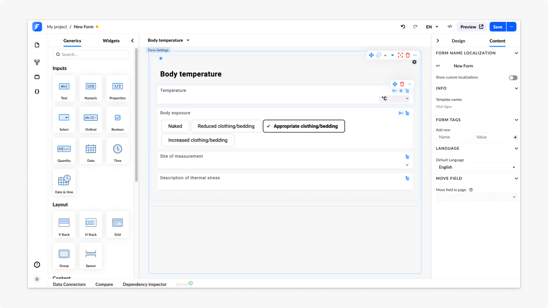
Components are divided between Generics and Widgets.
Generics are flexible, general-purpose components that are not bound to a specific openEHR data path by default. They include:
- Input components: Text, numeric, proportion, select, ordinal, boolean, quantity, date, time, date & time
- Layout components: V (vertical) stack, H (horizontal) stack, grid, group, spacer
- Content components: Rich text, HTML, notification
- Multimedia components: Image, upload, canvas
- Containers & lists components: Container, column list, stacked list
- Buttons
Widgets are pre-built, installable components available through the Marketplace. They extend the standard Generics library with specialised functionality that goes beyond what a standard input provides, for example: a patient banner, a clinical chart, a signature field, or a custom data display.
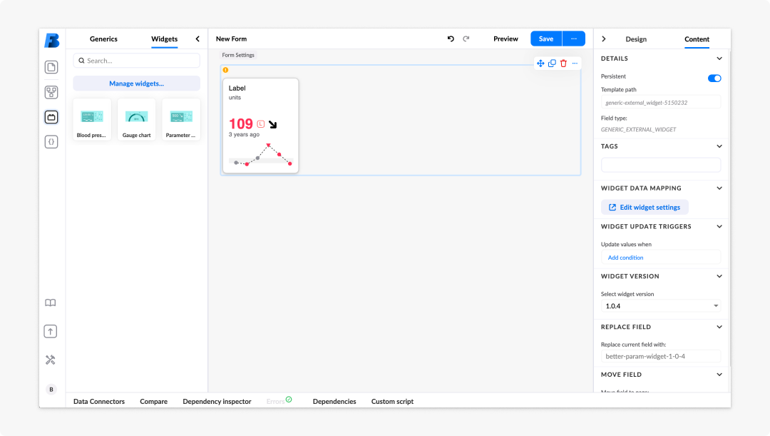
Widgets sit in a dedicated Widgets tab within the same Generics panel, and are used on the canvas in exactly the same way as generic inputs: drag, drop, and configure in the property panel.
There are three types of widget:
- Read-only widgets: Display data without accepting user input; for example, a patient banner or a clinical summary card
- Input widgets: Collect user input and store it in the same way as a generic input field; for example, a custom text input, a slider, or a specialised clinical measurement field
- Action widgets: Trigger an action or event within the form; for example, a custom button or a call-to-action component
Widgets must be installed into your project from the Marketplace before they appear in the Widgets tab. Each widget can be configured using the Widget configurator in the property panel, which lets you set widget-specific options, map data inputs and outputs, and apply or save presets.
To use a widget:
- Go to the Marketplace in your project and install the relevant widget to it by clicking on Install.
- Return to Form builder. The widget will appear in the Widgets tab of the left panel.
- Drag the widget onto the canvas as you would any other component.
You can also reach the Marketplace directly from Form builder. Simply navigate to the left panel, navigate to Widgets, and click on Manage widgets. A window will open with a list of widgets you can use within your form from Marketplace. Simply click Install to add the specific widget to your form.
You can bind a generic input to a data path manually. See Connecting data for details.
Adding components to the canvas
To add a component:
- Open the left panel and select the Templates tab or the Generics tab.
- Locate the component you want to add.
- Drag it onto the canvas and drop it into the target container or row.
- Alternatively, double-click the component to add it at the bottom of the form or summary you're working on.
To move a component: Drag it to a new position on the canvas, or use the content tree to reorder it within the form structure. To remove a component: Select your component and hover over the top right corner. A bin icon will appear. Click on it to remove the component.
Duplicating and copying components
To save time when building forms with repeated component patterns, you can duplicate a component on the canvas.
To duplicate a component:
- Select your component and hover over the top right corner.
- Click on the Duplicate icon.
- The duplicate is placed directly below the original with the same configuration.
- Update the alias before referencing the duplicate in any logic.
- Move your duplicated component to the desired location.
The property panel
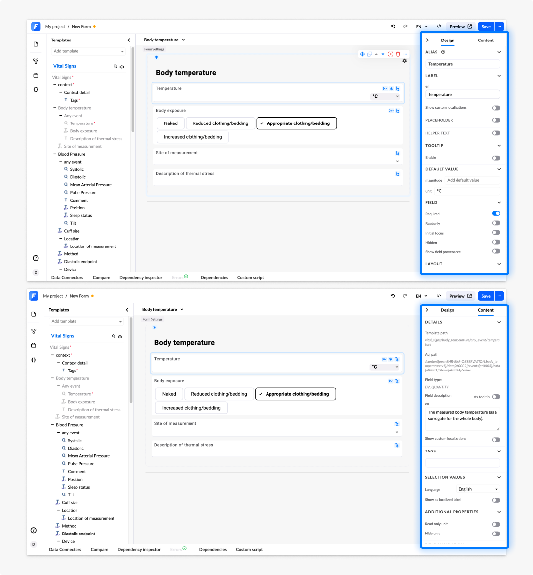
On the right side of the editor, you have the property panel. This is where you will change and edit the properties of your specific component.
To see what properties a specific component has, simply select (click on) it. The property panel will always show the Design and Content tab for you to explore.
Design tab
The Design tab controls how a component looks and behaves on the canvas and in the rendered form. The design options vary on the type of component you are working with.
- Label: The text displayed above or beside the component in the rendered form. Write labels as short, descriptive nouns or noun phrases, for example: "Systolic pressure" or "Date of birth".
- Alias: A unique identifier used to reference this component in expressions, dependencies, and scripts. Aliases are generated automatically but should be updated to be meaningful, for example: bp_systolic, patient_name, admission_date. Aliases must be unique within a form; changing one after it has been referenced in logic will break those references.
- Placeholder:
- Helper text: Explanatory copy shown below the label in the rendered form. Use it to guide end-users on what to enter. Keep it concise and actionable; do not repeat the label, and do not use it for warnings.
- Tooltip: A short hint that appears when the end-user hovers over the "?" icon, located on the component in the rendered form. Use it for contextual guidance that does not need to be permanently visible, unlike helper text. Keep tooltips brief, one or two sentences at most.
- Layout and size: Controls label position (top, left, or hidden) and the component size relative to the column grid.
- Field settings: Toggles for required, read only, hidden, and initial focus behaviour. These will change depending on the component you're looking at.
Content tab
The Content tab contains information about what the component is and what data it is connected to. Settings here vary significantly between template fields and generic inputs.
For template fields, the Content tab shows:
- Field type: The openEHR data type of the field (for example, DV_QUANTITY, DV_CODED_TEXT, DV_DATE_TIME).
- Template path: The AQL path that identifies where in the template this field's data is stored in the CDR.
- Description: The clinical description of the field as defined in the archetype, shown as reference for the form author.
- Type-specific settings: Common examples are unit options for quantity fields, selection values for coded text fields, or format settings for date fields.
For generic inputs, the Content tab shows:
- Data binding: You can manually specify the data path if you want the field to persist its value to the CDR.
- Default value: A value pre-populated when the form loads.
- Type-specific settings: Common examples are minimum and maximum for numeric fields, or options for dropdown and radio button inputs.
The Content tab is read-only for the template path and description on template fields. These are defined in the template and cannot be changed in Form builder. To change the underlying structure, update the template in the Archetype designer and re-import it into your project.
Frequently asked questions (FAQs)
What is the difference between a template field and a generic component?
A template field comes from an openEHR template and is automatically bound to a data path in the CDR. A generic component, such as a text field, checkbox, or dropdown, is a flexible component that you configure and bind manually.
How do I add a component to a form?
Open the left panel in the editor. Select either the Templates tab for template-bound fields or the Generics tab for generic inputs. Drag the component onto the canvas, or click it to place it in the currently selected container.
What is an alias?
An alias is a short, unique name you assign to a component. It is used to reference that component in expressions, dependencies, and scripts. Aliases must be unique within a form. Update auto-generated aliases to be meaningful before you reference them in logic — for example, bp_systolic or patient_dob. Changing an alias after it has been used in logic will break those references.
What is helper text?
Helper text is explanatory copy that appears below a field label in the rendered form. It guides users on what to enter — for example, "Enter the reading taken at rest, in mmHg." Keep it concise and actionable. Do not repeat the label, and do not use helper text for warnings.
What are widgets?
Widgets are pre-built, reusable components available from the Marketplace. They extend the standard component library with specialised inputs, displays, and interactive elements. Widgets must be installed into your project before they appear in the Widgets tab.