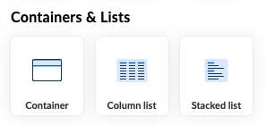
Column list and Stacked list
Lists are generic elements that allows you to display repeated sets of data in a tabular format. Data is obtained through APIs or AQL variables.
Imagine you're building a form for a patient's medical history. You can use a list to display information about the patient's visits, such as the date of the visit, the doctor's name, and the diagnosis. You can also use a list to display a list of medications, a list of allergies, etc. You can also control how data is displayed in the list. For example, you can sort the data, use widgets to convey complex information, or use generics to display simple data.
There are two kinds of lists to choose from:
- column list: displays data in a table format that consists of rows and columns
- stacked list: display data in a single column format
Column List
Column lists are used to display data in a table format. The data is displayed in rows and columns. Each column can contain any type of data, such as text, numbers, images, etc.
Adding a Column List to the Form
The column list is available in the Containers & Lists section. To add it to the form, drag it onto the canvas, or double click on it to add it to the end of the form.
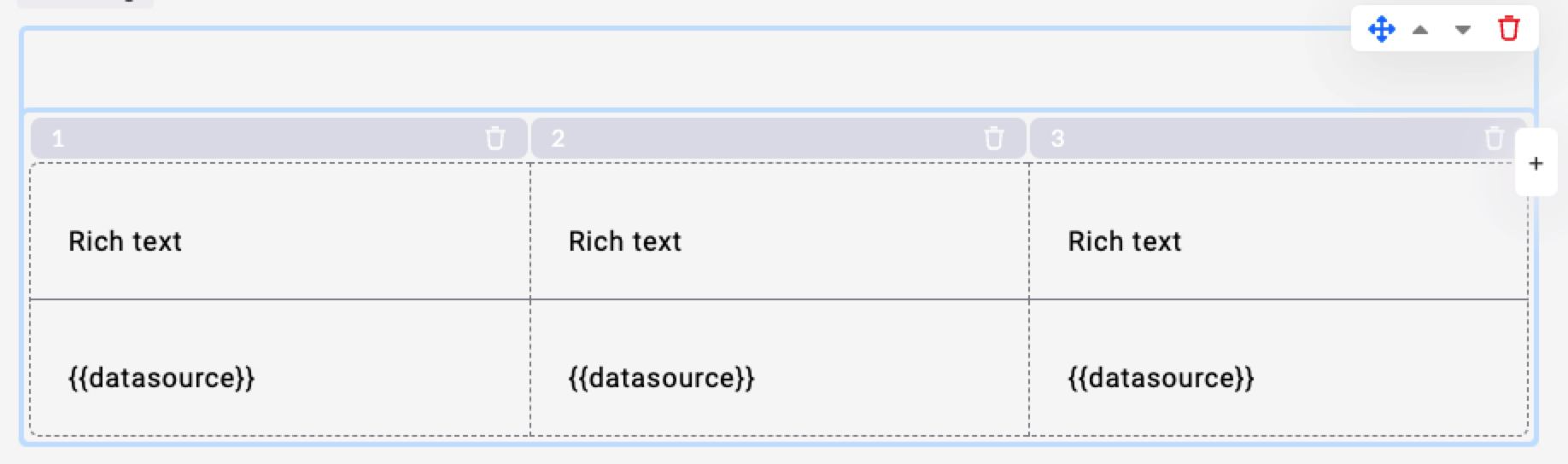
The column list has a header row and a data row. The header row usually contains column names that give an indication oo what kind of data is in that column, and can also contain sort indicators if sorting is enabled. If you have multiple rows in your source data set, the data row is repeated for each item in your source data set.
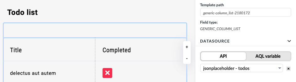
Setting Data Sources
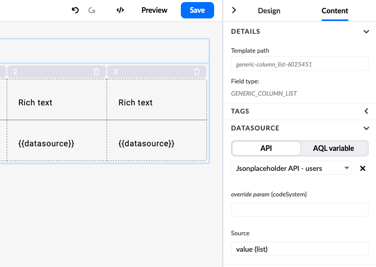
A list can receive data from an API or an AQL variable. The following steps will show you how to set an API as a data source for a list.
To set the data source of a list to an API, follow these steps:
- make sure you have added an API connector that returns a list of objects
- select the Content tab in the Right Panel
- select the desired API as the data source
- set the source to 'value (list)'
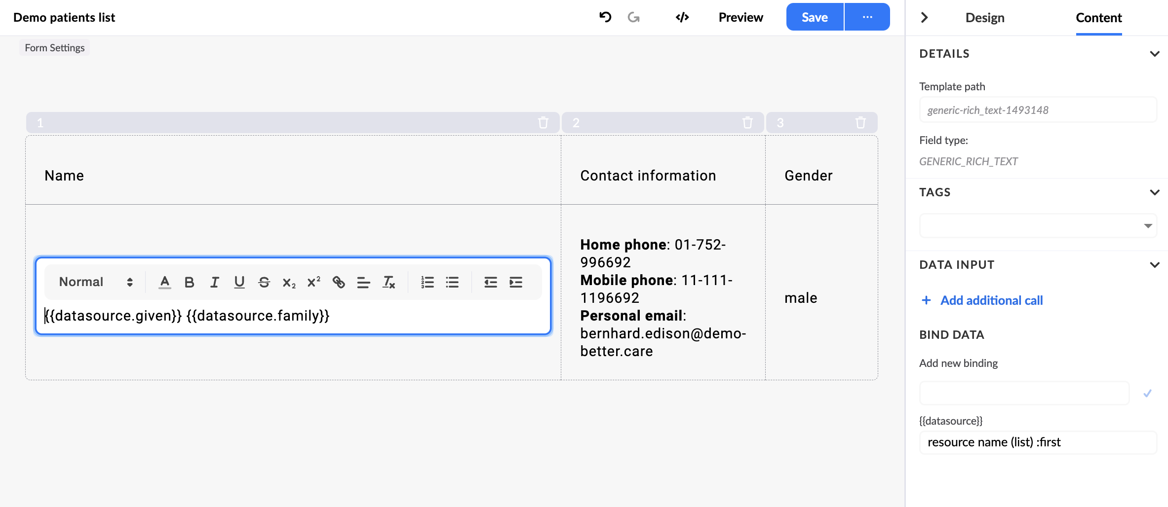
Binding Data to Columns
Each column has a Rich text generic by default. The Rich text generic uses the Mustache templating engine.
The default variable to bind data to is {{datasource}}.
You can bind data in the Right panel in the Content tab. You need to set a label for the {{datasource}}. When you bind data, Studio already previews a sample data.
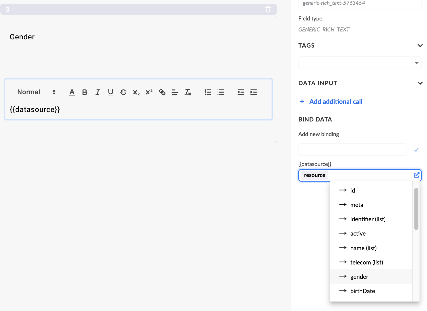
When you bind an array of data to one data source, you can access each item with a dot notation, for example {{datasource.name}}.
Adding, Removing, and Reordering Columns
To add columns, you can use the Add Column button in the Design tab on the right, or the Add Column button on the column list itself. Both methods add a new column to the end of the list.
To remove columns, you can use the Remove Column icon next to the column you want to remove in the right Property panel, or use the Remove Column icon in the column list itself. Either method will remove the selected column.
To reorder columns, you can use the drag handle icon next to the column name in the property panel on the right.
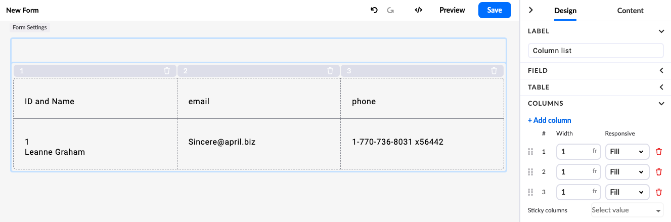
Column Widths
There are three properties that control the width of the columns in the list:
- Fixed - sets a fixed width (in pixels) for the column, the column will not change its width no matter what content it contains
- Fill - sets the column to fill the available space. This means that all columns set to 'Fill' will divide the remaining space between them according to their fraction unit (fr). For example in a two-column layout, if both columns are set to 'Fill' and the first column has a fraction unit of 2fr and the second column has a fraction unit of 1fr, the first column will be twice as wide as the second column.
- Fit - sets the column width to fit its text content. This means that the column will be as wide as the widest text in the column
In the figure below, we have a list with four columns:
- The first column will always be 150px wide
- The fourth column will be as wide as the longest content in the column
- The second and third columns will divide the remaining space between them, but the second column will be twice as wide as the third column
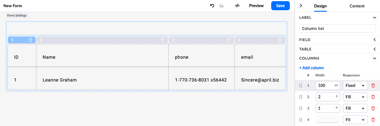
Different column widths
Column widths and Backwards Compatibility
Studio version 3.9 introduced new features to the Column list, such as column width, content alignment, and text overflow. These features are not backwards compatible with old versions of the renderer, and the Column list may not work as expected when used with a renderer version 3.8 or earlier.
If you are using Studio 3.9 and a version of renderer 3.8 or earlier, it will still render any column list created in version 3.8 or earlier, provided you do not edit any properties of the column list; once you edit any property, the column list will be updated to the new version and cannot be used in Renderer 3.8 or earlier. Updating to the new version will convert all columns to 'Fill' width.
List Settings
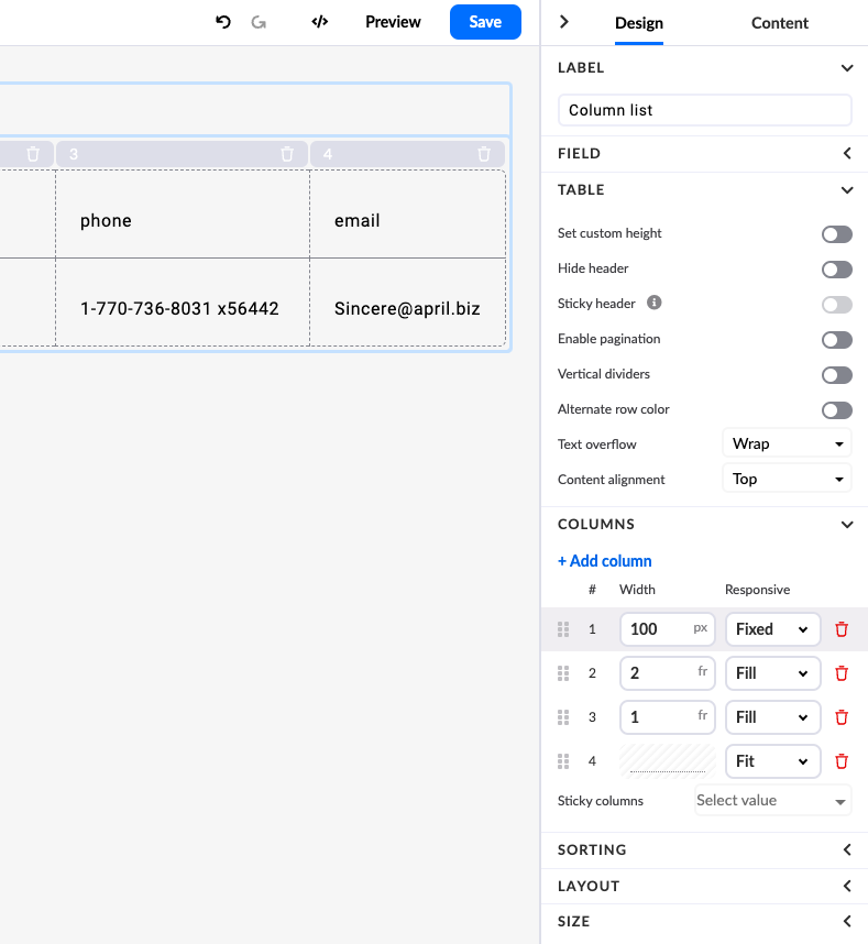
The properties panel also allows you to manipulate some additional settings of the table. These include:
- Set custom height - displays an input field where you can set the height of the entire list
- Hide header - hides the header row of the list
- Sticky Header - This option is only available if the list is assigned a custom height. When enabled, the header becomes 'sticky' and remains visible at the top of the list while scrolling.
- Enable pagination - Enables pagination for the list, which allows you to set the number of result rows displayed per list page and allows you to navigate through the pages.
- Vertical dividers - shows vertical dividers between columns
- Alternate row colors - sets a different background color for every other row
- Text overflow - determines the behavior of text that does not fit into a cell
- Content alignment - defines the alignment of the content in the cells
- Sticky columns - allows you to set one or more columns to remain sticky and always visible when scrolling horizontally through the list
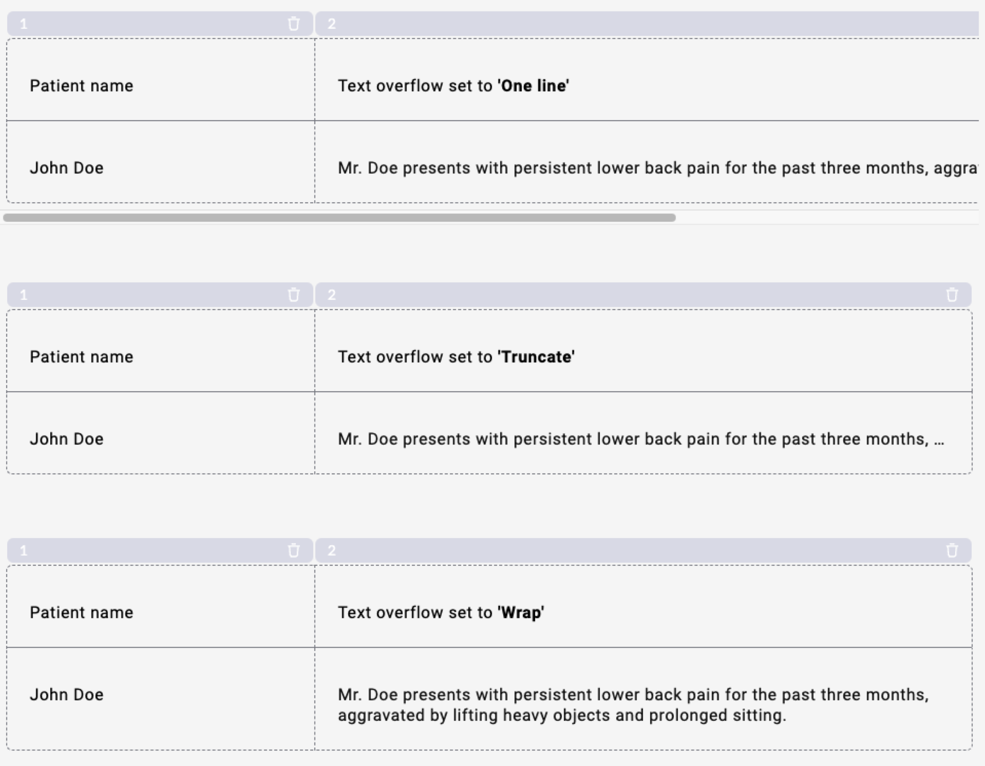
Text Overflow
Text overflow settings allow you to control how text that doesn't fit in a cell is displayed. You can choose between three options:
- One line - text will be displayed in one line and will not be cut off if it doesn't fit
- Truncate - text will be displayed in one line and will be cut off if it doesn't fit, but an ellipsis will be added to the end of the text
- Wrap - text will be displayed in multiple lines if it doesn't fit
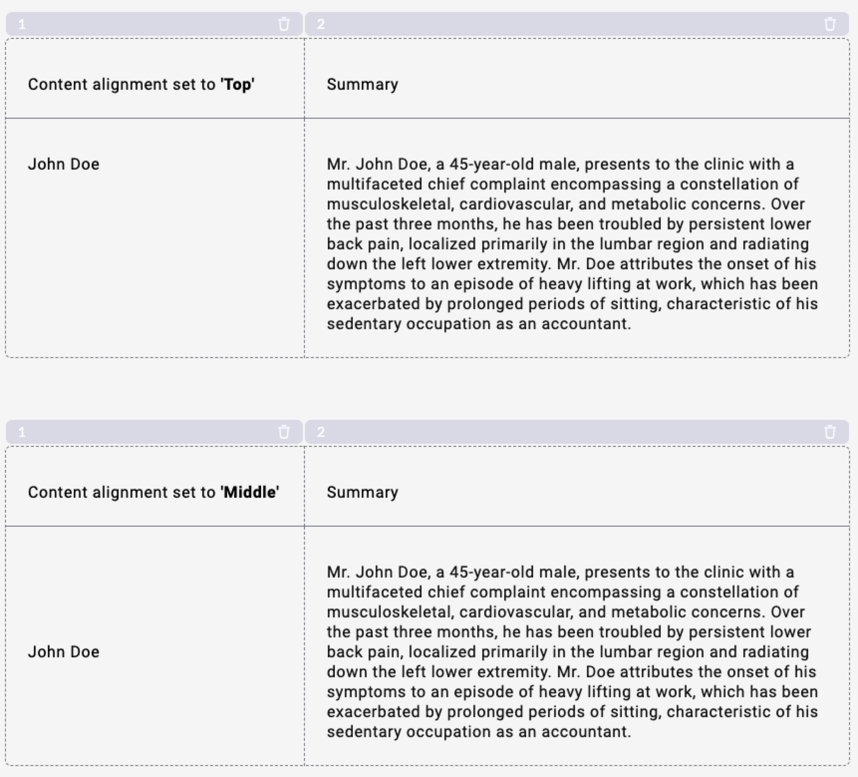
Content Alignment
Content alignment settings allow you to control how the content in the cells is aligned. You can choose between two options:
- Top - content will be aligned to the top of the cell
- Middle - content will be aligned to the middle of the cell
Sorting
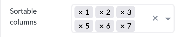
Sorting in a list refers to arranging the data in the column in a particular order, either ascending (ASC) or descending (DESC). Once a column is sortable, it will have additional arrow icons to indicate to the user that the column can be sorted. If the user clicks on the icon, it will toggle between ascending and descending order and display the corresponding icon.
Sorting can be enabled for any column in the column list. Select the columns in the Sortable columns section. To remove a column, click the x next to the column number.
For each sort group, there are two groups (ASC and DESC) where key-value pairs can be defined for each sort. These key-value pairs are appended to the URL that is expected to return sorted results. You can also define successive key-value pairs for sorting, for example you can set the first key-value pair to sort by date, then within the same dates you can add the second key-value pair to sort by name. The URL of the data source defined in the list is used as the base URL.
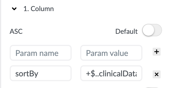
For each sortable column there is also a toggle switch that allows the user to set it as the default sort order for the column list. When the user first opens the form, the default sort order is applied to the list. This makes it easier for the user to quickly find the data they are looking for without having to manually select the sort order each time they use the table.
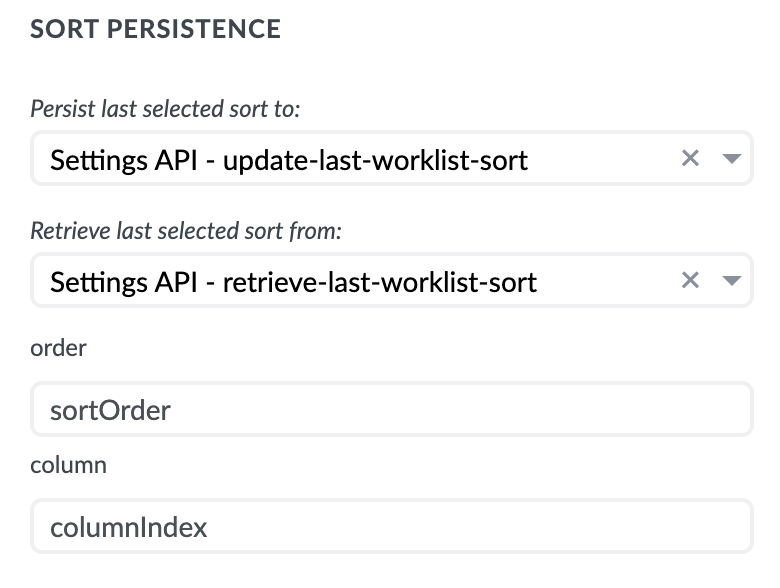
Sort Persistence
The last sort order selected can be saved to your desired server and applied each time the user opens the form. Once the user has selected a new sort order, it becomes the new default sort order for future use, regardless of which column is selected as the default in the Form builder.
To enable sort persistence, scroll to the bottom of the Sort section in the Properties panel, where you will find two drop-down menus: "Persist last selected sort to:" and "Retrieve last selected sort from:". Each of these defines a data source from/to which data is sent/received.
Sort Persistence Datasource
There are a few rules to follow when defining a datasource that can be successfully used to save/retrieve sort persistence.
- Saving:
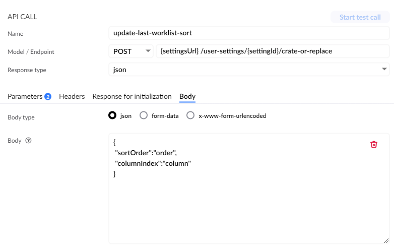
The form renderer automatically binds/replaces the values in the datasource body with actual sort values that are sent to the API endpoint specified by the user in the "Persist last selected sort to:" dropdown. To do this, the form renderer requires two predefined values in the API call body:
"order""column"
The sortOrder and columnIndex keys in the screenshot below are examples and should reflect the body that your backend/API accepts. The values order and column should be defined in the body and the server should accept the value types string and number. These values will be replaced by the form renderer with the actual sort order and column number values.
In our example, if we were to sort the first column in descending order, the payload sent to the server would be {"sortOrder": "DESC", "columnIndex": 1}
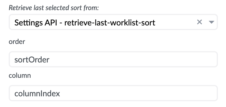
- Retrieving:
There are no special rules for defining a retrieval API for sort settings. Any API call with a
GETmethod type can be selected from the dropdown in the property panel. There is only one additional step when selecting a datasource, and that is to bind the return properties (ASC/DESC and column number) you defined in the API call to theorderandcolumnproperties, which the form renderer can then use to apply the sort to the form.
Stacked List
Stacked list is available in the Containers & Other section. You can drag it to the canvas.

Stacked list is similar to Column list. The differences are that Stacked list has no headers and only one column.
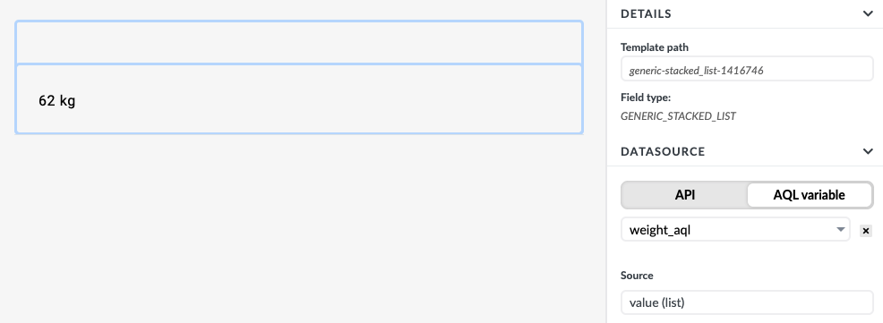
The example shows a stacked list connected to a weight_aql variable and displays the result in one column.

Manipulating Data Inside a List
Column list and Stack list allow you to add any other type of fields to the columns. Every column also contains a Rich text area with a Mustache template engine, which allows you to create different solutions.
The following examples shows how to create a list that displays different images based on the value of the data.
TODO List with a Complete Image
The first example will show a list of TODO tasks. Each task has a 'name' and a 'completed' properties. Completed property is of type boolean; it can be either true or false.
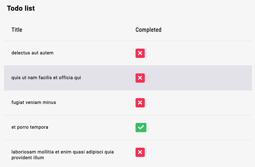
A red icon will be displayed when a task is incomplete, and a green icon when the task is complete.
You need to connect a column list to an API with the list of tasks.
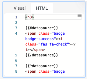
To a complete row, you will drag an HTML component. Since the HTML component interprets Mustache templating language, you can check if the data source variable has a value true or false. You can display the appropriate icon based on the data source value.
Measurements with a Status Image
The following example shows how to display different images based on the patient mood measurements. The example will show a mood icon based on the patient's mood.
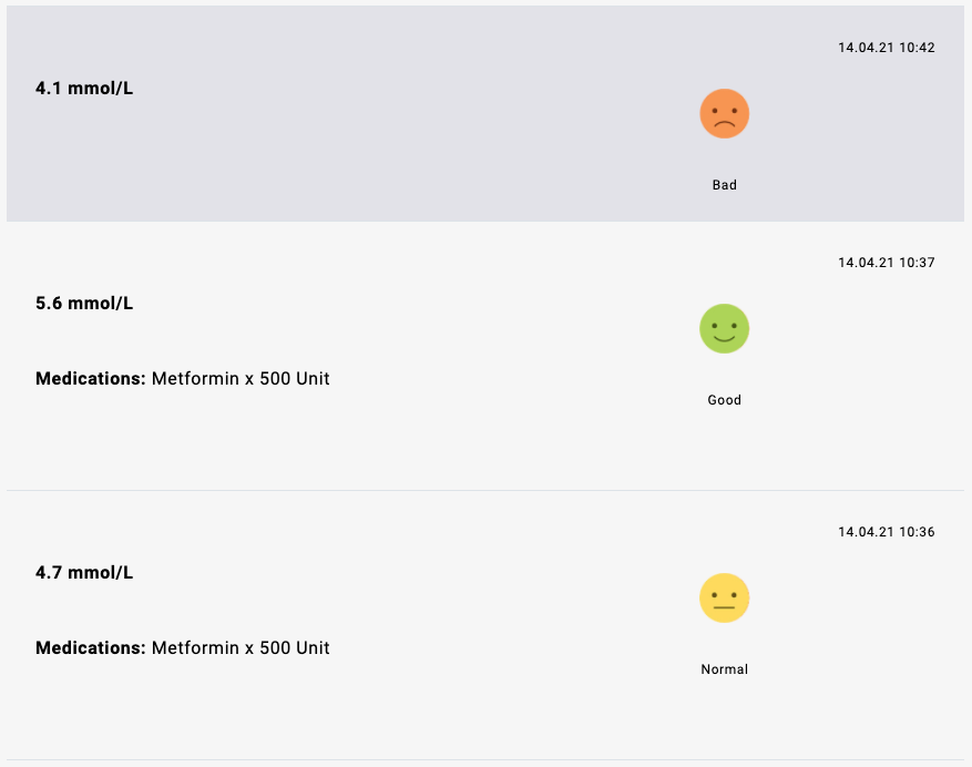
Since you cannot check variable values with the Mustache engine (only true/false), you can use the Studio's interaction dependencies. You can add an input field and bind the mood data to it, and turn off the visibility of the input.
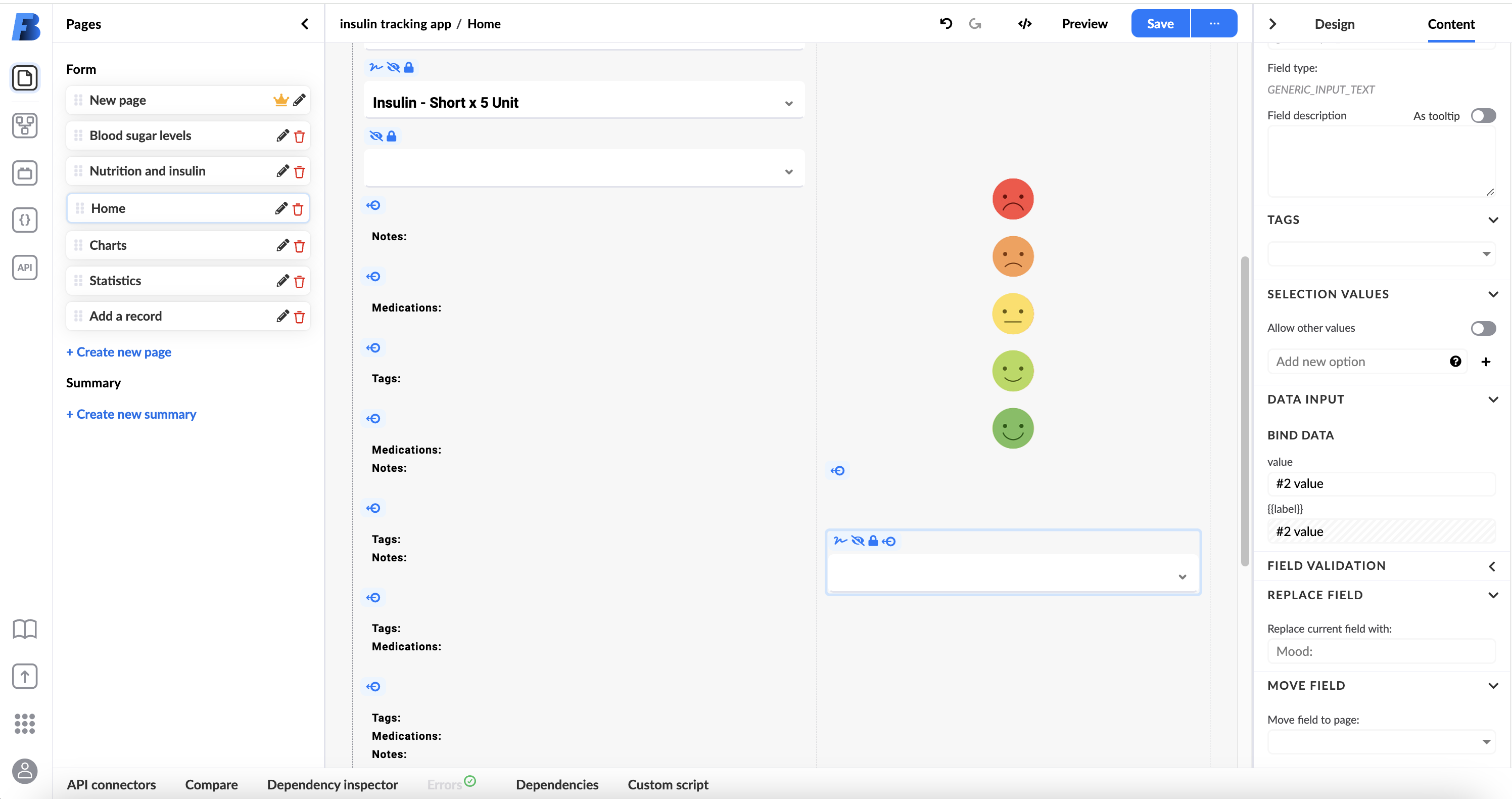
You can now set the interactions based on the input mood value.
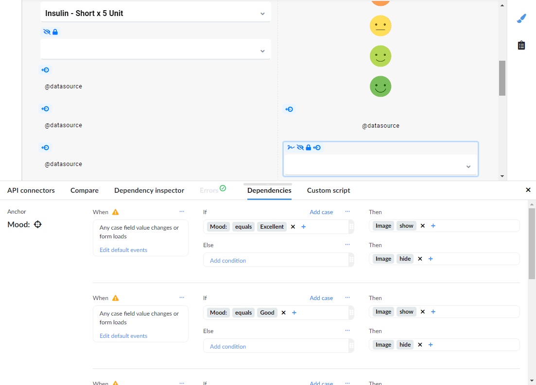
Based on the mood value, the form will show or hide mood images.
Many other interface solutions are possible using lists, generic inputs, and the Mustache templating engine.