Layout group fields and containers
Layout group fields are used for two purposes:
- to change the layout of the fields by adding rows and columns and
- to group fields together
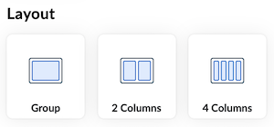
For your convenience we already provide layout groups in one, two and four columns, however you may add and/or remove columns and rows as you please.
Adding Rows and Columns
If you want to have fields distributed among rows and columns, you must have a layout group on the canvas and click on the cogwheel on the right side of the cell and then add rows or columns:
These columns are responsive to the environment they are in, and they stack on mobile device.
If Show borders is deselected, the end users won't see that this is a layout group, they will only see fields distributed among columns and rows.
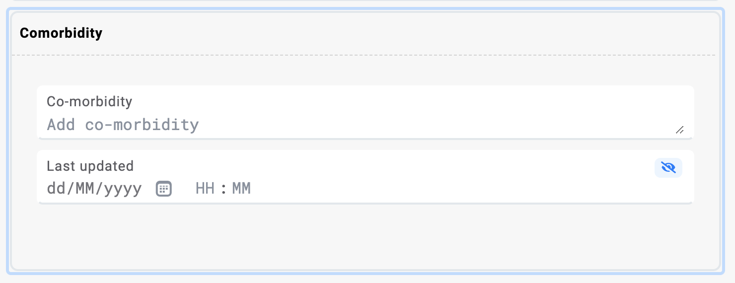
Grouping Fields Together
By adding fields in one layout group or container you are able to visualize them as one group of items. You can achieve this by adding fields to a layout group:
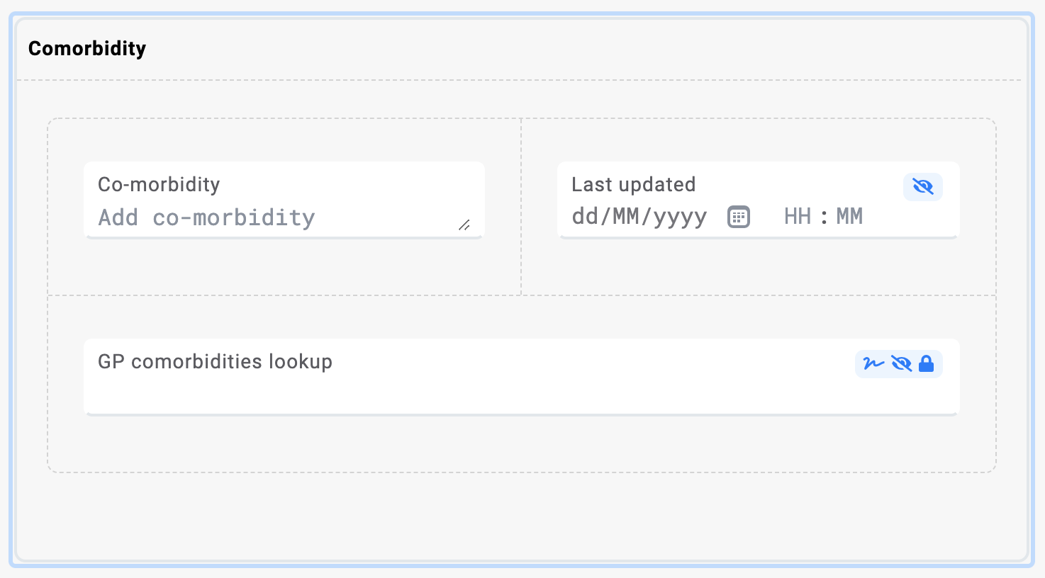
You can add fields into a container (but note that here you can no longer add rows or columns):
Or you may insert a layout group with rows and columns inside a container:
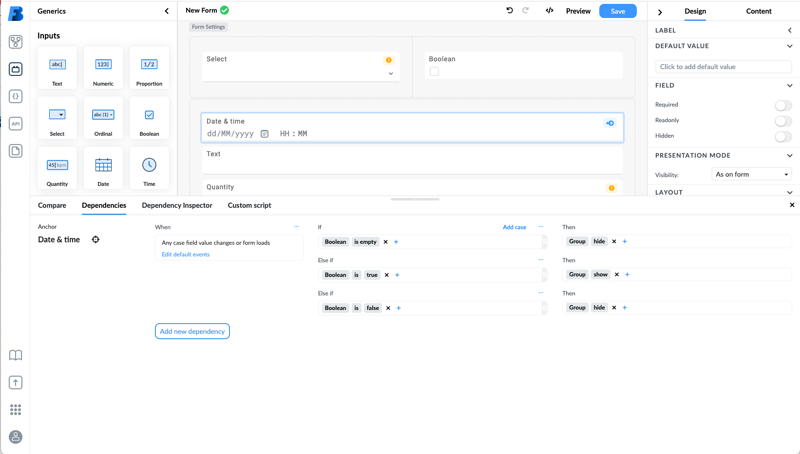
Consequentially, you can add a simple dependency on the whole container or layout group instead of adding it to individual fields separately:
Using containers on the canvas reduces the speed of your application, as rendering them is a performance-intensive operation. The alternative is to use tags to group elements together.
Multiplication of Data
Only non-generic containers that have max multiplicity > 1 have the multiplication option. The min setting sets the required data. For example, setting the min to 1, the end user needs to fill at least one set of the container components. The max setting sets the number of available duplicates of components within a container.

When filling in the form, you can see the (+) and (-) icons that allow you to multiply / add the container or remove it:
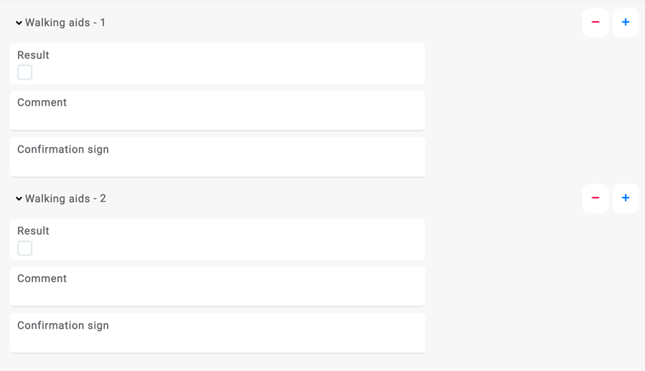
An example of multiplying container:
By setting the Height measurement event to min one and max two, the height measurement is required (at least one measurement), and it is limited to two measurement events.
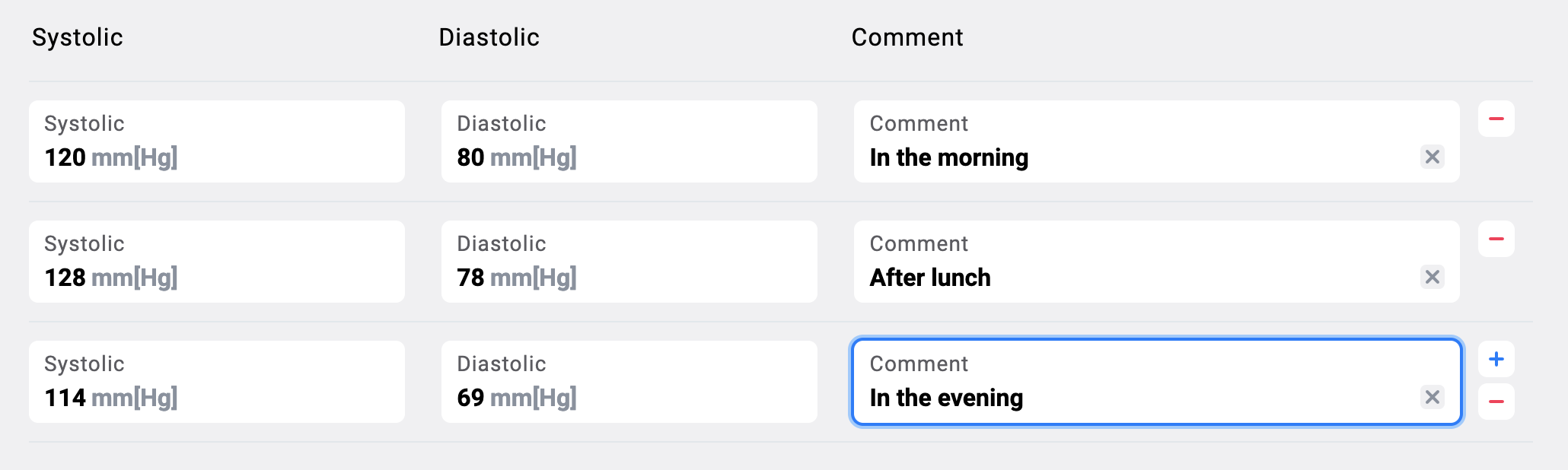
List presentation of multiplied containers
If you have a container that allows multiplication and does not contain containers within itself you can change the presentation of it to list.
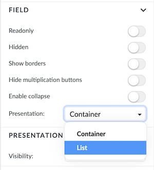
The list presentation will create a list of columns with the field names as headers. The functionality is the same as with multiplied containers above, the difference is the presentation, which might be more suitable for certain situations.
Layout group Settings
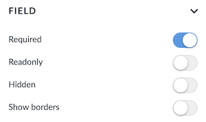
Layout group settings include:
- Required - the user can set the layout group to behave as required or not
- Readonly - all fields inside the layout group will be readonly
- Hidden - the layout group and all its fields will be hidden
- Show border - the user may choose to show the borders of the layout group field
Container Settings
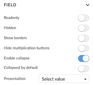
Apart from the widely used readonly and hidden, other containers settings are:
- Show borders - user can show the border of a container.
- Enable collapse - containers can be collapsed.
- Collapse by default - you can set a container to be collapsed by default if
Enable collapseis set to true. - Hide multiplication buttons - will hide the
+and-multiplication buttons (Note that this setting only appears if the container can be multiplied to begin with). - Presentation - user can choose the presentation of the container to be as
containerorlist(Note that this setting only appears if the container can be multiplied to begin with and if it doesn't include any containers in itself)
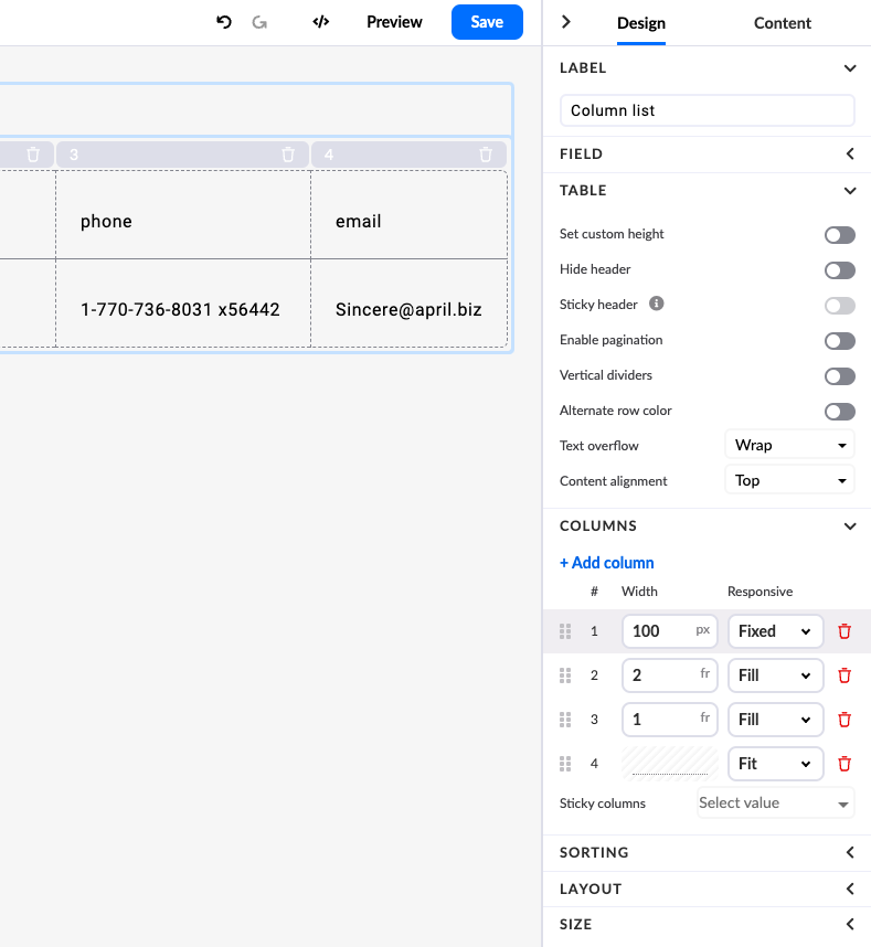
When a container presentation is changed to list you get an additional setting group for Table. Here you can set:
- Hide header - hides the header of the list
- Show all borders - shows all borders of the list
- Set custom height - opens up a input field where you can set a custom height expressed in pixels
- Sticky header - sets the header to sticky when scrolling through the list (only available if you set a custom height)
- Sticky columns - you can set one or more columnts to remain sticky when scrolling horizontally
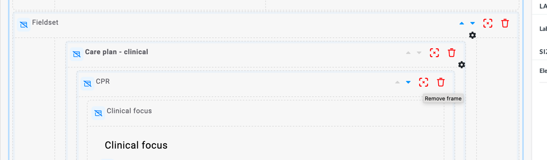
To remove a container from the canvas without removing the components that are in the container, you can click the red frame button on the right side of the container: