Notification fields
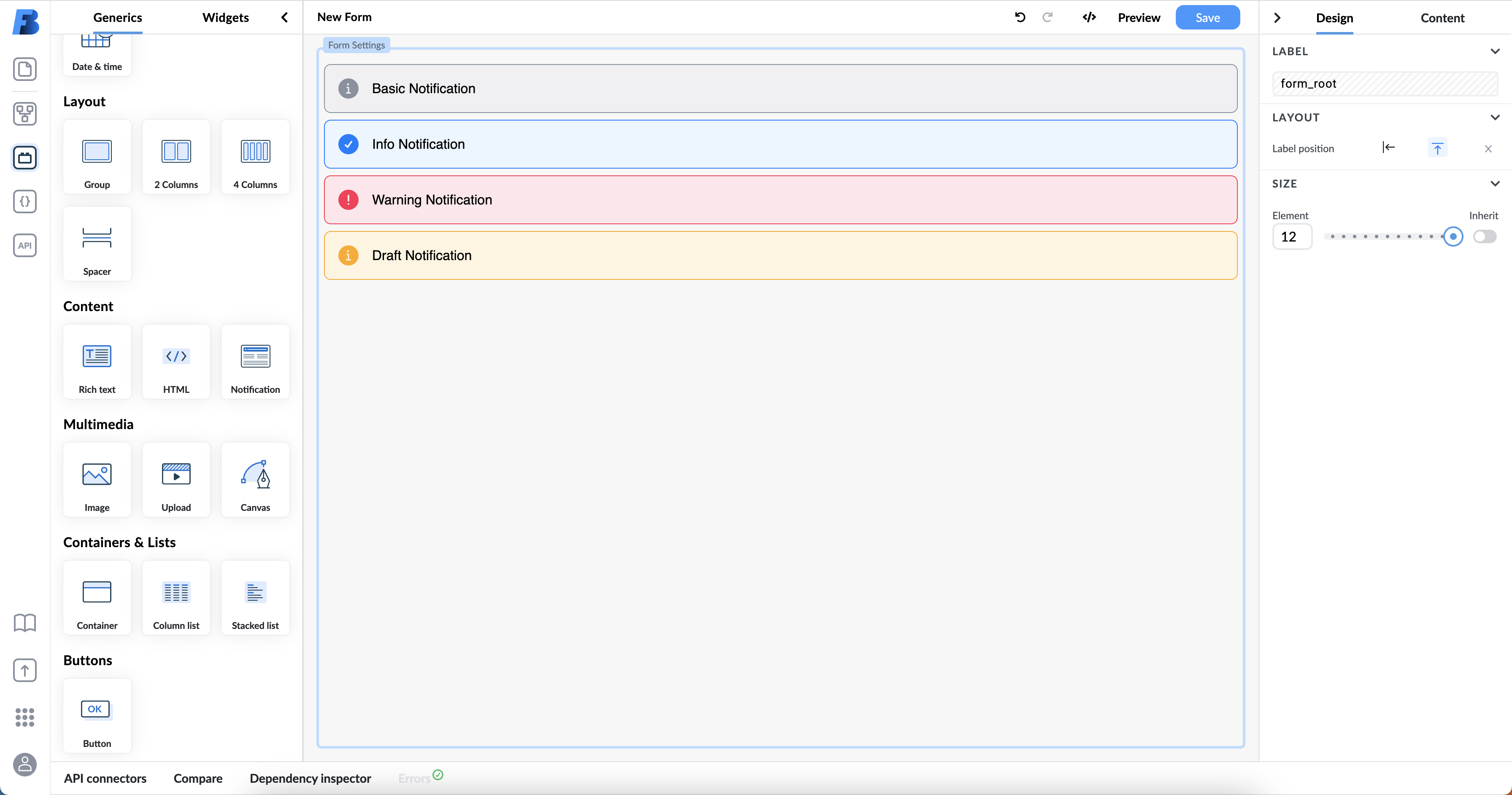
The notification component is a generic form element, which allows the user to create content, that notifies others about important information on the form, and it can have one of four different styles:
- basic
- info
- warning
- draft.

The styles allow you to quickly communicate the type of information you are adding - whether it is urgent or just a good to know type of information, and you can format the text inside it in the same ways as on the rich text field.

In dependencies you can control when a certain notification will show on the form by toggling visibility. If you’re using more than one notification on the form, it is best practice to change their labels in the design panel, so you can avoid confusion of having multiple different notifications all labeled 'Notification'.